Tables
A table is two pieces. A DataController declares the data shape and its operations — list, filter, sort, search, create/edit/delete, export, archive — once, with decorators; that whole backend side (route generators, field decorators, model wiring) is its own reference, Data controller. A TableView component points a page at that controller and renders the screen: toolbar, columns, forms, and pagination are wired for you, so a standard CRUD screen needs no Vue and no hand-written routes. For a static form or one-off list endpoint, use Pages & components instead.
TableView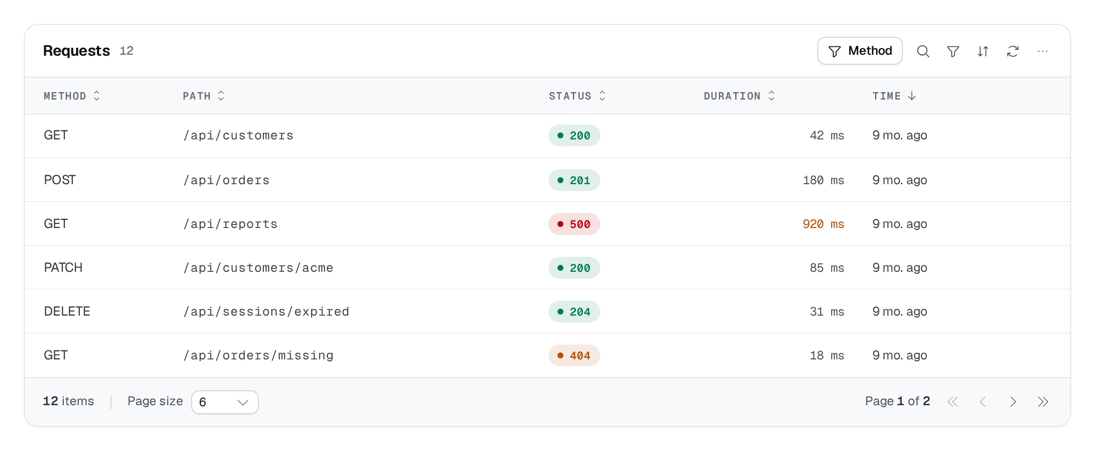
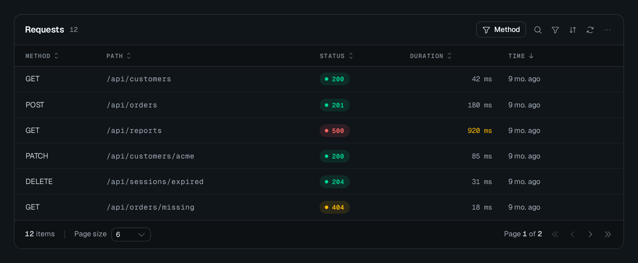
What it renders
TableView produces a full table screen:
- Toolbar — the
captionheading, a global search box (when@Searchablefields exist — it searches from 2 characters), a filter perfilterablecolumn, a column-visibility menu, an optional tab strip (tabs), a display switcher when more than one display is configured, an Export button (when the export routes are present), anycustomButtons, and an Add button (when theaddaction is enabled). - Columns — one per
@Column, headed byname; a@Sortableheader toggles ascending/descending. Each cell renders through itsDataType(a badge, date, thumbnail, relation chip), not raw text — see Data types. - Rows — one per record, keyed by
rowIdKey(default_id). WithhasSelectionon, a leading checkbox column enables multi-select and bulk delete/archive/restore. - Row actions — a per-row menu of the enabled actions (edit, details, duplicate, delete, copy link, archive/restore, plus
customentries), hidden or disabled per row by theirrule. - Pagination — a footer driven by the
list/countroutes.
Editing happens in a form container — drawer, modal, or page — built automatically from the controller's @Column fields. See Forms.
Usage
Model the data first: declare the controller, its routes, and its field decorators as shown in Data controller — this example reuses the taskDataAPI controller built there.
Pass the controller class itself (not an instance) to TableView. Columns come from the controller's @Column decorators — you do not redeclare them on the page.
import {
  PageController,
  RegisterPage,
  pagesCategory,
} from "@antelopejs/interface-dms/page";
import { TableView } from "@antelopejs/interface-dms/base/table-view";
import { taskDataAPI } from "../data-api/tasks";

@RegisterPage()
export class TasksPage extends PageController("tasks", {
  displayName: "Tasks",
  icon: "i-ph-table",
  category: pagesCategory,
}) {
  static table = TableView(taskDataAPI, {
    caption: "Tasks",
    labelKey: "name", // names the row in form titles and breadcrumbs
    archiveMode: true, // requires an @ArchiveField on the controller
    formContainer: {
      type: "drawer",
      // The form titles, in a drawer, a modal or a page alike.
      pages: {
        new: { displayName: "New task", description: "Name it and assign people." },
        edit: { displayName: "Edit task" },
        details: { displayName: "Task details" },
      },
    },
    rowActions: {
      add: true,
      edit: true,
      details: true,
      hasSelection: true,
      delete: { isEnabled: true, rule: { field: "status", notEquals: "done" } },
    },
  });
}
TableView options
| Option | Type | Default | Description |
|---|---|---|---|
captionContent | string | – | Heading above the table. |
searchPlaceholderContent | string | – | |
footer.countLabelContent | string | – | |
footer.hintContent | string | – | |
archivedCountLabelContent | string | – | Count shown while the archive is listed, with {count} ("13 archived invoices"). |
archiveModeFeatures | boolean | – | The row is archived instead of erased, and stays readable in archive mode. |
rowActions.hasSelectionFeatures | boolean | – | |
rowClickFeatures | "single" | "double" | – | Whether a row opens with one click or two. |
densityAppearance | "default" | "compact" | – | |
layoutAppearance | "full" | "compact" | – | Full for a page of its own, compact for a short list in a settings page. |
pageSizeAppearance | number | – |
The generated table above lists what the page editor offers. The reference below details every option, including the ones only code sets.
TableView(controller, options):
| Option | Type | Default | Purpose |
|---|---|---|---|
caption | string | — | Heading above the table. |
layout | "full" | "compact" | "full" | How much the table draws around its rows: the dashboard grid, or the compact list of a settings page (see Layout). |
searchPlaceholder | string | — | Placeholder of the search field, also its accessible name ($-prefixed: i18n key). |
searchShortcut | string | "shift_f" | Key opening and focusing the search, in defineShortcuts notation: "/", "shift_f", "meta_k". Like every table shortcut, it does not fire while the user types in a field. |
quickFilters | TableViewQuickFilter[] | — | One-click dropdown filters in the toolbar over a column's values (see Quick filters). |
pageSize | number | 10 | Rows per page while the user picked none, 1 to 50 (registration throws above). A size other than 10, 25 and 50 joins them in this table's page size picker. |
pagination | "pages" | "loadMore" | "infinite" | "pages" | How the rows go past the first page: a pager, a "Load more" button, or more rows as the footer scrolls into view (see Pagination). |
density | "default" | "compact" | "default" | Row density the table opens with (compact: 36px rows). The user picks another from the "Density" entry of the ⋯ menu, kept with the table's state. |
maxHeight | string | — | Caps the rows in a scroll area of their own (any CSS length, e.g. "60vh"), under a header that stays in view. |
rowClick | "single" | "double" | "double" | What runs the row's click action (its isDefault custom action, else edit or details): a double-click, or a single click. A single click on a control of the row, or one ending a text selection, runs nothing. |
footer | TableViewFooterOptions | — | Footer band: the row count ($ key pluralized on { count }, e.g. "7 members"), a hint, summary figures computed by the server and a legend (see Footer summaries). |
emptyStates | TableViewEmptyStates | — | What the empty body says when the table has no row yet, when its filters match nothing, or when the list failed (see Empty states). |
expandable | TableViewExpandableOptions | — | A caret column opens a detail band under each row, listing fields and/or rendering a component (see Expandable rows). |
rowIdKey | string | "_id" | Field used as row identity for actions and realtime. |
labelKey | string | — | Field naming a row: it follows the drawer/modal title ("Edit task · Buy milk") and ends the breadcrumb of the edit and details pages. |
rowActions | TableViewRowActionOptions | — | Which per-row actions to show and their rules (see Row actions). |
columns | { hidden?: string[] } | — | Columns of the controller this table view opens hidden, for this table view only (see Hiding a column on one page). |
customButtons | CustomButton[] | — | Extra toolbar buttons with an ActionTarget. |
formContainer | { type: "drawer" | "modal" | "page"; pages? } | page | Where the add/edit/details form opens, and its titles in pages (see Form containers). |
archiveMode | boolean | false | Replace delete with archive/restore; requires an @ArchiveField. |
archivedCountLabel | string | "Archived: {count}" | Count the caption shows while the archived rows are listed (see Archive mode). |
defaultFilters | Array<{ accessorKey; value?; mode }> | — | Filters pre-applied and visible when the table opens. |
defaultSort | { field; desc? } | — | Initial sort when the user has no saved preference, and the sort the table goes back to when the user clears theirs. |
pinnedRows | RowActionRule | — | Rows listed first whatever the sort, by a rule on their fields (see Pinned rows). |
queryParamFilters | Record<string, { field; mode?; visible?; label? }> | — | Map URL query params to hidden filters (not persisted; shown as a removable chip only with visible: true). |
routeParamFilters | Record<string, { field; mode? }> | — | Map DMS route params (page-slug tokens like :id) to hidden filters — for detail pages scoped by a path param. |
strictRuleValidation | boolean | false | When true, reject the whole request if any row fails a rule; when false, process only eligible rows. |
tabs | TableViewTab[] | — | Tab strip above the table; each tab filters on one column (filter) or links to another page (to), never both. An implicit "all" tab is added automatically. |
realtime | boolean | true | Broadcast row mutations and presence to other viewers (opt-out). |
realtimeTopic | string | string[] | — | Topic(s) the backend publishes on when rows change elsewhere (a batch, a job); the table reads its rows again on each event. |
liveHold | boolean | { whileRowOpen?; whileScrolled?; whileSearching?; whileSorted?; missedLabel? } | — | On a page declared with live, keeps the rows while the page is paused and shows a "N new · Show" strip; the object also holds the table alone while a row is open, the user scrolled down, searches or sorts otherwise than by default, and the strip says why (see Live pages). |
reorder | { field } | — | Rows ordered by hand: a drag handle moves a row (or a card, on the cards display), saving its new field value (see Rows ordered by hand). |
kanban | KanbanOptions | — | Enable a kanban display; groupByField must be a non-multiple SelectType, BooleanType, or StatusType column. |
grouped | GroupedOptions | — | Offer the grouped display: the grid's columns with a header row per group of rows (see Grouped display). |
views | TableViewViewsOptions | — | Named states of the whole table — filters, search, sort, columns, display, density — as tabs, a strip or a menu, opened from the URL, and saved by users for themselves (see Views). |
card | { fields?; component?; minWidth?; skeletonHeight? } | — | The card the kanban and cards displays draw for each row (see Cards). |
displays | TableViewDisplayOption[] | [{ id: "table" }] | The displays offered, in the switcher's order: the grid ({ id: "table" }), the built-in cards ({ id: "cards" }), or a module's own, named <module>:<id> (see TableView displays). Left out, the grid alone; listed, exactly these, so list the grid to keep it. kanban and grouped are offered by their own options, after the list unless it places them. |
defaultDisplay | string | first display | Display shown when the user has no preference. |
mobileDisplay | string | — | Display a phone (narrower than 768px) opens on when the user has no preference, e.g. "cards"; one of displays (see Narrow screens). |
guards | TableViewGuards | — | Server-side checks before mutating actions (see Guards). |
formSlots | { new?, edit?, view?: string } | — | Component slot each generated form opens, so another module can extend it through RegisterComponentSlot. The values its fields submit reach the data routes only if the controller reads them — wrap the edit write with TableViewRoutes.EditWith(baseRoute). |
forms | { new?, edit?, view?: (form: FormBuilder) => void } | — | Callback receiving each generated form's builder, to declare on it what a Form takes (.watch()…): conditional fields in a drawer, a modal or a form page alike. See Form watches. |
bypassTenantAccessGate | boolean | false | Keep the table readable while a tenant access gate denies the tenant — for tables on recovery surfaces (invoices on a suspended tenant's billing page). Covers view, list and select only: every write, and export (which queues a job and delivers a file), still asserts the gate. Action permission checks apply on top. Latched controller-wide: once one TableView() registration of a controller declares it, a later registration without the flag cannot silently re-gate (or un-gate) the shared routes — so a table mounted on several pages shares the opening, and mounting it both ways is warned about. |
queryParamFilters and routeParamFilters also seed form submit defaults: a form opened from a filtered view inherits the parent token (e.g. a :projectId route param flows into the new row's projectId), resolved against the form's route and dropped if absent. A field of the form named by one of them starts with that value, so the picker of a mandatory parent relation shows the parent and the form submits without asking for it.An active queryParamFilters filter counts as a filter: an empty table shows its filtered empty state (no clear action for a hidden filter, which the user cannot see; a visible one is removed from its chip, see below) rather than firstRun. When the URL changes a hidden filter's value — a link to ?status=open on the same page — the table goes back to page 1, as for a visible filter (the page kept in the user's preferences is only restored under the hidden filter values it was reached with); a loadMore / infinite list starts over from one page.
A filter a link applies is invisible by default. visible: true shows it, while the URL carries its parameter, as a chip at the start of the filters row, named by label (a $ key is translated) or else by its column's label, with its compare mode and value. Its × removes the parameter from the URL, which lists the rows again without it; the filter stays out of Clear filters, which clears what the user added. The chips live in the filters row, so they only show where that row can: a table with no filterable column, a chrome hiding the filters or a display without filters applies the filter without showing it.
TableView(SuppressionsController, {
  queryParamFilters: {
    email: { field: "email", visible: true, label: "$mailing.suppressions.email" },
  },
});
Features
Wrapping complex cells
The grid clips cell content to one line by default and inherits white-space: nowrap from the table container. Set cellWrap: true on a controller's @Column to let its default cell renderer wrap without a line limit. Other columns keep their existing layout.
@Column({
  name: "Access",
  type: new AccessSummaryType(),
  cellWrap: true,
})
Wrapping keeps secondary text such as scope hints visible without changing the data type, forms, or exports. Long unbroken text can break within the column. Rows grow to fit their content, a wrapped cell keeping 10px above and below its lines so they clear the row's hairlines (a line that fits keeps the row at its height); column widths and pinning do not change.
false and omission both retain the theme default. A renderer's own whitespace-nowrap, fixed widths, or flex constraints still apply: use a wrapping or vertical container for a badge plus hint, and keep only the badge non-wrapping. This option does not create a tooltip or a disclosure control. Avoid hiding essential information inside a separately clamped child.
Standalone TableColumn definitions accept the same option. A custom <column-id>-cell slot replaces the default wrapper and owns its layout. TableView does not forward these slots. Alternate displays such as kanban are unaffected.
Narrow screens
A table wider than its card — many columns, a phone — scrolls sideways inside the card, the header and the pinned columns (the selection, the row actions) staying in place. The side still hiding columns fades out with an inset shadow, as the scrollbar sits under the last row, out of view on a long list; scrolled to an end, its fade goes. A grid of more than three or four columns is still hard to read on a phone. A table opts in to a card per row there with mobileDisplay, naming a display it offers:
static tickets = TableView(ticketDataAPI, {
  labelKey: "subject",
  displays: [{ id: "table" }, { id: "cards" }],
  mobileDisplay: "cards", // phones open on the cards, wide screens on the grid
  card: { fields: ["customer", "priority", "status"] },
});
A phone then opens on the cards, and the switcher still leads to the grid. The server cannot see the viewport: it draws defaultDisplay, and the phone moves to mobileDisplay once the page is in the browser. A display the user picked, one the open view fixes with its own display, or a default display drawing its whole interface keeps its place. A view that sets no display — a views.defaultView showing every row, a view the URL names — opens on the phone's display, and the phone's display is never saved as the user's choice: the same user on a laptop keeps the grid. An unknown mobileDisplay throws at registration, as defaultDisplay does.
Hiding a column on one page
A data controller declares its columns once, and every TableView over it shows them. A page listing the controller's rows for one record — a workspace's invoices on the workspace's page — has a column that says the same thing on every row. columns.hidden opens it hidden in that table view only; the other table views over the controller keep it.
static invoices = TableView(InvoiceAPI, {
  routeParamFilters: { id: { field: "workspace" } },
  columns: { hidden: ["workspace"] },
});
A hidden column behaves as one declared isVisible: false: the user can still show it from the column menu, it can still be filtered on, and the forms keep the field. A name the controller has no column for throws at registration. A view or the user's saved choice of columns applies over it.
Layout
layout decides how much a table draws around its rows. The default, "full", is the dashboard grid: caption and count, a search button, filters, sort, refresh, the ⋯ table menu (columns, density, page size, export, import), column header menus and resizing, and a footer with the page size picker. "compact" is the list of a settings page: no caption (the page header names it, and the tabs move up into the header band), an always-open search field, quick filters, custom buttons, sortable headers, the row menu and a footer with the count and the page size picker.
static members = TableView(memberAPI, {
  layout: "compact",
  searchPlaceholder: "$page.members.search",
  quickFilters: [{ field: "roleIds", label: "$page.members.role" }],
  pageSize: 25,
  footer: { countLabel: "$page.members.count", hint: "$page.members.hint" },
});
Whatever the layout, a control shows only when it means something:
| Control | Shown when |
|---|---|
| Caption | caption is set (without it, the tabs move up into the header). |
| Search | the controller declares @Searchable fields. |
| Filters | a column is filterable. |
| Export | the caller holds the table's export action. |
A display's capabilities still apply on top (a kanban hides the tabs whatever the layout). Keyboard shortcuts, row actions, selection, presence, density and the maxHeight scroll area are unaffected.
Quick filters
quickFilters draws one dropdown button per entry in the toolbar, listing the values of a filterable column: a select's items, a boolean's two labels, a tags column's suggestions, or the rows a relation points to (read from the select endpoint its data type's selectSource names, by its label and value keys unless keyMapping maps them, as its picker reads them). Picking a value sets the column's filter — the very one the filters row edits — with the mode array_contains_string for a multiple select or relation and for a type whose default compare mode is array_contains_string (tags), is otherwise, or the declared mode ("is" | "is_not" | "include" | "exclude" | "array_contains_string"); "All" (allLabel) clears it. Being a column filter, the value is kept with the table's state, counted as an active filter, shown as a chip in the filters row and cleared by "Clear filters". A relation filter's chip names the rows it keeps ("Acme"), read once from the relation's select endpoint as its picker does, rather than their ids; an id the endpoint does not answer shows as is. In the compact layout, which has no filters row, the button names the column and its value ("Role: Admin") next to a clear button. Registration throws for an unknown or non-filterable column.
A quick filter needs values to list, so only these columns can carry one: a SelectType with items, a BooleanType, a StatusType, and a relation (RelationType, CascaderRelationType) — or a custom type whose input declares items or a searchUrl. A free-text column (a StringType, a number, a date, a select without items) has nothing to pick from: the toolbar leaves its quick filter out, and registration logs a warning naming the table and the column. Filter such a column from the filters row or the search, or declare it as a select.
Link tabs
A tab can open another page instead of filtering (it then takes no filter) — sibling lists such as Members ↔ Invitations. Give it to (a page controller, whose URL and permission it follows, or a dashboard path) and countFrom (a data controller, or its location) for its counter. A tab with the id "all" stands in for the implicit "all" tab, at its own position, with its own label and icon.
Any tab, filter or link, can be gated like a custom button: permission names an action of this table ("list" → <table permission id>.list) or is an Action of any component; permissionId is an absolute permission id ("settings.workspace.invites"), the usual gate of a link tab to a path, and wins over permission. A link tab to a page controller follows that page's own permission without either.
tabs: [
  { id: "all", label: "$page.members.tabs.members", icon: "i-ph-users", navBadge: true },
  { id: "invites", label: "$page.members.tabs.invites", icon: "i-ph-envelope-simple",
    to: "/settings/workspace/invites", permissionId: "settings.workspace.invites",
    countFrom: "/api/tables/admin-invites" },
],
A link tab the caller may not open is left out when the layout is served; one whose list the caller may not read shows no counter.
navBadge: true publishes the tab's counter as the navigation badge of the page it stands for — this table's page for a filter tab, the linked page for a link tab, which then needs a page controller to and a data controller countFrom (a path or a location logs a warning and publishes nothing). The server counts it on each page visit, with the caller's own list permission on that table and only for the pages the caller can open, and the badge shows in the main navigation and the settings one. A count of zero shows no badge, and a page's static MenuOptions.badge wins over it. While the table is on screen, it keeps the badge fresh with the tab's count over the whole page: the tab's counter itself while nothing narrows it, else a count of the tab's filter alone, sent in the same request, without the view, the user's filters, the search or the URL filters. TableView.fromSource tables cannot publish one.
The badge is a neutral grey pill. To draw it in a tone, give navBadge an object instead of true — a tab of rows to check, say:
{ id: "pending", label: "$orders.tabs.pending", filter: { accessorKey: "status", value: "pending", mode: "is" },
  navBadge: { tone: "warning" } },
The tones are the dashboard's, drawn with the status pills' colours. When several counts land on one page they add up, and the badge takes the strongest tone, in this order: error, warning, primary, secondary, success, info, neutral.
Cells drawn by a display
display on @Column draws the grid cells another way — an avatar and a name, a status pill, a progress bar, a sparkline, a duration — while the column keeps its type for forms, filters and exports. A display is a typed class (new DefaultDisplays.StatusPillDisplay({ tones })); a module registers its own with @RegisterDisplay("<module>:<id>"). See Cell displays.
Expandable rows
expandable adds a caret column in front of the content. Opening a row shows a detail band under it, on the muted surface: either the configured fields as a label/value list, or a registered frontend component that draws the whole band in their place. The option is a union, so giving both does not compile (and a schema-built option giving both, or neither, throws at registration).
static orders = TableView(orderDataAPI, {
  caption: "Orders",
  expandable: {
    // Column keys, or { key, label } to relabel one. Each value renders
    // through its column's data type, exactly like a grid cell.
    fields: [{ key: "shippingAddress", label: "Ship to" }, "carrier", "payment"],
    fieldsLabel: "Shipping & payment",
    defaultExpanded: "first", // "none" (default) | "first" | "all"
  },
});

static orderLines = TableView(orderLineAPI, {
  expandable: {
    // Resolved by name from the global frontend registry; draws the band.
    component: CustomComponent("OrderLinesDetail"),
    single: true, // opening a row closes the previous one
    lazyLoad: true, // read the row from `get` when it opens
  },
});
| Option | Type | Default | Purpose |
|---|---|---|---|
fields | Array<string | { key; label? }> | — | Columns listed in the band (not with component). A field must name a declared @Column (registration throws otherwise) and be @Listable to carry a value, unless lazyLoad reads the row. |
fieldsLabel | string | — | Eyebrow above the field list ($-prefixed: i18n key). |
component | Component | — | Frontend component drawing the whole band (not with fields). It receives TableViewExpandedRowProps, plus its own options: row (the listed row, or the one lazyLoad read), rowId, columns (the column metadata), labelKey, actions (the table's row actions and their per-row predicates), open (what a click on the row does) and refresh (reloads the table and the open bands). |
defaultExpanded | "none" | "first" | "all" | "none" | Rows open on arrival, and again whenever a new set is listed: page, page size, filter, search, sort, tab or archive view. |
single | boolean | false | At most one row open at a time. |
lazyLoad | boolean | false | Read the row from the data API's get route when it opens, and show the band with that answer. Not for a source table, which has no get route. |
A field the grid should not show stays listed and takes isVisible: false on its @Column: it is then read off the row for the band only (the column manager can still show it). Data a component needs that is no column at all — order lines, a timeline — only has to be @Listable on the controller.
With lazyLoad, the band reads its row from get when it opens instead, so detail data need not be listed: the list stays light and the details are fetched only for the rows someone opens. The band shows a placeholder while the row loads and, if the read fails, an error with a retry that reads that row again; the component mounts only once the row is in. What was read is kept while the rows stay listed: any reload of the list (refresh, realtime update, a new page or filter) drops it, and the open rows read it again.
A refresh of the same set (the refresh button, a realtime update) keeps the rows the user opened, minus those no longer listed. The caret is a real button (aria-expanded, and aria-controls naming the band while it is open), so it works from the keyboard. It sits next to the selection checkbox and stays pinned with it, and the band spans the presence rail, the row actions and pinned columns; density, the maxHeight scroll area, archive mode and tabs apply as usual. Alternate displays (kanban, cards, custom displays) are unaffected.
Filtering, search, and sorting
Filtering, search, and sorting need no page-side configuration — they come from the controller's decorators (Data controller): a filterable column gets a filter offering its DataType's operators, @Searchable fields feed the search box, and @Sortable columns get sortable headers.
While a search, a filter or a quick filter narrows the rows, the filters row and the "No results" empty state offer one clear action, named after what it clears ("Clear filters", "Clear search" or "Clear filters and search"). It drops the added filters, puts the defaultFilters back to their value, empties the search and the quick filters, and returns to page 1; sort, page size, tab, display, group-by and the archive view stay as they are. A chip's × removes that filter only.
What the page declares are pre-applied filters, in two forms. defaultFilters applies filters when the table opens, visible in the toolbar. tabs adds a tab strip where each tab applies its own filter, on one column; an implicit "all" tab is added automatically.
A tab pairs an id and a label (plus optional icon, iconColor, textColor) with its filter, on a single column: an accessorKey, a mode, and usually a value (several values of a list joined with commas). A tab filters or links (to, see Link tabs): registration throws for a tab giving both. The tabs array below sits inside the TableView(controller, { ... }) options object:
tabs: [
  { id: "pending", label: "Pending", icon: "i-ph-clock",
    filter: { accessorKey: "status", value: "pending", mode: "is" } },
  { id: "high", label: "High priority", icon: "i-ph-fire", iconColor: "error",
    filter: { accessorKey: "priority", value: "high", mode: "is" } },
],
Each tab shows a row counter, and filter tabs with counters require the controller to mount countBatch: TableViewRoutes.CountBatch (POST <location>/count/batch); TableView() logs a warning at registration when a table declares tabs without it.
A tab's counter is the number of rows a click on it would list, the rest of the table's state kept: the open view's filters (as the user edited them), the filters the user picks, the search, the page's queryParamFilters and routeParamFilters, and the tab's own filter. With a view "Mine" open, the tabs read what each of them lists under it, and a tab whose filter no row of the view passes reads 0. The counters follow the table: changing the view, the filters or the search counts again, in one count/batch request once the change settles (picks made in a row are counted once), and so do realtime events and refreshes. Sorting or paging asks nothing; switching tabs counts the views again. A link tab still counts its whole countFrom list.
Pinned rows
pinnedRows lists first the rows a rule accepts — the same rule a row action's rule takes — whatever column the user sorts on: the base language of a languages table stays on top. The sort still orders the pinned rows among themselves, and the others after them.
TableView.fromSource({
  fetchUrl: "/api/languages",
  columns,
  defaultSort: { field: "coverage" },
  pinnedRows: { field: "isBase", equals: true },
});
The rows pinned are those of the list the route answers: a route answering every row (a source table without paginate) has them on the first page, whichever page they would otherwise fall on; a route answering one page — a data controller, or a paging source — has them first within that page. The grouped display keeps each group's rows together and pins nothing, and registration refuses pinnedRows beside reorder, whose rows keep the position the user gave them.
Row actions
rowActions enables the per-row menu. Each built-in action takes a boolean or a RowActionConfig with optional isEnabled, isVisible, and rule:
| Action | Needs route | Effect |
|---|---|---|
add | new | Toolbar Add button (opens the new form). |
edit | edit | Open the edit form. |
details | get | Open the read-only view form. |
duplicate | new | Open the new form pre-filled from the row (?duplicate=<id>). |
delete | delete | Delete the row. |
copyLink | get | Copy a deep link to the row. |
archive / restore | archive / restore | Soft-archive / restore (archive mode). |
hasSelection | — | Enable the selection checkbox column and bulk actions. |
custom | — | Array of custom actions (below). |
menuLabel | — | Accessible name of the row's ⋯ menu button (below). |
A rule hides or disables the action per row by evaluating against the row's fields. Field operators are equals, notEquals, in, notIn; combine them with and, or, not:
rowActions: {
  add: true,
  edit: { isEnabled: true, rule: { field: "status", notEquals: "completed" } },
  delete: {
    isEnabled: true,
    rule: {
      and: [
        { field: "status", notEquals: "completed" },
        { field: "priority", notEquals: "high" },
      ],
    },
  },
  hasSelection: true,
},
Rules are enforced server-side as well as in the UI:
- A delete/edit/archive/restore request for an ineligible row is filtered out.
- A non-strict edit whose single row is ineligible returns
403. - With
strictRuleValidation: true, the whole request is rejected400. - The rules are those of the controller's writing table view. A data controller has one: a
TableViewwith at least one write action enabled (add, duplicate, edit, delete, archive or restore). Other pages may mount read-only table views over the same controller — every write action set tofalse— but a second writing one fails its page's registration at boot. To show the same data in two writing screens, derive a controller for the second one: see Show the same data in two writing screens.
Custom row actions add menu entries that fire an ActionTarget rather than a built-in CRUD operation — the custom array below sits inside the TableView's rowActions:
custom: [
  {
    label: "Mark complete",
    icon: "i-ph-check-circle",
    target: { type: "api", url: "/api/task/complete", method: "POST",
              successMessage: "Task completed" },
    rule: { field: "done", equals: false },
  },
],
A target's URL (page, external, download, api, exportJob) may also name the page the table is on, as a block's fetchUrl does: {{params.X}} and {{query.X}} are filled from the page URL when the action runs, a query pair whose token the page has no value for being left out, then the row's {{row.field}}. url: "/shop/order?id={{row._id}}&store={{query.store}}" opens the order in the store the reader is looking at. A confirmation's from takes the same tokens (Template tokens).
A custom action's label may name the row's fields as translation parameters, in single braces (a URL names them {{row.field}}): "Translate {name}" reads "Translate Français" on that row, and a $ key's translation receives the row's fields as parameters ("Translate {name}" in the locale file). A brace naming no field stays as written. On the selection bar (bulk) the label names several rows, so keep row fields out of a bulk action's label.
The ⋯ button opening a row's menu is named for assistive technologies "Actions for
A custom row action can also take a permission or a permissionId (like a custom button below: stripped for a caller without it — it only hides the action, so the route its target calls must check the permission itself), a color, and — inline (isVisible: true) — a variant and showLabel to draw a labelled button ("Resend", "Revoke") rather than an icon. In the ⋯ menu, the row's own actions (details, edit, duplicate) come first, then the custom ones, then the destructive ones (delete, archive, restore) after a separator.
A built-in action's RowActionConfig can rename and re-icon it (label, icon: "Change roles" for edit); delete, archive and restore — the actions that run on a selection too — also take a successMessage toasted once they succeeded.
Bulk actions
bulk: true also offers a custom action on the selection bar (with hasSelection): an api, exportJob, page, external or download target receives the selected ids (?ids=a&ids=b), a drawer or modal a selection prop, and its texts { count }. With bulk: { allMatching: true }, "Select all N matching" sends the table's filters instead, and the route finds the rows with resolveBulkRowIds. See Bulk actions.
Row drawers
A custom action opening a drawer or a modal on a row hands its component a navigation prop to step through the rows shown (J and K too), and deepLink: true keeps the open row in the URL (?record=<id>). A sidePanel target opens the row in a non-modal panel docked next to the table instead, the DMS drawing its header (title, "x of y", previous / next, close); with rowClick: "single", a click on a row opens it. See Row drawers.
Confirmations
Every action — built-in or custom, whatever its target, and custom toolbar buttons — takes one confirm option: a fixed ConfirmDialog (title, impact list, type-to-confirm, fields whose values go with the request…), or { from }, a URL answering the dialog the server words for the row. See Confirmations.
delete: { confirm: { from: "/settings/workspace/members/{{row._id}}/removal-confirm" } },
An api target may send a JSON body and copy a field of its response to the clipboard (copy: "url" for a share link).
A target can open a component in a drawer or a modal, navigate to an internal page or an external URL, run a quick action ({ type: "quickAction", id }), call an API endpoint, or run an async export job — each ActionTarget type and its fields are in Actions & reactivity. Custom toolbar buttons (customButtons) take the same target, plus a variant and a color.
A custom toolbar button can also declare a permission: either the name of one of the table's own actions, relative to its permission id (e.g. "add" → <table permission id>.add), or an Action from another component (otherTable.getAction("add")). permissionId takes an absolute permission id instead and wins over permission. The button is stripped from the serialized options when the caller lacks the permission — same mechanism as the built-in actions. The route the button calls still needs its own guard (@AuthUserWithPermission(...)). placement: "header" draws it in the header of the page instead of the toolbar, as does rowActions: { add: { placement: "header" } } for the built-in add, whose label ("$projects.add") and icon ("i-ph-folder-plus") name and draw its button wherever it is drawn — toolbar, empty state or header — "New entry" and a plus without them: see Header actions. Give the button an id to expose it as a quick action ({ type: "button", page, button: "<id>" }), which inherits this permission.
A custom toolbar button can also declare an availability resolver, called per request with { tenantId, user } while the page layout is filtered. When it returns { reason }, the button reaches the client disabled, with the reason (a string or a $ i18n key) in its tooltip; a quick action pressing it shows the reason instead of opening the target. Returning { hidden: true } leaves the button out for that request, as if the caller lacked its permission (a quick action pressing it then does nothing). Returning undefined leaves it enabled, and a resolver that throws is logged and leaves it enabled too. It only shapes the UI: the operation behind the button must still refuse on its own.
Archive mode
Set archiveMode: true and decorate a boolean field with @ArchiveField(); archive mode swaps delete for archive/restore.
TableViewthrows at registration ifarchiveModeis set without an@ArchiveFieldon the controller.- An
@ArchiveFieldwithoutarchiveModeis accepted: it enables the archive filter on list without swapping the actions. - Archive mode registers three permissions —
archive,restore,viewArchived. - While the archived rows are listed, the caption counts them as "Archived: 13" ("Archives : 13" in French), a wording that agrees with no noun.
archivedCountLabelnames them instead: a$i18n key receiving{ count }and pluralized on it, or a text with{count}—archivedCountLabel: "$invoices.archived_count"with"{count} facture archivée | {count} factures archivées".
It also injects default rules so the right action shows per row: edit/duplicate/archive apply only when the archive field is not true; restore/delete apply only when it is true. Your own rule on any of these is combined with the default one (both must hold): it narrows the action further, and never makes an archived row editable or a live one deletable. Turn an action off (false) to drop it. These rules are enforced server-side like any rule, and a row whose archive field was never written (created by a form that leaves it out) counts as active. @ArchiveField() makes the field filterable, listable and — unless it declares an @Access of its own — read-only, so the rows carry it for the client to evaluate the rules.
The viewArchived permission is enforced server-side: a client sending showArchived=true without it gets a hard 403, not a silent empty list. Archive and restore are bulk PUT operations over selected ids.
Kanban display
Setting kanban offers the built-in kanban board as an alternate display — cards grouped into columns by a field, with drag-and-drop between columns writing the group field back:
static board = TableView(taskDataAPI, {
  caption: "Tasks",
  labelKey: "name",
  rowActions: { add: true, edit: true, delete: true },
  kanban: {
    groupByField: "status", // default grouping; users can switch to any eligible field
  },
  card: { fields: ["priority", "assignee"] },
  defaultDisplay: "kanban",
});
KanbanOptions:
| Option | Type | Default | Purpose |
|---|---|---|---|
groupByField | string | required | The column cards group by. Must be a non-multiple SelectType, a BooleanType, or a StatusType column — anything else throws at registration. |
draggable | boolean | true | Allow dragging cards between columns to update the group field. |
columnMaxHeight | string | "60vh" | Column height before the card list scrolls. |
Kanban manages its own data (one query per column) and hides the filter tabs while active. Beyond kanban, a frontend layer can register entirely new displays — calendar, gallery, map — that inherit the whole toolbar: see TableView displays.
Footer
footer words the row count (countLabel), adds a hint, summary figures the server computes over every listed row — not only the page shown — and a legend of a select column's colors. Summaries need the controller's summary: TableViewRoutes.Summary route (in TableViewRoutes.All). See Footer summaries.
Pagination
pagination: "loadMore" replaces the pager with a "Load more" button and "infinite" loads the next page as the footer scrolls into view; pageSize (1 to 50) is the page or the step. See Pagination.
Empty states
emptyStates words the empty body in the module's terms: firstRun (no row yet), filtered (the filters or search match nothing) and error (the list failed), each a title, a description, an icon and links — or a component drawing the whole state. The table keeps its own action in front. See Empty states.
Grouped display
grouped offers a display that keeps the grid's columns and draws a header row before each group of rows sharing a value of groupByField, or the same day or week of a date. See Grouped display.
Views
views declares named states of the whole table — filters, search, sort, columns, display, density — drawn as tabs, a strip or a menu, opened from the URL (?<tableId>.view=<id>) and, with userViews, saved by users for themselves. Filter values may hold tokens the server resolves ({{user.id}}, {{now-7d}}). See Views.
Sources
TableView.fromSource({ columns, fetchUrl, capabilities }) lists the rows of a module's own route, answering { results, total }, with no data controller: a read-only table with custom actions only. See Source tables.
Rows ordered by hand
reorder: { field } puts a drag handle in front of each grid row and on each card of the cards display; a move saves the new position of the rows it changed in field, a @Sortable(), writable NumberType column, through the edit route. See Rows ordered by hand.
Cards
The kanban board and the built-in cards display (displays: [{ id: "table" }, { id: "cards" }]) draw one card per row from one shared card option: fields picks the columns shown, component draws the whole card (for instance with DmsRecordCard). See Cards.
Form containers
formContainer.type controls where the add/edit/view form opens:
page(default) —TableViewauto-generates hidden sub-pages at<page slug>/<key>/new,<page slug>/<key>/:id/editand<page slug>/<key>/:id/view, each gated by the matching permission.<key>is the key the table view is mounted under —static invoices = TableView(...)gives.../invoices/new— so several table views on one page, nested ones included, each get form pages of their own. A page entry offormContainer.pages(new/edit/details) can also set itsurlSlug: a declared slug is relative to the page with no key segment inserted, which is full control over the URL; custom edit/details slugs must contain:id. SetcustomPage: trueto skip auto-generation and register the page yourself. Two table views resolving to the same form URL fail the page's registration, naming both.drawer— slides in from the side.modal— opens centered; accepts asize.
Whatever the container, formContainer.pages titles the forms: each of new, edit and details takes a displayName and a description ($-prefixed: i18n keys). Left out, the forms read "New entry", "Edit entry" and "Entry details", a drawer or modal naming the caption in its description; the row's label (labelKey) follows the edit and details titles.
Whatever the container, the form behaves the same way with unsaved changes: its Save and Discard buttons show once a value changed, its footer sticks to the bottom of the page, drawer or modal when the form is longer than it, and closing the drawer or modal, leaving the page or going back in the browser with changes not saved asks first in a warning dialog. A clean form shows Cancel in their place, in the same spot: it closes the drawer or modal, or, on a form page, goes back to the list. Navigating to another page closes an open drawer or modal.
Forms are built from the controller's @Column fields, honoring @Access, @Mandatory, readonlyBehavior, and @ColumnGroup. See Forms.
Conditional fields
A field shown, required or locked only for some values of another column is declared on its @Column, with no watch: visibleWhen shows it only while the other column holds one of the listed values, disabledWhen makes it read-only then. Both take { field, in: [...] } (null matches an empty field).
@Mandatory("new", "edit")
@Column({ name: "Loss reason", type: reasonType, visibleWhen: { field: "stage", in: ["lost"] } })
declare lostReason: string;

@Column({ name: "Probability", type: percentType, disabledWhen: { field: "stage", in: ["won", "lost"] } })
declare probability: number;
The generated forms apply them from the values they open with, and the new and edit routes apply them to whatever a client sends, on the row as it will be stored (an edit's stored row under its body):
- a hidden field is not mandatory —
@Mandatorybinds it while it shows, and there an edit must leave it filled — the value sent for it is ignored, and an edit that hides it clears the value it stored (a business turned household loses its VAT number); - a disabled field's sent value is ignored; it keeps the value it stored.
Form watches
forms hands each generated form's builder to a callback, by form kind, before the table view embeds it. It is for input comfort only — a value filled in from another, a field one table's forms leave out — and holds no data rule: the routes never see it, so what must hold whichever client writes is a column's visibleWhen / disabledWhen or a guard. The callback declares on it what it would on a module's own Form — .watch() with its params, onParam and requirePermission:
import { FormEvents, FormFunctions } from "@antelopejs/interface-dms/base/form-types";

const fillProbability = (form: FormBuilder) =>
  form.watch(FormEvents.FIELD_CHANGE, FormFunctions.SET_FIELD_VALUE, {
    params: { targetField: "probability", valueMap: { won: 100, lost: 0 } },
    onParam: { key: "fieldId", value: "stage" },
  });

static deals = TableView(DealAPI, {
  formContainer: { type: "drawer" },
  forms: { new: fillProbability, edit: fillProbability },
});
What the callback declares holds wherever the form opens — a drawer, a modal or its form page — and the new form's also on a duplicated row. A watch with requirePermission reaches only the callers holding that permission, as on a page's own components: the page checks the watches of every component it serves, those a host embeds in its options (a table view's forms, a drawer's content) included.
Export jobs
When the ExportRoutes are present, the Export button runs an asynchronous job, not a synchronous download: it exports the @Exported fields for the current filter/sort in the background, shows progress, and downloads the file on completion. Exports are CSV with download delivery — the only exporter and deliverer shipped.
- A job that exceeds its execution limit (10 minutes by default) is marked failed.
- Artifacts older than 24 hours are swept by a built-in cron.
- Jobs are private to the requesting user and tenant.
The engine behind this is reusable for your own exports — see Backend services.
Events & realtime
With realtime on (the default), the table broadcasts row mutations (created / updated / deleted) to other viewers — their tables refresh live — and tracks edit presence: opening a row's edit form acquires a row lock, and other viewers see who is editing (with a warning dialog before a concurrent edit). Set realtime: false to opt a table out.
Rows can also change without a write through the table's routes — a batch import, a background job. Name the topic the backend publishes on in realtimeTopic (PublishMessage(topic, type)): the table reads its rows again on each event, keeping the current rows on screen. It also reads them again when the page asks its blocks to refresh (BlockFunctions.REFRESH_PAGE, refreshPageBlocks(), a page header button that changed something).
The other way round, a write through the table — a row or bulk action, a form it opened that saved, a row deleted, archived or restored — asks the whole page to refresh, not only the table: a KPI counting the same records, a tab set's badges or another list on the page read their data again with it. The refresh button and ⌘R read the table alone.
Live pages
On a page declared with live, the table's row events and its realtimeTopic go through the page's Direct / Pause valve like any block's: in Direct the table reads its rows again at most once per maxRate (instead of patching each row in place), paused it requests nothing and reads once on resume.
liveHold: true makes the pause visible on the table. While paused, its rows stay as they are and a pill laid over the first rows, just under the column headers (and under a sticky header band as its rows scroll), counts what arrived since: "12 new · Show". It counts the rows the table would list, not the events: while events come in, the table asks its own count route (the tab counters' one) how many rows its tab, search and filters match now, and shows how many more that is than the rows it holds — so a "4xx" tab announces only the new 4xx. Rows removed meanwhile lower that count; a count that fails falls back to the number of events. The page in Direct, the table also keeps its rows while they are on screen or scrolled past: a new row landing at the top would push down the rows the user reads, so the new ones wait behind the same pill, which takes no room and moves nothing. A table still below the screen follows the feed, and reads what it missed when it leaves the screen downwards. Show reads the rows once, the page staying paused, and so does an action of the user (a row action, the refresh button, refreshPageBlocks()), which also moves the hold to that moment. The user's own search, sort and pagination still read the rows: a source table's route receives liveHeldAt, the moment the rows were frozen, so it can answer them as they stood; a data controller's list has no such bound, and lists the rows as they are now.
The strip counts published rows, not messages: a row event counts each of its rows once, a batch announcing payload.count counts that many.
missedLabel words that count, given {count}, as the LiveToggle's own: liveHold: { missedLabel: "$api.live.new_requests" } reads "12 new requests · Show". While the page is paused, the strip also shows the breakdown a component gave the page with usePageLive().setMissedDetail(), in its tone, as the toggle does: "12 new requests · 2 in 5xx · Show". A table holding by itself while the page is live shows the count alone: the page's breakdown counts what the paused page missed.
An object holds the table alone while the rest of the page stays live, in more cases, and names them in a strip above the rows — all off by default, so liveHold: true and {} behave as above:
liveHold: { whileRowOpen: true, whileScrolled: true, whileSearching: true, whileSorted: true }
whileRowOpen: while one of its rows is open in the side panel, so the row the user reads does not move away.whileSearching: while the user's search narrows the rows.whileSorted: while the user sorts the rows otherwise than by the table'sdefaultSort(the newest first, for a log), where new rows would land anywhere.whileScrolled: while the user has scrolled the table's first row out of view, reading further down.
While held this way the strip shows from the start and says why, before anything came in: "Table on hold · search active", then "Table on hold · search active · 3 new · Show". It appears on the user's own action, which is why it may take room; a count alone always comes as the pill. When several apply, the first of row open, search, sort and scroll is named. The table counts its events into the strip and Show reads its rows once; when the hold ends, it reads them if it missed any. While the page itself is paused, the strip names no reason: the page's LiveToggle says why it paused.
The rendered table also emits component events — TableViewEvents: ROW_CLICK, ROW_SELECT, ROW_ADD, ROW_EDIT, ROW_DELETE, FILTER_CHANGE, SORT_CHANGE, EXPORT — that other components can react to through watch-actions (Actions & reactivity). On the function side, TableViewFunctions ships one watchable id, CUSTOM_PAGE_FORM_SUCCESS (a url, optional preserveQuery): after a custom-page form succeeds, it navigates back to the table, restoring filters. {{params.X}} / {{query.X}} tokens in url are resolved against the current route first.
Guards
guards runs a server-side check before a mutating action commits. this inside a guard is the data controller instance, so @Model-bound models are reachable. Throw with assert(...) from @antelopejs/interface-api-util to abort with an HTTP status and an i18n message key:
import { assert } from "@antelopejs/interface-api-util";

guards: {
  edit: (ctx, { id, body, current }) => {
    assert(current.status !== "locked", 403, "$tasks.locked");
  },
  delete: (ctx, { ids }) => { /* … */ },
},
Guards exist for get, new, edit, delete, archive and restore, each receiving the relevant id(s) or body (and, for edit, the current row). A guard may also return a function, run once the write succeeded in the same request — the place for work that compares the row before and after, like telling a member what changed (AfterWrite, Types):
guards: {
  edit: (ctx, { current }) => async () => {
    await notifyAssigneeChanged(current);
  },
},
The new and edit guards may also amend the body in place — fill a generated number, stamp a field, drop one: the route writes the body as the guard leaves it, and checks it (mandatory fields, types) as it would the request's. No need to wrap TableViewRoutes.New:
guards: {
  new: async function (ctx, { body }) {
    body.number = await this.invoices.nextNumber(); // `this`: the data controller instance
  },
},
A refusal that belongs to one field of the form (a name already taken, a value out of range) should say so: throw an HTTPResult whose body is { message, field } — field being the field id — and the form shows the message under that field instead of a toast. values (optional) names the offending values of a list field (the invite form marks those addresses):
import { HTTPResult } from "@antelopejs/interface-api";

guards: {
  new: async function (ctx, { body }) {
    if (await this.tasks.getByTitle(body.title)) { // `this`: the data controller instance
      throw new HTTPResult(409, { message: "$tasks.title_taken", field: "title" });
    }
  },
},
The form reads the same way the zod issues assertValidation answers with (each issue's first path segment is its field) and the data API's { code: "missing_mandatory_fields" | "invalid_field_types", fields: [...] }. A write outside a form (a card dropped on the board, a row moved by hand, a row action) toasts the same refusal naming each field by its column's label: "Loss reason is required." Anything else — a 403, a 429, a server error, a refusal naming no field the form shows — stays a toast.
Permissions
Several table views may share one data controller (an overview and the screen that edits the rows), as long as only one of them writes: its data routes are shared, so each read action is guarded by the permission of every table view mounting it — a caller holding list on any of those tables may list, exactly what that table already exposes — and each write action by the writing table view's alone. A table view no page mounted carries no permission and is ignored. Two screens that both write need two controllers: see Derived controllers.
Every table action registers its own permission, named <componentPermissionId>.<actionId>. The component permission id is the page's permission id (its full id, unless the page declares permission.id) followed by every field/child id in the table's position; each action appends its id — list, select (granted by default), add, edit, view, delete, export, plus archive/restore/viewArchived in archive mode. These same per-action permissions gate the row actions.
The table is filtered per user: it strips the forms and row actions the caller lacks before the page renders, and the matching routes reject unauthorized calls server-side. As a special case, if the edit action has no rule, the table force-disables details (the edit form already covers viewing). See Auth & permissions.