Cell displays
A column renders its cells through its data type's formatter. display on @Column draws the grid cells (and the fields of expandable rows) another way: a member as an avatar and a name, a status as a tinted pill, three counters as a progress bar. The column keeps its type for its forms, filters, validation and exports, and one label, its name.
A display is a typed class, like a data type: its options are checked at compile time, and its formatter receives the whole row, so a cell can compose sibling fields.
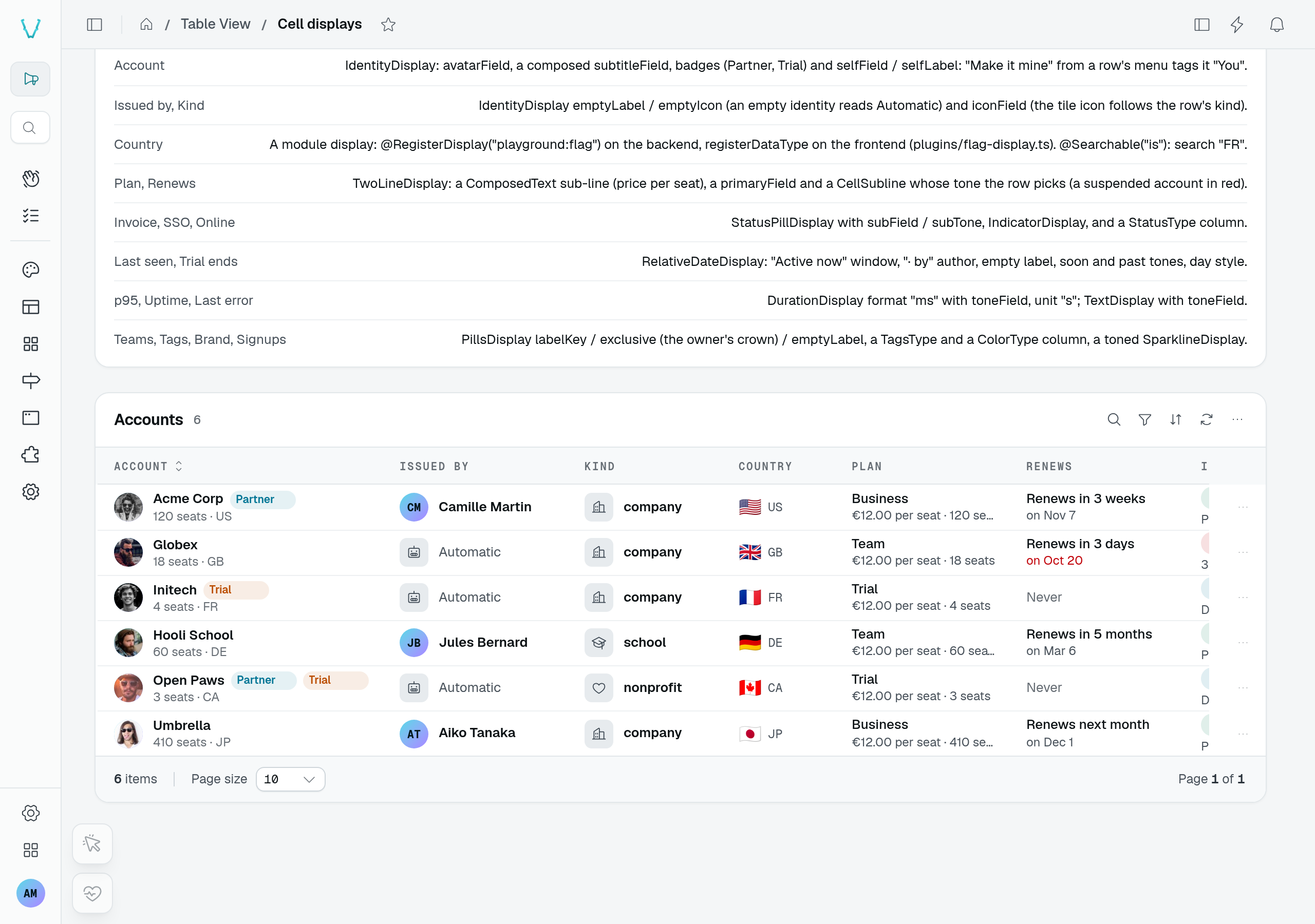
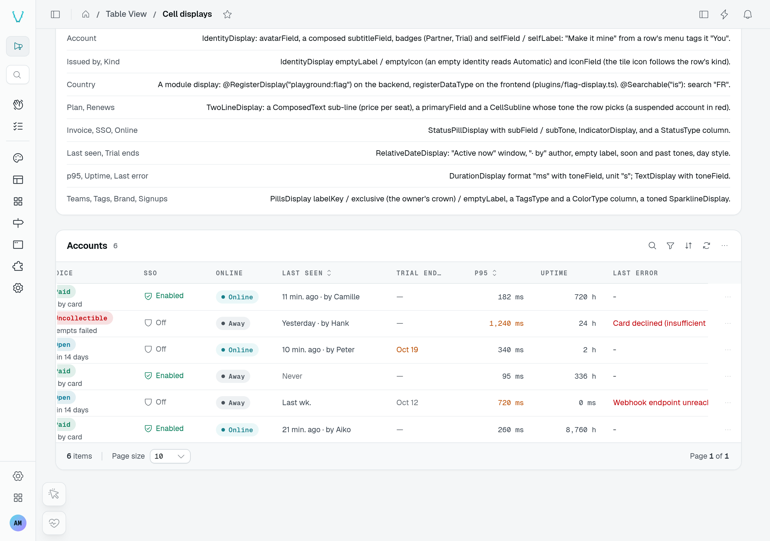
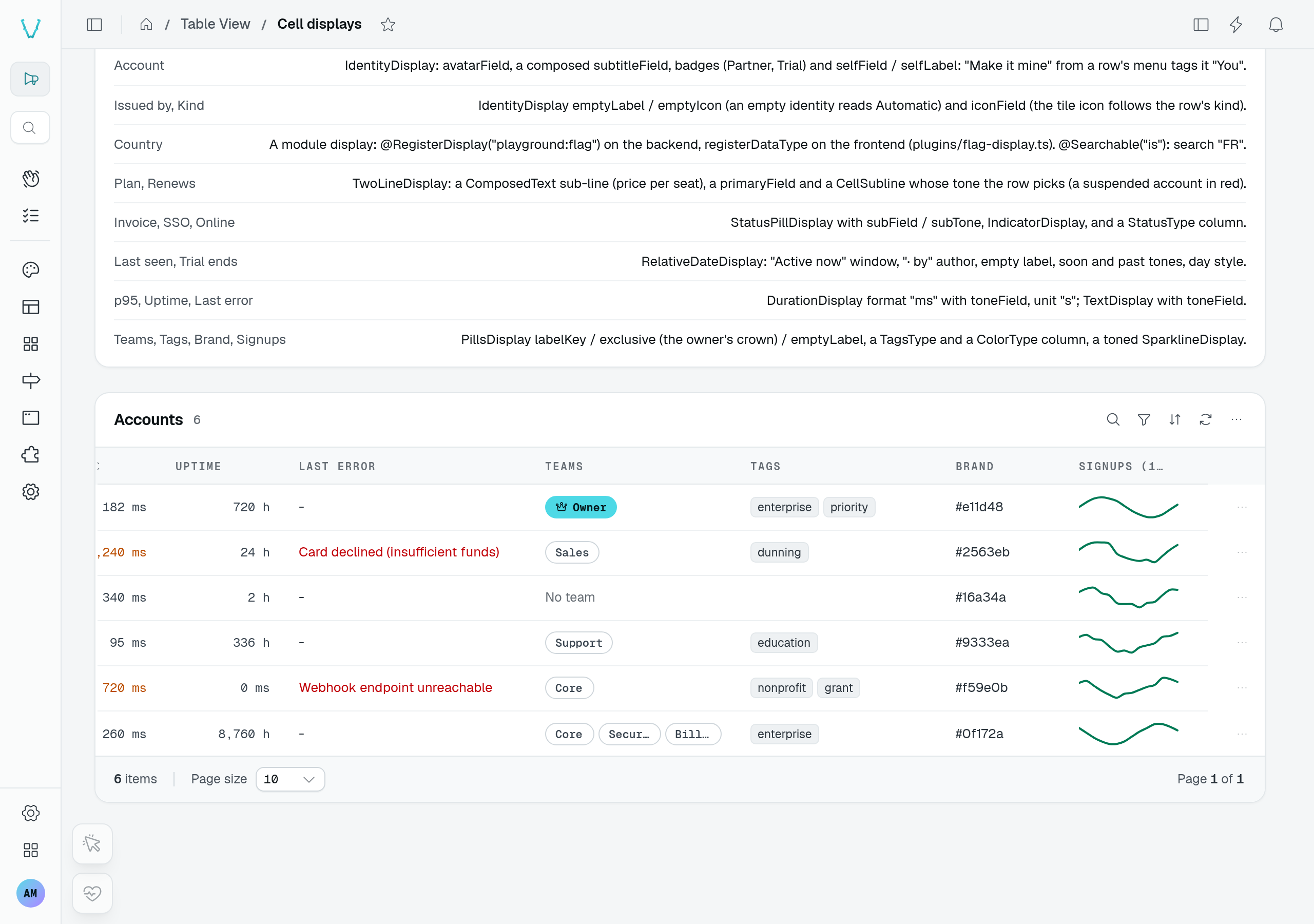
These are horizontal sections of the playground's Cell displays table, not separate datasets. Scroll the grid to compare the formats without shrinking the whole wide table. The country flags are a custom cell display; a custom input or rating type belongs in Custom data types.
Usage
import { DefaultDisplays } from "@antelopejs/interface-dms/base/table-view";

@Listable()
@Column({
  name: "Status",
  type: new DefaultDataTypes.SelectType({ items: JOB_RUN_STATUSES }),
  filterable: true,
  display: new DefaultDisplays.StatusPillDisplay({
    tones: { healthy: "success", running: "info", degraded: "warning", failing: "error" },
    subField: "lastError",
    liveValues: ["running"],
  }),
  size: 220,
})
declare status: JobRunStatus;

@Listable()
@Column({
  name: "Steps",
  type: new DefaultDataTypes.NumberType({ min: 0 }),
  display: new DefaultDisplays.ProgressDisplay({
    doneField: "doneSteps",
    totalField: "totalSteps",
    errorField: "failedSteps",
  }),
})
declare doneSteps: number;
A field a display reads (lastError, totalSteps) must be @Listable() to reach the row; give it isVisible: false on its own @Column, or no column at all, to keep it out of the grid. size sets the column's default width in px (150 otherwise; the room left is spread in proportion).
Built-in displays
Every class lives in DefaultDisplays (@antelopejs/interface-dms/base/table-view):
| Class | Options | Draws |
|---|---|---|
IdentityDisplay | avatarField (image value or URL), icon (tile instead of an avatar), iconField (a row field holding the tile's icon; icon when empty), subtitleField (a sub-line; a plain string is drawn as written) + subtitleTone (dimmed), selfField + selfLabel (tag of the signed-in user's row), badges: [{ field, equals?, notEquals?, label, tone? }], storage, emptyLabel + emptyIcon (a row without a value) | Avatar or icon tile, the value as the name, a "You" tag, badges, a secondary line; "Automatic" and a robot tile for an empty row. |
TwoLineDisplay | primaryField (a row field's text in place of the value), subField (a sub-line), subTone (muted), emptyLabel (—) | A primary line — the value in its column's format, an amount, a select's label — over a secondary line; no avatar. |
PillsDisplay | labelKey (a related row's label field, name by default), exclusive: { field, label, icon? } (one filled pill when the row's field is set), emptyLabel | A list as outline pills; an unresolved relation id is skipped; a pill item in its own tone and variant. |
RelativeDateDisplay | style ("relative", the default, or "day"), tone, nowWithinMs + nowLabel, emptyLabel + emptyTone, soonWithinMs + soonTone, pastStyle + pastTone, byField + byLabel ({ date, name }) | "2 hr. ago", "Active now", "In 5 days", "Sep 27 · by Camille". |
IndicatorDisplay | onLabel, offLabel, onIcon, offIcon, onTone (success), offTone (dimmed) | An icon and a word; on for a set flag or a non-empty list. |
StatusPillDisplay | tones (value → Tone; a value left out is neutral), toneField (a row field holding the tone, read before tones), subField (a sub-line under the pill), subTone (the pill's tone by default), liveValues (values with a pulsing dot) | A tinted pill led by a dot; a select column's item label and icon name it. |
ProgressDisplay | doneField, totalField (required), errorField | A bar of the items done and "31 / 44", failed items in red at its end; green once all are done. |
SparklineDisplay | field (a list of numbers, required), tone (primary) | A small line chart ("last 30 days"). |
DurationDisplay | unit ("ms", the default, or "s"), format ("readable", the default, or "ms": always milliseconds, digits grouped), toneField (a row field holding the text's tone) | "910 ms", "1.8 s", "4 min 12 s"; "2,149 ms" with format: "ms". |
BytesDisplay | — | "12 kB", "1.4 MB". |
TextDisplay | toneField (a row field holding the text's tone) | The value as plain text, as a string column draws it, in the row's tone. |
MonoDisplay | copy (a button copying the value) | The value in the mono font: ids, codes, slugs. |
Labels are $-prefixed i18n keys or literals. Cell tones (tone, onTone, subTone, a sub-line's tone…) are default, muted, dimmed, highlighted, success, warning, error, info and primary; the status pill, the sparkline, the identity badges and the row tones a toneField names take a Tone (neutral, primary, secondary, success, warning, error, info).
Composed sub-lines
The secondary line of a cell — under a status pill (subField), under an identity's name (subtitleField), under a two-line primary (subField) — is a row field the server fills per row. It holds a CellSublineValue:
- a string:
$-prefixed for an i18n key, else drawn as written — under an identity, always drawn as written, since it is usually data (an address, an id); - a composed text
{ key, params }, written in the reader's language with its amounts, dates and counts formatted for their locale; - a
CellSubline,{ text, tone? }: the text and the cell tone it is drawn in, for a line whose tone depends on the row ("Payment failed · retry Oct 10" inerror, "Due Oct 28" inmuted).
Nothing (null, "") draws no line. A line without a tone takes the display's (subTone, subtitleTone), else its default. The logic stays on the server, which knows the row's state; the column only names the field. CellSubline and CellSublineValue come from @antelopejs/interface-dms/base/table-view.
An invoice status and what payment is doing about it
import { type CellSubline, Column, DefaultDisplays } from "@antelopejs/interface-dms/base/table-view";

const SUB_STATE = "$saas.invoice.sub_state";
const day = (date: Date) => ({ type: "date", value: date.toISOString(), format: "day" }) as const;

@Listable()
@Column({
  name: "$saas.invoices.column.status",
  type: statusType("invoice"),
  display: new DefaultDisplays.StatusPillDisplay({
    tones: { draft: "neutral", open: "info", paid: "success", void: "neutral", uncollectible: "error" },
    subField: "statusDetail",
    subTone: "muted",
  }),
  size: 200,
})
declare status: InvoiceStatus;

@Listable(["status", "attemptCount", "nextPaymentAttemptAt", "dueAt"])
get statusDetail(): CellSubline | null {
  if (this.status === "open" && this.attemptCount) {
    return this.nextPaymentAttemptAt
      ? { text: { key: `${SUB_STATE}.retry`, params: { date: day(this.nextPaymentAttemptAt) } }, tone: "error" }
      : { text: `${SUB_STATE}.retries_over`, tone: "error" };
  }
  if (this.status === "open" && this.dueAt) {
    return { text: { key: `${SUB_STATE}.due`, params: { date: day(this.dueAt) } } };
  }
  if (this.status === "uncollectible") return { text: `${SUB_STATE}.written_off`, tone: "error" };
  return null;
}
{
  "saas": {
    "invoice": {
      "sub_state": {
        "retry": "Payment failed · retry {date}",
        "retries_over": "Payment failed · no retry left",
        "due": "Due {date}",
        "written_off": "Written off"
      }
    }
  }
}
Two lines without an avatar
TwoLineDisplay draws the column's value in its column's own format — a select's label, an amount, a date — over a sub-line. primaryField draws a row field's text instead, for a column whose value is not what it reads ("Renews in 3 days" over a renewsAt date the column sorts and filters by). Both lines are read even when the value is empty.
// "Business" over "€29.00 × 23 seats / month"
@Column({ name: "$saas.workspaces.column.plan", type: new DefaultDataTypes.StringType(),
  display: new DefaultDisplays.TwoLineDisplay({ subField: "planDetail" }) })
declare planName: string | null;

@Listable(["planUnitAmountMinor", "currency", "seats", "planInterval"])
get planDetail(): ComposedText | null {
  if (!this.currency) return null;
  return {
    key: "$saas.workspaces.plan_cell.price_times_seats", // "{price} × {count} seat / {interval} | {price} × {count} seats / {interval}"
    params: {
      price: { type: "money", value: this.planUnitAmountMinor, currency: this.currency },
      count: { type: "count", value: this.seats },
      interval: { key: `$saas.workspaces.interval.${this.planInterval}` },
    },
  };
}

// "€49.00" over "At risk" in red, under a money column
@Column({ name: "$saas.workspaces.column.mrr", type: new MoneyCentsType(),
  display: new DefaultDisplays.TwoLineDisplay({ subField: "mrrNote" }) })
declare mrrMinor: number;

// "Renews in 3 days" over "Oct 12, 2026", red when the workspace will be suspended
@Column({ name: "$saas.workspaces.column.renews", type: new DefaultDataTypes.DateType(),
  display: new DefaultDisplays.TwoLineDisplay({ primaryField: "renewalSummary", subField: "renewalDate" }) })
declare renewsAt: Date | null;

@Listable(["renewalKind", "renewsAt"])
get renewalSummary(): ComposedText | null {
  if (!this.renewalKind || !this.renewsAt) return null;
  return { key: `$saas.workspaces.renewal.${this.renewalKind}`, params: { count: { type: "count", value: daysUntil(this.renewsAt) } } };
}

@Listable(["renewalKind", "renewsAt"])
get renewalDate(): CellSubline | null {
  if (!this.renewsAt) return null;
  return {
    text: { key: "$saas.workspaces.renewal.date", params: { date: { type: "date", value: this.renewsAt.toISOString() } } },
    tone: this.renewalKind === "suspends" ? "error" : undefined,
  };
}
A credit note's reason over its internal memo is a select column with TwoLineDisplay({ subField: "internalMemo" }); an owner's name over "Invitation pending" in its tone is TwoLineDisplay({ subField: "ownerState" }) with ownerState a CellSubline.
A tone the server picks
StatusPillDisplay({ toneField }) names a row field holding the pill's Tone, for a tone the column cannot map value by value: an HTTP status by its class. The row's tone comes before tones; a row whose field holds no tone falls back to tones, then to neutral. The sub-line takes the pill's tone, as before.
const TONE_BY_CLASS: Record<number, Tone> = { 2: "success", 3: "info", 4: "warning", 5: "error" };

@Column({ name: "Status", type: new DefaultDataTypes.NumberType(),
  display: new DefaultDisplays.StatusPillDisplay({ toneField: "statusTone" }) })
declare status: number;

@Listable(["status"])
get statusTone(): Tone {
  return TONE_BY_CLASS[Math.floor(this.status / 100)] ?? "neutral";
}
DurationDisplay and TextDisplay take a toneField too, and colour their text with it — no pill: a slow request's duration in warning, an error message in error. A row whose field holds no tone (null, a value that is no Tone) keeps the default look; neutral reads muted. TextDisplay draws through the string data type, the one that writes a plain text column, so it suits a string column; format: "ms" keeps every duration of a column in one unit, so request timings line up.
const SLOW_MS = 1000;

// "2,149 ms" in orange for a slow request
@Column({ name: "Duration", type: new DefaultDataTypes.NumberType(),
  display: new DefaultDisplays.DurationDisplay({ format: "ms", toneField: "durationTone" }) })
declare durationMs: number;

@Listable(["durationMs"])
get durationTone(): Tone | null {
  return this.durationMs >= SLOW_MS ? "warning" : null;
}

// The error message in red, the other rows unchanged
@Column({ name: "Message", type: new DefaultDataTypes.StringType(),
  display: new DefaultDisplays.TextDisplay({ toneField: "messageTone" }) })
declare message: string;

@Listable(["status"])
get messageTone(): Tone | null {
  return this.status >= 500 ? "error" : null;
}
Pills styled by the row
An item of the list a PillsDisplay draws is a string, a related row, or a PillItem — { label, tone?, variant? } — the server styles per row: variant is "soft" (a tinted pill, the default) or "outline" (a hairline in its tone), tone a Tone (neutral by default). A pill item with neither draws like a string, and strings sit beside pill items in one list. An object holding the labelKey field is a related row, not a pill item. PillItem comes from DefaultDisplays in @antelopejs/interface-dms/base/table-view.
// The locales a template is written in: present ones solid, missing ones outlined.
@Column({ name: "Locales", type: new DefaultDataTypes.StringType(), display: new DefaultDisplays.PillsDisplay() })
get locales(): DefaultDisplays.PillItem[] {
  return LOCALES.map((locale) =>
    this.bodies[locale] ? { label: locale, tone: "primary", variant: "soft" } : { label: locale, variant: "outline" },
  );
}
An identity without a value
emptyLabel and emptyIcon stand for a row without a value: a credit note no operator issued reads "Automatic", muted, next to a robot tile, where the others show the operator's avatar and name.
@Column({
  name: "$saas.credit_notes.column.issued_by",
  type: new DefaultDataTypes.StringType(),
  display: new DefaultDisplays.IdentityDisplay({ emptyLabel: "$saas.credit_notes.automatic", emptyIcon: "i-ph-robot" }),
})
get issuedBy(): string | null { /* ... */ }
An icon per row
icon draws the same tile on every row. When the icon says something about the row — a feature's own icon, a document's type — iconField names the row field holding it; a row whose field is empty falls back to icon. The field must be @Listable() to reach the row, like any field a display reads.
@Column({
  name: "$saas.credit_notes.column.number",
  type: new DefaultDataTypes.StringType(),
  display: new DefaultDisplays.IdentityDisplay({ iconField: "typeIcon", icon: "i-ph-receipt", subtitleField: "forInvoice" }),
})
declare number: string;
A display of your own
A module declares a display in two halves joined by an id of the form <module>:<id>.
Backend — a class extending ColumnDisplay<Options>, registered with @RegisterDisplay:
import { ColumnDisplay, RegisterDisplay } from "@antelopejs/interface-dms/base/table-view";

@RegisterDisplay("automation:last-runs")
export class LastRunsDisplay extends ColumnDisplay<{ limit?: number }> {}

@Listable()
@Column({ name: "Last runs", type: new DefaultDataTypes.StringType(), display: new LastRunsDisplay({ limit: 12 }) })
declare lastRuns: string;
Frontend — a data type registered under the same id (useDataTypes().registerDataType({ id: "automation:last-runs", formatter })), whose formatter draws the cell. It receives the display's options, plus the column's own type options as typeOptions (a select's items, for instance) and the id of the column's own type as columnType, and the row. See Custom data types for the formatter's signature.
Registration of the table throws for a display whose class was never decorated with @RegisterDisplay: its cells would otherwise fall back to the column's type without a word. Name a module's display <module>:<id>: the unprefixed ids are the DMS's own.
{ type, options } object is not a display: display only takes a ColumnDisplay instance.