Cards
Two built-in displays draw one card per row instead of a grid row: the kanban board (the kanban option) and the cards grid (offered by listing { id: "cards" } in displays, beside { id: "table" } to keep the grid). Both draw the same card, configured once with the table view's card option. Left out, a card shows the row's label (labelKey) with its first few listable columns, in the cards grid and on the board alike (the board leaves out the column it groups on, which a card's place already tells).
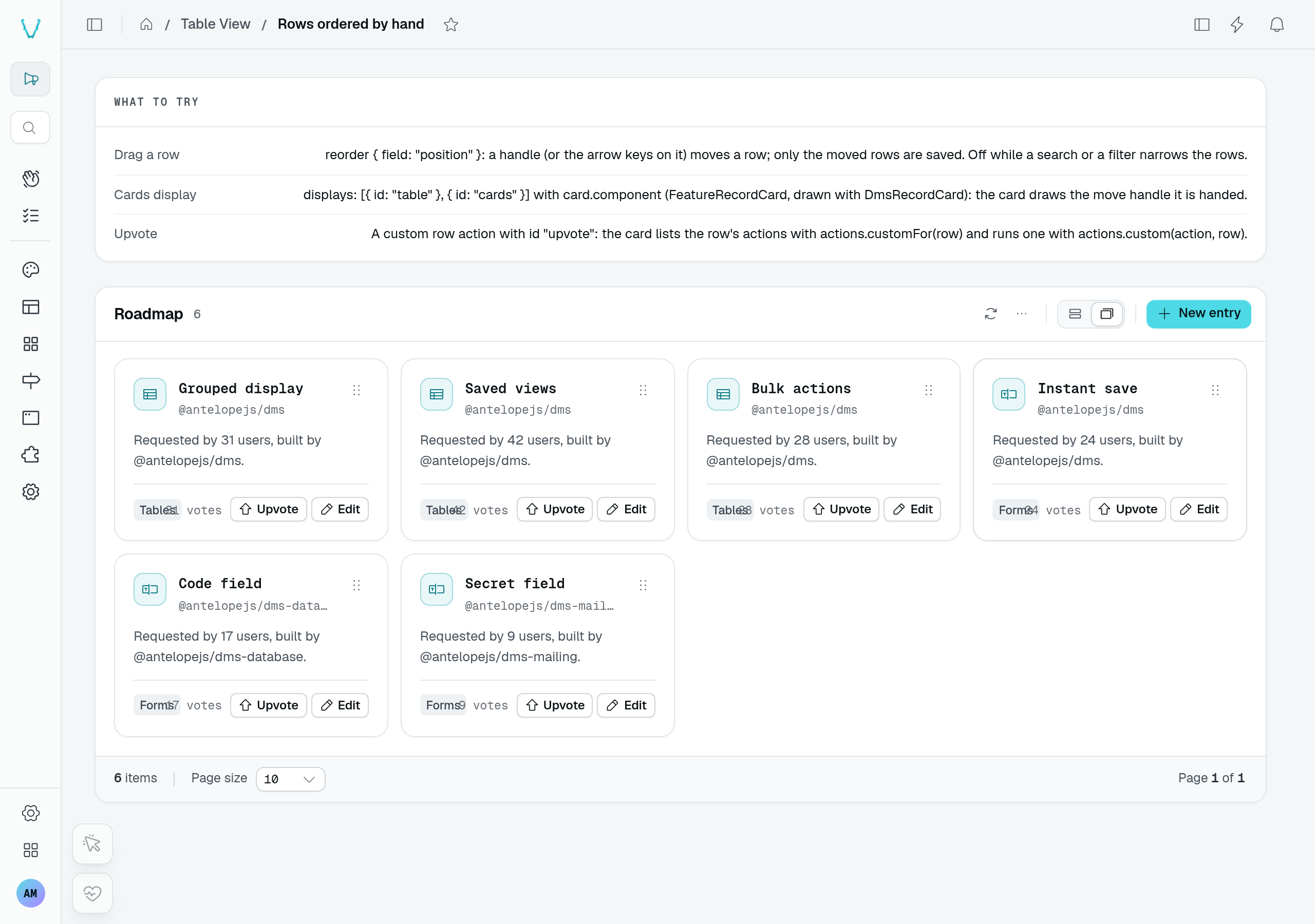
The playground's Rows ordered by hand page uses the built-in cards display with a custom card.component. Each roadmap card keeps its move handle and actions.
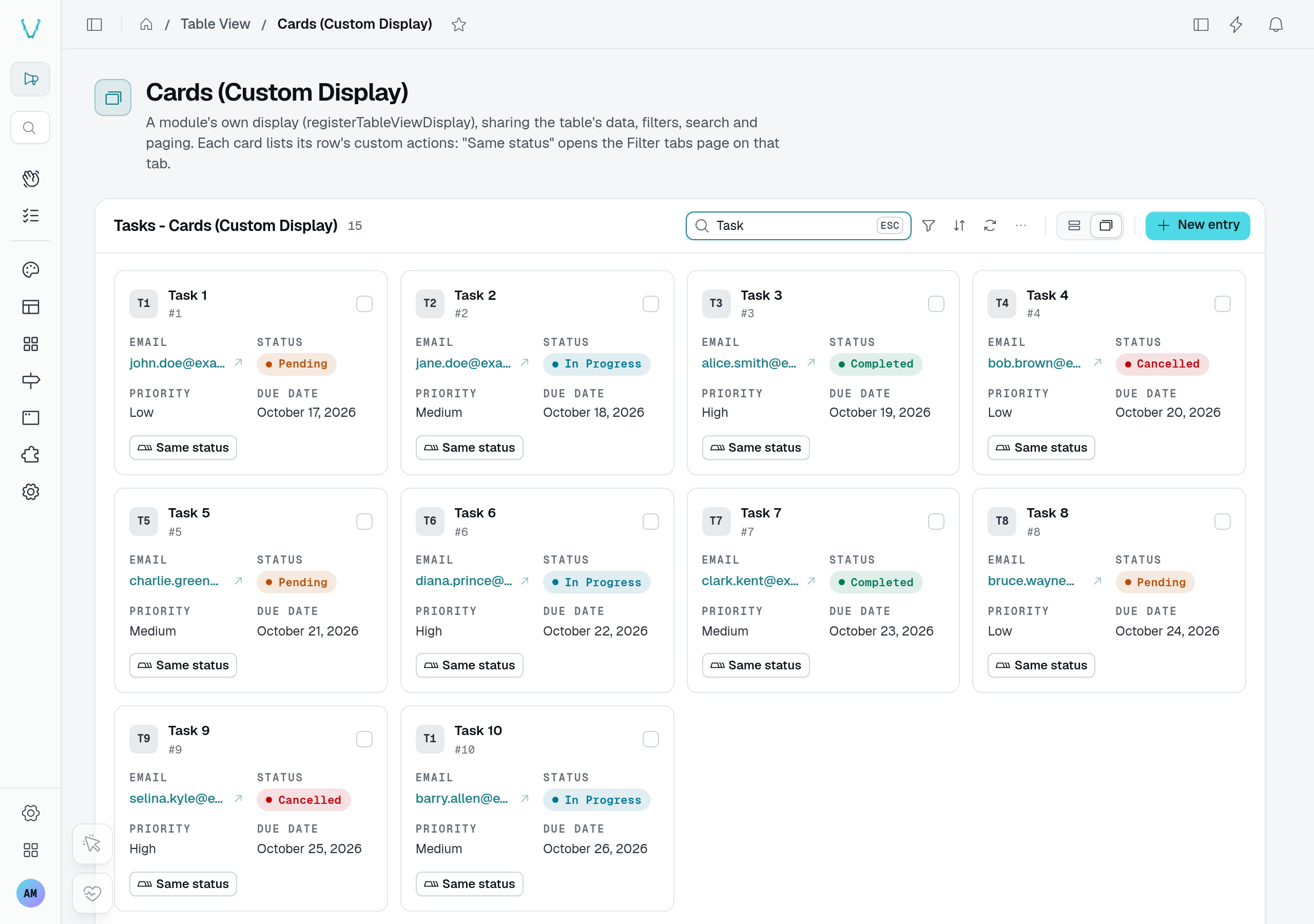
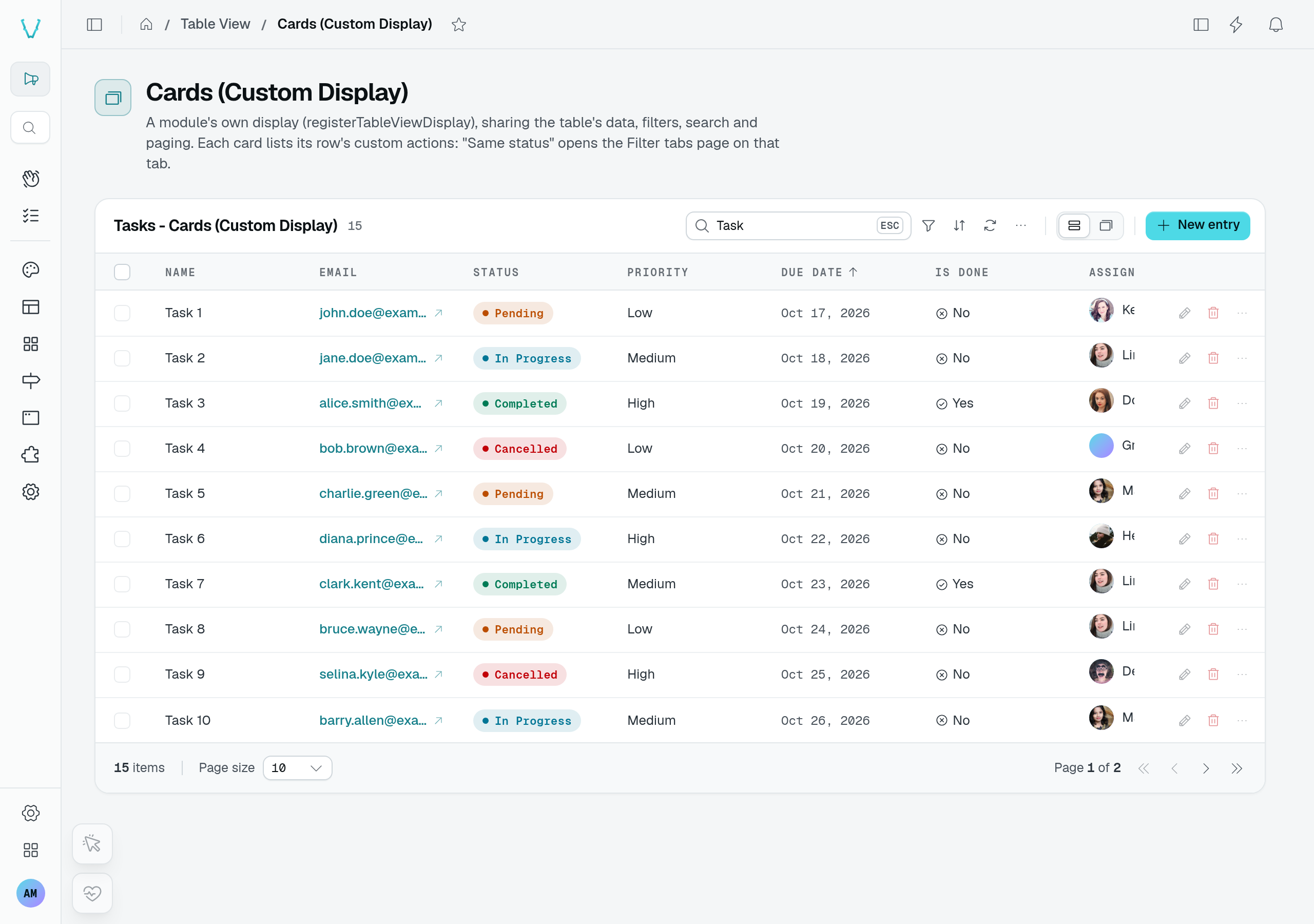
The separate Cards (Custom Display) page replaces the whole display through registerTableViewDisplay. Switching between its cards and grid preserves the Task search and the 15 matching records. This is different from replacing only the card content.
Usage
static tasks = TableView(taskDataAPI, {
  labelKey: "name",
  kanban: { groupByField: "status" },
  displays: [{ id: "table" }, { id: "cards" }],
  card: { fields: ["priority", "assignee"] },
});
To draw the whole card yourself, name a frontend component instead:
static roadmap = TableView(roadmapFeatureDataAPI, {
  labelKey: "name",
  displays: [{ id: "table" }, { id: "cards" }],
  card: { component: CustomComponent("FeatureRecordCard") },
});
Options
| Option | Type | Purpose |
|---|---|---|
fields | string[] | Columns shown under the card's title, each value rendered with its column's data type, like a cell. Registration throws for an unknown column. |
component | Component | Frontend component drawing the whole card, resolved by name from the global registry (declare its directory as global). Replaces fields. |
A card component
The component receives the same props in both displays (TableViewCardProps), so one card serves the board and the grid:
| Prop | Type | Purpose |
|---|---|---|
row | T | The row the card stands for. |
rowId | string | Its id (the rowIdKey value). |
columns | TableViewColumn[] | The table view's column metadata (types, labels). |
labelKey | string | undefined | Field naming the row. |
actions | TableViewDisplayActions<T> | The table's row actions, with the per-row predicates canEditRow(row) and canDeleteRow(row), and customFor(row), the custom row actions the row offers (their rule accepted), run with custom(action, row). |
selected | boolean | The row is selected. |
select | (value?: boolean) => void | Selects or unselects the row; toggles without a value. |
open | () => void | Does what a click on the row does in the grid. |
groupValue | string | undefined | Board only: the value of the column the card sits in. |
reorder | TableViewCardReorder | undefined | Cards grid of a table ordered by hand (reorder) only: the card's move handle, { enabled, dragging, handle }, handle bound with v-bind on a button (see Rows ordered by hand). |
A card can draw itself with DmsRecordCard, the v2 record card — icon well, mono title and subtitle, badge, description, tags, a mono note and footer buttons that act without opening the card (see UI toolkit):
<script setup lang="ts">
interface FeatureRow {
  name: string;
  owner: string;
  area: string;
}

interface Props {
  row: FeatureRow;
  selected: boolean;
  actions: { canEditRow: (row: FeatureRow) => boolean; edit: (row: FeatureRow) => void };
  open: () => void;
}

const props = defineProps<Props>();

const cardActions = computed(() =>
  props.actions.canEditRow(props.row)
    ? [{ label: "Edit", icon: "i-ph-pencil-simple", onClick: () => props.actions.edit(props.row) }]
    : [],
);
</script>

<template>
  <DmsRecordCard
    icon="i-ph-sparkle"
    :title="props.row.name"
    :subtitle="props.row.owner"
    :tags="[props.row.area]"
    :actions="cardActions"
    :selected="props.selected"
    interactive
    @open="props.open()"
  />
</template>
Kanban aliases
The kanban takes no card options of its own: card draws its cards.
Cell displays
Draw a column's cells another way with a typed display class — identity, two lines, pills, relative dates, status pills, progress bars, sparklines, durations, sizes, ids, toned text — with composed sub-lines, or register your own.
Pagination
Page a table view with a pager, a "Load more" button or infinite scroll, and pick its page size.