Forms
Form is the component builder for data-entry screens. You declare a list of fields — each labelled and typed by a DataType (Data types) — plus where the form loads its values from and submits them to. The shared Inertia/Vue frontend turns that into rendered inputs, client-side validation, and the submit flow. You write no Vue.
Use a Form for create/edit screens, settings panels, and standalone data entry. For paginated, sortable, CRUD-backed lists whose add/edit forms are generated from a Data controller, use a TableView (Tables) instead.
Form is a page component: assign the builder to a static field on a PageController (see Pages & components). The field key becomes the component key and part of its permission id.
Form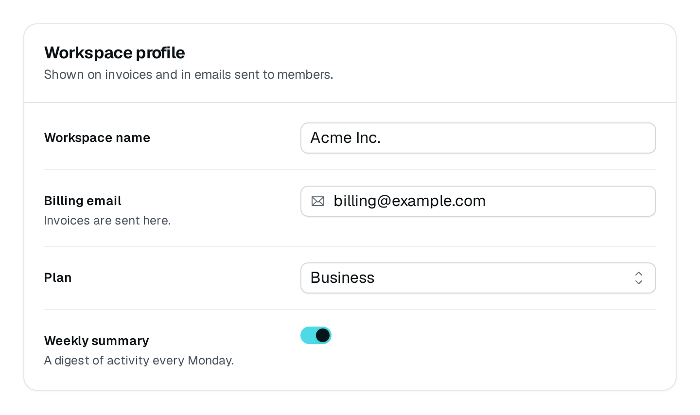
What it renders
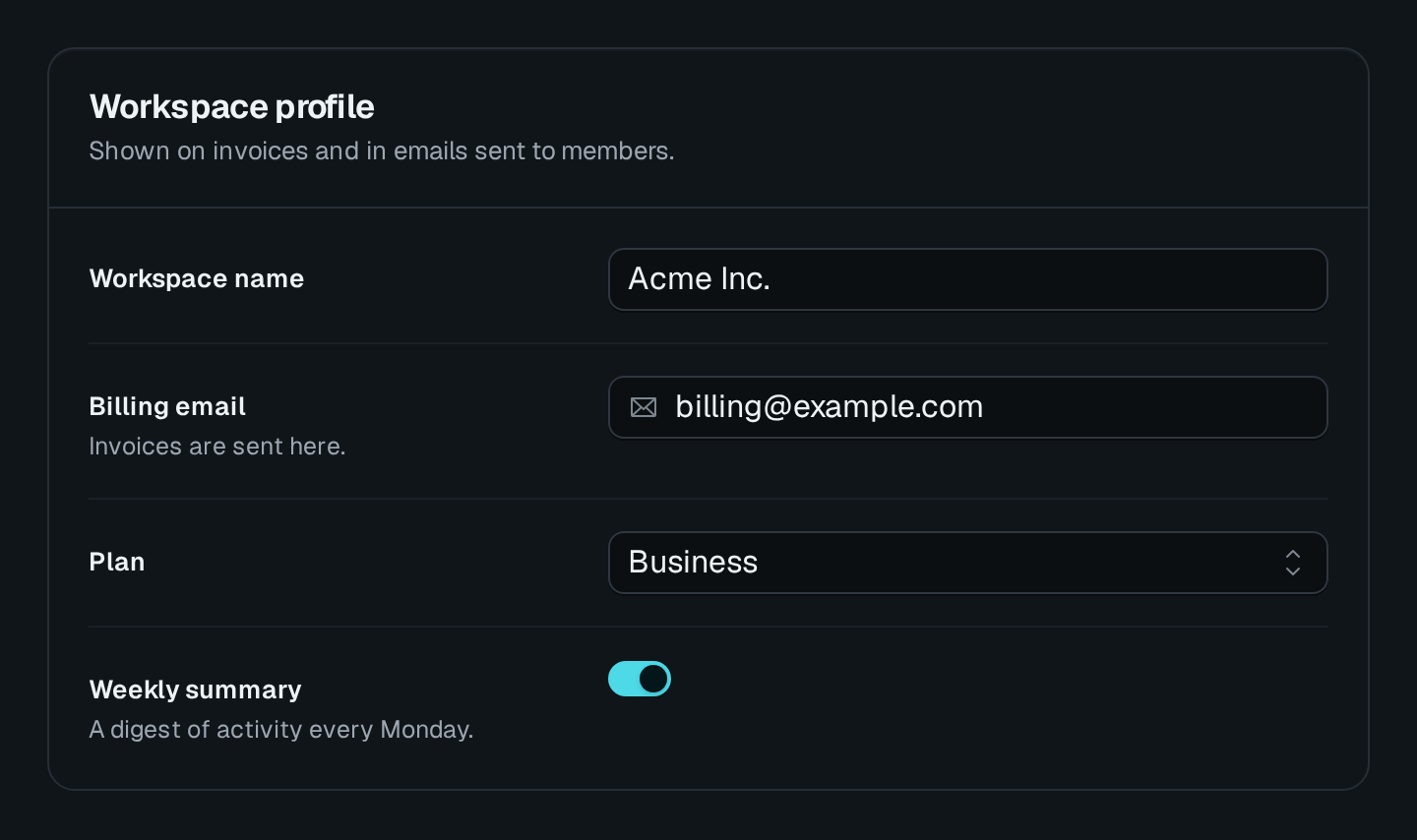
The frontend renders a titled card. From the top:
- An optional title and description header.
- The fields, each a labelled input chosen from its DataType (text box, select, date picker, file upload, rich text, …), with the field's
descriptionas helper text (none in a form where nothing can be changed, a record's details: there it would only tell how to fill a value shown read-only). A required field carries an asterisk after its label (a group's label when one of its fields is required), and a* Required fieldslegend closes the form; a disabled or hidden field is never marked. Invalid fields show an inline message and an error state. - Field groups, whose members render together under a shared label, each keeping its own label above its control, laid out horizontally or vertically (
orientation). A horizontal group sets its members side by side and wraps them onto the next line where the row is too narrow for each to keep a usable width (a modal, a drawer, a phone). - The layout follows the form's own width, not the window's. A horizontal form (the default) sets each label in a 240px column beside its value once the row is 560px wide — a drawer from about 600px, a page card — and stacks the label above the value below that, whatever the screen: the same form reads well in a narrow drawer, a resized one and a full page. A group's fields sit side by side from the same width. Wide fields always take the row's full width under their label, read-only as editable, so a table of values never shares a drawer with a label column: rows of fields (
ArrayType, the repeater), name and value pairs (KeyValueType), code (CodeType), rich text, several files or images (multiple), and a textarea taller than threerows. A group holding a wide field stacks too. - The save controls at the bottom, as
saveModeandkindset them (Saving). On submit the form validates against its schema; on success it showssuccessMessage(and optionally navigates viaredirectOnSuccess), on failureerrorMessage. A failure the server ties to a field (a zod issue, a{ message, field }body, see Guards) shows under that field — marked invalid and focused — instead of the toast. A submit that went through but left something for the user to act on answers with awarningfield (an i18n key or plain text) in its JSON response: the form then shows that warning instead ofsuccessMessage, and still redirects. A submit response carryingnotice: { title, description?, color?, params? }adds a toast of its own — a partial success such as "2 invitations sent, 1 address skipped" ($keys pluralized on a numericparams.count).
When fetchUrl is set the form first loads existing values and pre-fills the inputs (an edit form); without it the form starts empty (a create form). An edit form loads them again every time it opens, and its submit sends only the fields the user changed, so a value someone else saved in the meantime is not written back; a form that posts its loaded values as a new row (submitUrlMethod: "POST", a duplicate) still sends them all.
Usage
Assign the builder to a static field on the page.
import {
  PageController,
  RegisterPage,
  pagesCategory,
} from "@antelopejs/interface-dms/page";
import { Form } from "@antelopejs/interface-dms/base/form";
import { DefaultDataTypes } from "@antelopejs/interface-dms/base/data-types";
import { HttpMethod } from "@antelopejs/interface-dms/base/types";

@RegisterPage()
export class ContactPage extends PageController("contact", {
  displayName: "Contact",
  icon: "i-ph-note-pencil",
  category: pagesCategory,
}) {
  static form = Form({
    title: "Contact Us",
    description: "Send us a message and we'll get back to you",
    fields: [
      {
        id: "name",
        label: "Full Name",
        type: new DefaultDataTypes.StringType({ placeholder: "Jane Doe", maxLength: 100 }),
        required: true,
      },
      {
        id: "email",
        label: "Email",
        type: new DefaultDataTypes.EmailType({ placeholder: "[email protected]" }),
        required: true,
      },
      {
        id: "message",
        label: "Message",
        type: new DefaultDataTypes.StringType({ textarea: true, rows: 6, maxLength: 1000 }),
      },
    ],
    submitUrl: "/api/contact",
    submitUrlMethod: HttpMethod.post,
    kind: "action", // sends something new each time: Reset and Submit, emptied after a submit
    successMessage: "Thanks — we'll be in touch.",
  });
}
The routes behind submitUrl (and fetchUrl) are normal API controllers — see Pages & components for wiring. Return _id, never id, for created rows.
Options
| Option | Type | Default | Description |
|---|---|---|---|
titleContent | string | – | |
descriptionContent | string | – | |
successMessageContent | string | – | |
errorMessageContent | string | – | |
submitLabelContent | string | – | |
saveModeAppearance | "bar" | "footer" | "none" | "instant" | – | How the form offers to save: a sticky bar while there are changes, footer buttons, none, or each change on its own. |
sectionNavLayout | "side" | "jump" | "none" | – | How a sectioned form lists its sections: beside them, as chips above them, or not at all. |
fieldsOrientationLayout | "horizontal" | "vertical" | – | |
kindBehavior | "record" | "create" | "action" | – | A record keeps its values once saved; a create form makes a new record; an action (send, invite, run) empties after a submit. |
redirectOnSuccessBehavior | string | – | The page to open once the form is sent. |
The generated table above lists what the page editor offers. The reference below details every option, including the ones only code sets.
Form(options) takes a single options object (FormProps):
| Option | Type | Default | Purpose |
|---|---|---|---|
fields | (FormField | FieldGroup)[] | — | Fields and field groups to render. See Fields. Beside sections, they come first, outside any section. |
sections | FormSection[] | — | The fields split into titled cards on one page, saved together (Sections). |
sectionNav | "side" | "jump" | "none" | side from 3 sections, else none | How a sectioned form lists its sections (Sections). |
title | string | — | Heading above the fields (no heading is rendered when unset); the component's display name falls back to "Form". |
description | string | — | Sub-heading text under the title. |
fetchUrl | string | — | URL to load existing values from (pre-fills the form). Omit for a create form. |
fetchUrlMethod | HttpMethod | GET | HTTP method for the fetch request. |
submitUrl | string | — | URL the form submits to. |
submitUrlMethod | HttpMethod | PUT | HTTP method for the submit request. |
submitLabel | string | — | Label of the submit button (i18n key or literal). Defaults to the generic "Save changes". |
successMessage | string | — | Toast shown after a successful submit. |
errorMessage | string | — | Toast shown when a submit fails. |
saveMode | "bar" | "footer" | "none" | "instant" | "bar" | How the form offers to save (Saving). |
kind | "record" | "create" | "action" | "record" | What the form edits: a record keeps its values once saved; a create form makes a new row (its submit reads Create and shows from the start); an action (send, invite, run) empties after a submit (Saving). |
backTo | string | — | Where Cancel leads a record form on a page opened directly (a link from outside the app, a bookmark); reached from another page of the app, Cancel goes back to it. Without either, the form offers no Cancel there. Table views set it on their form pages, to the list. |
labelKey | string | — | Field of the loaded record whose value ends the page breadcrumb once the form has loaded. Table views fill it from their own labelKey. A custom component reads or sets the same label with usePageRecordLabel(). |
requiresRecord | boolean | false | The form is about the record fetchUrl loads: while a route value that URL names is missing (no ?id=), it shows "No entry selected" instead of its fields with their defaults. A ResourceForm in edit or view sets it. |
fieldsOrientation | "horizontal" | "vertical" | — | Overall layout direction of the field list. |
redirectOnSuccess | string | — | Path to navigate to after a successful submit. Supports token substitution. |
submitDefaults | Record<string, unknown> | — | Extra values merged into the submit payload. String values support token substitution. |
Saving
saveMode picks the controls — bar (default, a sticky save bar while there are unsaved changes), footer, none, or instant (each changed field saves on its own) — and kind what the form edits: a record (default) keeps its values once saved, a create form makes a new row, an action (send, invite, run) empties after a submit. A form loaded from fetchUrl sends only the fields the user changed, a cleared one as null ([] for a list field). The modes, what a submit sends and the instant save are in Saving a form.
Unsaved changes
Every form tracks whether it holds unsaved changes, wherever it is rendered (a page, a drawer, a modal, a section). It is dirty while a field's value differs, by value, from the one it loaded (or its defaultValue, or what it last saved): typing a value then putting the original back makes it clean again, a successful submit makes the saved values the new starting point, and an empty, untouched create form is clean.
- Save bar. A
recordform's bar (or footer) shows in two states of the same height: Cancel while there is nothing to save (when it has somewhere to go back to), and an "Unsaved changes" mark with Save once there is, so switching never moves the fields. Beside Save, a form with somewhere to go back to keeps Cancel; one with nowhere to go back to offers Discard, which puts the values back and stays. Acreateform (kind: "create", set on a table view's add form, the duplicate it opens and a relation's add form) makes a row: its submit, Create by default, shows from the start, so a duplicate saves as it opened, and neither the bar nor the fields list "changes", since all it holds is new. Cancel drops any change and leaves, in one click and without asking: it closes a drawer or modal; on a page it goes back to the page of the app the user came from, or tobackTo(the list, for a table view's form page) when the page was opened directly. The bar sticks to the bottom of the visible area (the page, the drawer or the modal body) while the form runs past it, and sits right under the fields when they fit. On a page it floats over the form: hidden, it takes no space, and showing up moves nothing above it (The save bar on a page). - Leave guard. While a form is dirty, leaving it asks once, in a warning dialog ("Discard unsaved changes?", with "Keep editing" and "Discard changes"): closing its drawer or modal (X, Escape, a click outside, Cancel), navigating away (sidebar, breadcrumb, links, the browser's Back and Forward buttons), switching away from the tab panel it sits in, and reloading or closing the browser tab (the browser's own prompt). Nothing asks after a save, after Discard or Cancel, or when nothing changed, and a drawer closing because the page changed never asks twice.
Hand-built forms get the same behaviour from the useFormDirty and useUnsavedChanges composables (see Utilities).
submitUrl, redirectOnSuccess, backTo and submitDefaults string values support token substitution, resolved against the form's route at submit time (the same tokens as every other option, see Template tokens):
{{params.X}}— a route path parameter. A route can repeat a parameter name — a table view's form page under a:idpage resolves to/workspaces/:id/invoiceTable/:id/edit— andXis then its last occurrence;{{params.X:n}}reaches the n-th one,{{params.id:1}}being the id of the page above.{{query.X}}— a query-string parameter.{{response.X}}— (redirectOnSuccessonly) a field of the submit's JSON response body, a dotted path reaching into it, e.g./items/{{response._id}}/editto redirect to a freshly created entity.
In a URL (fetchUrl, submitUrl, redirectOnSuccess) the {{params.X}} and {{query.X}} values are percent-encoded, so a value such as GET /api/a?b=c stays one parameter; {{response.X}} is written as answered, so a response may hand back a whole path, and submitDefaults values are written as they are.
submitDefaults entries whose tokens can't be resolved are dropped — this is how a page-rendered "new" form inherits context such as a parent id.
HttpMethod is a string enum (HttpMethod.get, HttpMethod.post, HttpMethod.put, HttpMethod.delete, HttpMethod.patch, …). The options take the enum member or its string value ("POST").submitUrlMethod is omitted, the frontend submits with PUT — a creation form must set submitUrlMethod: HttpMethod.post explicitly.Fields
Each entry in fields is either a single field (FormField) or a field group (FieldGroup).
Field
{
  id: "email",                                   // payload key — required
  label: "Email Address",                        // visible label
  description: "We never share it",              // helper text under the label
  type: new DefaultDataTypes.EmailType({ ... }), // a DataType instance — required
  required: true,                                // marks the field and tightens validation
  defaultValue: "[email protected]",              // initial value
  localized: true,                               // store one value per locale
  disabled: true,                                // render read-only
  inputComponent: FormComponents.InputText(),    // override the DataType's default input
}
| Property | Type | Purpose |
|---|---|---|
id | string | The field's key in the payload. Required. |
type | DataType | The DataType instance driving the input, parsing, and validation. Required. |
label | string | Field label. Use a $-prefixed i18n key in real modules. |
description | string | Helper text under the label. |
required | boolean | Marks the field required and tightens validation (see Validation). |
defaultValue | DefaultValue | Initial value (string | number | boolean | Date | null | array). |
localized | boolean | Store the value as a per-locale record instead of a single scalar. |
disabled | boolean | Render the input non-editable. |
readonly | boolean | FormFieldReadonly | Show the value, not an input, optionally with a badge and a link (Field notes). |
hint | string | A grey help line under the control (Field notes). |
showEmptyOnCreate | boolean | Keep a read-only field on a create form while it holds nothing (Field notes). |
inputComponent | ComponentInfoSerialized | Override the input the DataType would otherwise pick (see below). |
visibleWhen | { field, in } | Show the field only while field holds one of the values in lists (null for empty), from the moment the form opens: hidden, it is neither required nor sent. |
disabledWhen | { field, in } | Make the field read-only while the condition holds: its value is not sent. A table view's data routes enforce both (Conditional fields). |
The type is always a DataType instance — StringType, EmailType, SelectType, DateType, FileType, RichTextType, AddressType, and so on. Each carries its own options (placeholders, min/max, items, constraints) and supplies both the validation rule and the default input. See Data types. Choice cards, segments, boolean cards, repeaters, key-value pairs, secrets, code and tags are in Field types.
Field group
A group renders related fields together under a shared label:
{
  id: "contactGroup",
  label: "Contact Information",
  description: "Your email and phone number",
  orientation: "vertical",   // or "horizontal"
  order: 1,                   // place among the groups giving an order
  fields: [
    { id: "email", type: new DefaultDataTypes.EmailType(), required: true },
    { id: "phone", type: new DefaultDataTypes.PhoneType() },
  ],
}
Grouped fields still submit as flat top-level keys (email, phone) — the group only affects layout. The group's own label heads the cluster, and a member with a label keeps it above its control (with its own asterisk when required), so a group — a table's @ColumnGroup among them — can title a run of labelled fields. A member may omit label to show its control bare under the group's.
The groups giving an order trade the places they are declared at, lowest first (equal orders keep their declaration order); fields and groups without one keep their place.
Field notes
Any field can carry notes under its control: a hint line, "Changed · was X" while a change waits for its save, "Module default: X · Use default" when it opts in (offersDefault) and holds something other than its defaultValue, and readonly (true, or with a badge and a link) for a value shown, not edited. See Field notes.
Overriding the input component
Each field renders the input its DataType chooses. Set inputComponent to override it with a factory from the FormComponents namespace (same import as Form), each taking its own options object:
- Text & numbers —
InputText,InputTextarea,InputEmail,InputPassword,InputPhone,InputNumber,InputPercentage,InputSlider,RichText. - Choices —
InputSelect,InputRadioGroup,InputSwitch,InputCheckbox,InputCascader,InputRelation. - Dates & times —
DatePicker,DatePickerRange,Calendar,InputTime. - Media & specialized —
File,Image,InputColor,InputAddress.
Prefer configuring the DataType; reach for inputComponent only when you need a different control than the type's default.
A module's own input
An inputComponent may also name a component of the module's frontend layer. It receives the field's id (give it to its control, so the error summary and the field's anchor find it), v-model, disabled and its own options as props. What it needs of the form it sits in, it asks useEnclosingForm(), auto-imported, rather than the DOM (closest("form"), requestSubmit()):
| Member | Type | Contract |
|---|---|---|
submit() | () → Promise<void> | Submits the form as its save button does: validation, the validators, then the request. A refused submit shows its errors. |
addValidator(validator) | (() => boolean) → () => void | Runs validator before each submit; false stops the submit before anything is sent. Removed with the component, or by calling the returned function. |
focusField(fieldId) | (string) → Promise<void> | Brings a field of the form into view and focuses its control (a group's first focusable part). |
useEnclosingForm() returns null outside a Form. A field that asks before a save, then saves once confirmed:
const form = useEnclosingForm();
const { confirm } = useConfirm();
let confirmedValue: number | null = null;

form?.addValidator(() => {
  if (!isLowered.value || confirmedValue === model.value) return true;
  void confirm({ title: "Delete older logs?", color: "error" }).then((accepted) => {
    if (!accepted) return;
    confirmedValue = model.value ?? null;
    void form.submit();
  });
  return false;
});
A number the field adjusted
DmsInputNumber, the number control a module's own input can draw, keeps a typed value within its min and max when the user leaves it or presses Enter: 250 typed in a field of max: 100 becomes 100. Its step only drives the steppers and the arrow keys: a value is never put on it, typed or loaded (9,692 stays 9,692 with steps of 100), unless the control is given stepSnapping: true, where 1020 typed in a field of steps of 50 becomes 1,000. It then shows the value it kept, never the one typed, and emits adjust with an InputNumberAdjustment (auto-imported type):
| Member | Type | Contract |
|---|---|---|
typed | number | The number as typed, read in the field's locale ("1,020"). |
value | number | The number the field keeps, already in v-model. |
reason | "min" · "max" · "step" | Above max, below min, or off step (stepSnapping only). |
Nothing is emitted when the field keeps what was typed, or when nothing was typed since it last settled. With clamp: false the field keeps a value outside min / max and reports it as its error, so only "step" can be emitted. A custom field says why its value changed with a note under the control, cleared once the value changes again:
<script setup lang="ts">
const model = defineModel<number | null>();
const adjustment = ref<InputNumberAdjustment | null>(null);
const { formatNumber } = useRegionalFormat();

watch(model, (value) => {
  if (value !== adjustment.value?.value) adjustment.value = null;
});
</script>

<template>
  <DmsInputNumber v-model="model" :min="0" :max="5000" :step="50" @adjust="adjustment = $event" />
  <p v-if="adjustment" class="text-muted text-xs" role="status">
    {{ formatNumber(adjustment.typed) }} → {{ formatNumber(adjustment.value) }}
  </p>
</template>
Linking to a field
A page opened on the anchor of a field — its id, /settings#retentionDays — brings that field into view and focuses it once the form is drawn, a loaded record included, and so does a change of the anchor while the page is open. A link inside the app needs nothing more: the browser's own jump does not happen there, the form's does. A form in a drawer or a modal follows no anchor. A section has its own anchor (Form sections).
Features
Sections
A long form splits its fields into sections, each { id, label, description?, icon?, fields }: one card per section, on one page, saved by one submit. sectionNav (side, jump or none) lists them, each entry marked while its section holds unsaved changes or invalid fields, and the save bar names the changed sections. See Form sections.
Validation
The form validates on the client before submit, against rules derived from the fields: each field's DataType supplies its rule, then:
- Required string and array fields must be non-empty (min length 1); other required fields must be non-null. Non-required fields are nullable and optional. A required boolean shown as a checkbox (
FormComponents.InputCheckbox()) is an agreement: only ticking it fills it; a switch keepsfalseas a value. - Localized fields validate as a record of locale → value, so each provided translation is checked against the field's rule. A field with a
fallbackLocalecannot be saved with a value in some language and none in that one: the error goes on the fallback language, and a required field left empty is reported there too.
Once a submit is refused, by the client or by the server, an alert above the fields lists the invalid ones as links that focus each; it goes away once they are fixed. An error the server raises on a part of a field (["address", "postalCode"], ["title", "fr"]) lands on that part. See Form sections.
An input component of your own refuses what was typed into it the same way the built-in ones do, with useControlError (auto-imported from the UI layer, or imported from #dms-ui/app/composables/form/useControlError): report(message) makes the message the field's error, which blocks the submit and joins the summary; report(undefined) clears it, and so does unmounting the input. Outside a form, the returned message ref holds it for the component to show.
<script setup lang="ts">
import { useControlError } from "#dms-ui/app/composables/form/useControlError";

const model = defineModel<string>();
const { report } = useControlError();

watch(model, (value) => {
  report(value && !isKnownLocale(value) ? t("locale.unknown") : undefined);
});
</script>
required flag.Custom input in a real form
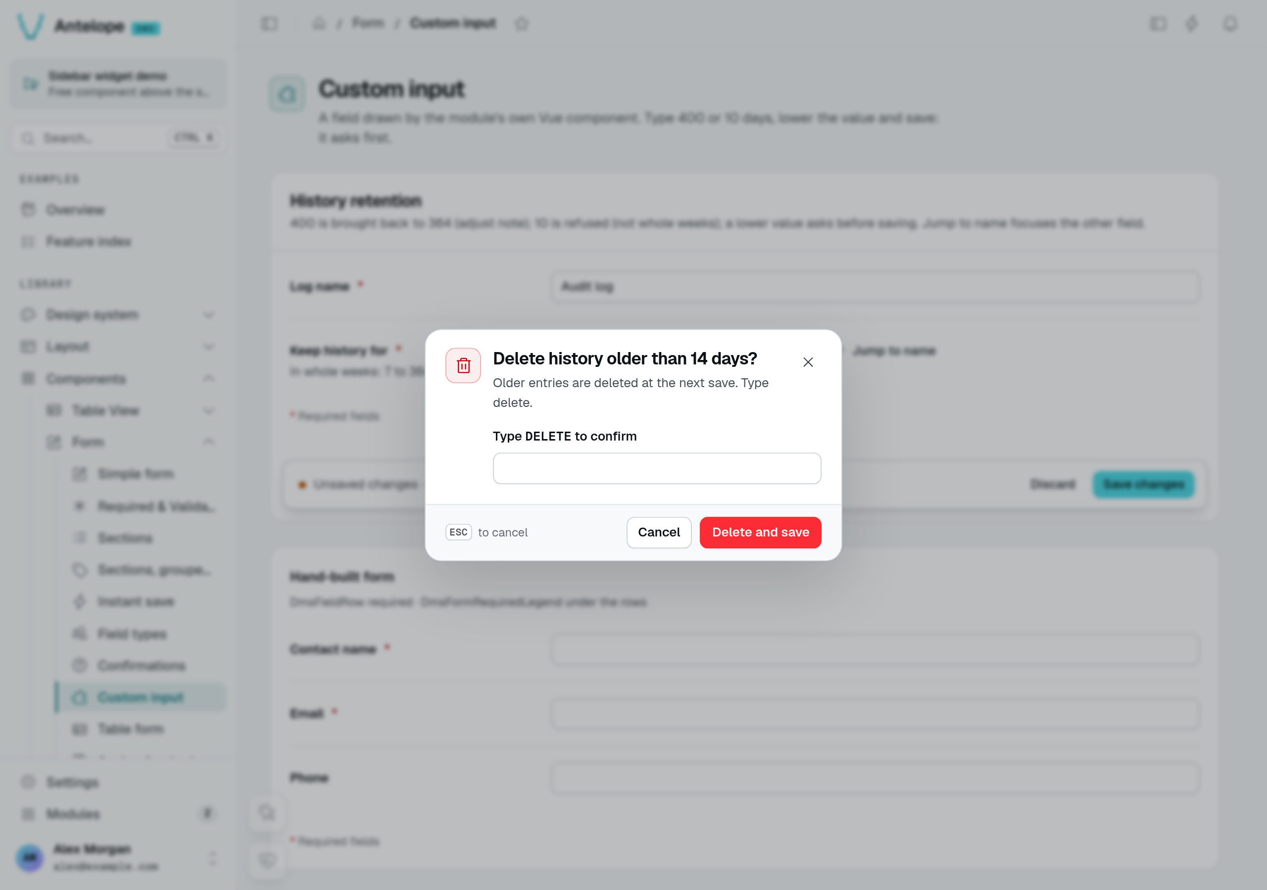
The playground's Custom input page uses RetentionInput.vue from its frontend layer. It binds a numeric model to DmsInputNumber, reports control errors with useControlError, and asks the enclosing form to confirm a reduction before submitting. This is a custom input, not a star-rating display or a replacement for the standard form.
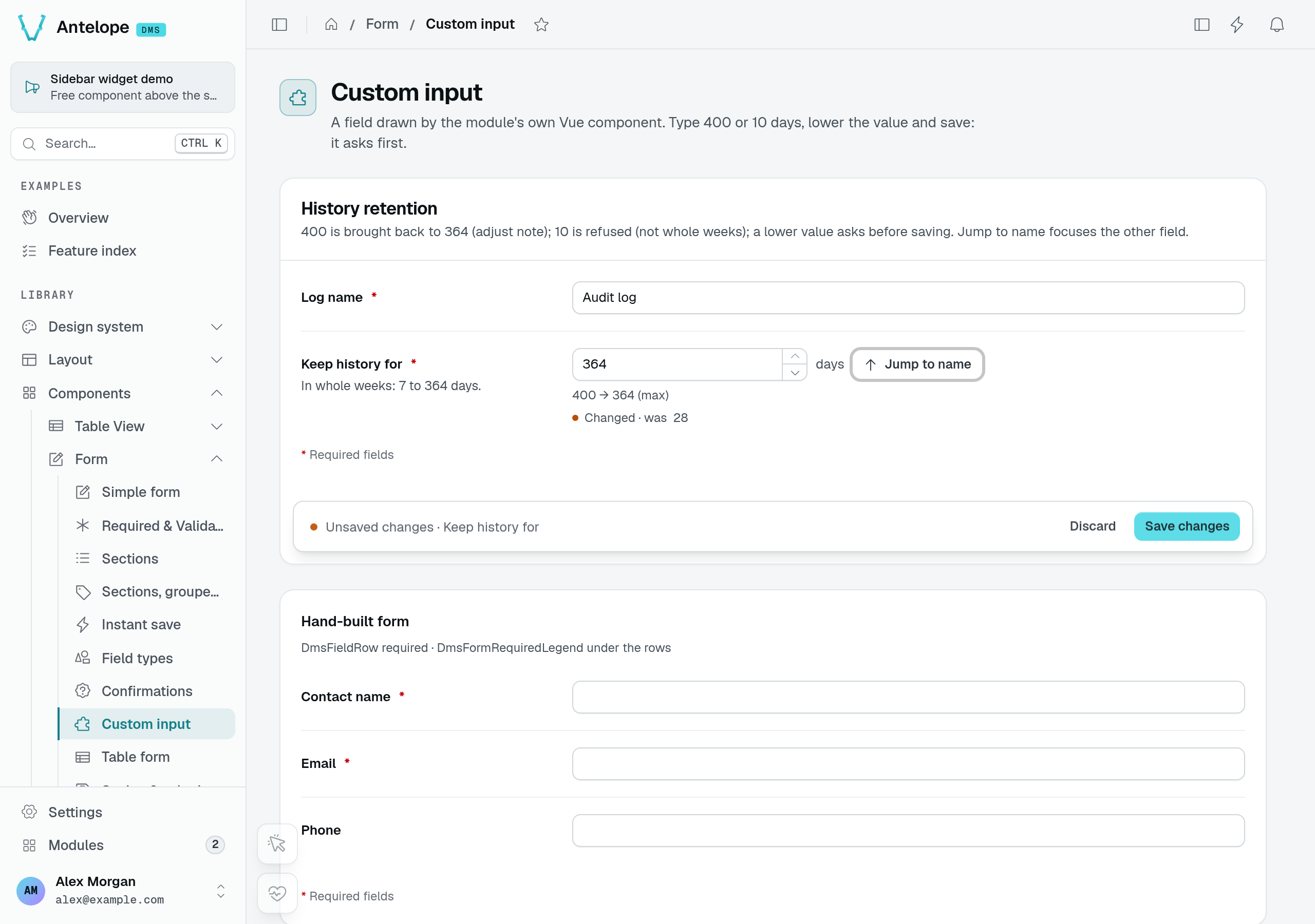
Typing 400 and leaving the input clamps it to 364; the component's adjust handler explains the correction. The enclosing form still owns the pending value and its save state.
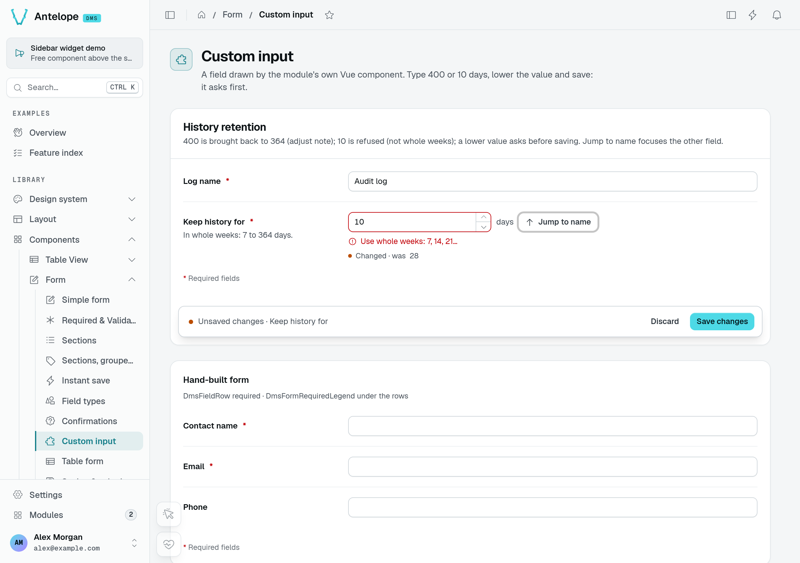
Typing 10 produces a control error because it is not a whole number of weeks. Reducing the loaded 28 days to 14 and choosing Save changes opens a confirmation before the form submits.
See Custom component for rendering a module component, Frontend layer for installing its Vue code, and Component events for the surrounding event system.
Localized fields
Set localized: true to store one value per locale: the value becomes a record keyed by locale code (e.g. { en: "Title", fr: "Titre" }) and the input renders a per-language editor. Set fallbackLocale to the language other languages fall back to: a table view fills it from the column's @Localized({ fallbackLocale }), and the form requires it whenever the field holds any language. This is for content translated per locale — distinct from $-prefixed i18n message keys used for static labels (Localization).
Watches and reactivity
.watch() below is the form-flavored use of a generic builder API — the full reference (including .watchOn(), watchFilter, and the events every component emits) is Actions & reactivity; the frontend engine and custom function handlers are in Component events.A form reacts to its own events through .watch() on the builder. A watch listens for a form event and runs a form function, optionally gated by a condition or a permission:
import {
  Form,
  FormEvents,
  FormFunctions,
} from "@antelopejs/interface-dms/base/form";

static form = Form({
  fields: [
    { id: "isOwner", label: "Is Owner", type: new DefaultDataTypes.BooleanType(), defaultValue: false },
    { id: "displayName", label: "Display Name", type: new DefaultDataTypes.StringType() },
  ],
})
  .watch(FormEvents.FIELD_CHANGE, FormFunctions.SET_FIELD_DISABLED, {
    params: { targetField: "displayName", setDisabled: true },
    onParam: [
      { key: "fieldId", value: "isOwner" },
      { key: "value", value: true },
    ],
  });
- Events (
FormEvents):SUBMIT,SUBMIT_SUCCESS,SUBMIT_ERROR,FIELD_CHANGE,RESET. - Functions (
FormFunctions):SET_FIELD_DISABLED({ targetField, setDisabled }),SET_FIELD_HIDDEN({ targetField, setHidden }),SET_FIELD_REQUIRED({ targetField, setRequired }) — which toggles a field's required state in the client-side validation (a hidden or disabled field is never required) — andSET_FIELD_VALUE({ targetField, value }or{ targetField, valueMap }), which writes a field's value (see Setting a value from another field). onParam— one condition or an array of conditions ({ key, value }) that must all match the event payload for the function to run. ForFIELD_CHANGEthe payload carriesfieldIdandvalue, so the example above disablesdisplayNameonly whenisOwnerchanges totrue.FIELD_CHANGEalso fires once per field with the values the form starts from (its defaults, or the record it loaded), so a watch applies to the form as it opens: one keyed onfieldIdalone runs at load. Key it on avaluetoo when it should apply only while the field holds that value, whether the form opened with it or the user picked it.requirePermission— only apply this watch if the calling user holds the given permission id (see Permissions)..watchFilter((permissions, watches, permissionId) => watches)— a final hook to filter the watch list per user at serialize time.
watchActions inside the options object is silently stripped by the builder — those watches never reach the frontend. Use .watch() on the builder.Setting a value from another field
SET_FIELD_VALUE writes a field when another one changes: a fixed value, or with valueMap the entry named by the new value of the field that changed. A deal's probability follows its stage:
static form = Form({ /* stage: SelectType, probability: PercentageType, … */ })
  .watch(FormEvents.FIELD_CHANGE, FormFunctions.SET_FIELD_VALUE, {
    params: { targetField: "probability", valueMap: { won: 100, lost: 0 } },
    onParam: { key: "fieldId", value: "stage" },
  })
  .watch(FormEvents.FIELD_CHANGE, FormFunctions.SET_FIELD_VALUE, {
    params: { targetField: "lostReason", value: null },
    onParam: [
      { key: "fieldId", value: "stage" },
      { key: "value", value: "won" },
    ],
  });
- A stage the map does not name (
qualified) writes nothing: the probability keeps whatever it holds. - It runs on a change only, in a create form as in an edit form. The
FIELD_CHANGEevents the form sends for the values it starts from carryinitial: trueand write nothing, so an edit form opens with the stored probability, even one the map disagrees with, and saving another field never sends it. Declare adefaultValueon the target that matches the source's default when a new record should start consistent. - A value it writes on a change is a change of the record like one typed in: the field shows as changed and is submitted.
- The field it writes fires
FIELD_CHANGEin turn and may drive other watches; two watches writing each other loop. - It writes in the browser only: a rule that must always hold (a won deal stores 100 %) still belongs to the write route.
Form modes and readonly behavior
A standalone Form has exactly two modes, decided by fetchUrl: present means edit, absent means create. The new / edit / view form modes and the per-mode readonly behavior (disabled / hidden / default) belong to the data-controller-generated add/edit forms behind a TableView (Tables) — they are not props on the standalone Form builder. For per-field create/edit/view behavior, model the data with a DataController (Data controller).
Permissions
A Form is a page component: its permission id is the page's fullId (category chain + page id) joined with every field/child id in its position — e.g. a form field on the page whose fullId is pages.form.form-grouped resolves to pages.form.form-grouped.form, while a form nested as details under panel resolves to pages.form.form-grouped.panel.details. That id is also what a watch's requirePermission references. Derivation rules, gating the backing routes, and registering standalone permissions are covered in Auth & permissions. A Form gates at the component level — it does not assign a permission per field.
Section & field row
Section and FieldRow compose a settings page from the backend — titled cards of labelled rows, forms that become rows, save bars and instant save.
Form sections
Split a long form into titled cards on one page, with a section navigation, per-section states and a summary of the fields to fix.