Grouped display
The grouped display keeps the grid — its columns, cells, selection and row actions — and draws a header row before each group of rows that share a value of one column: a status, or the calendar day or week of a date ("Today · 29 Sept", "Week of 21 Sept"). It suits a timeline of runs, a list of tickets by state, an activity log by day: anywhere a module would otherwise build its own "timeline" display.
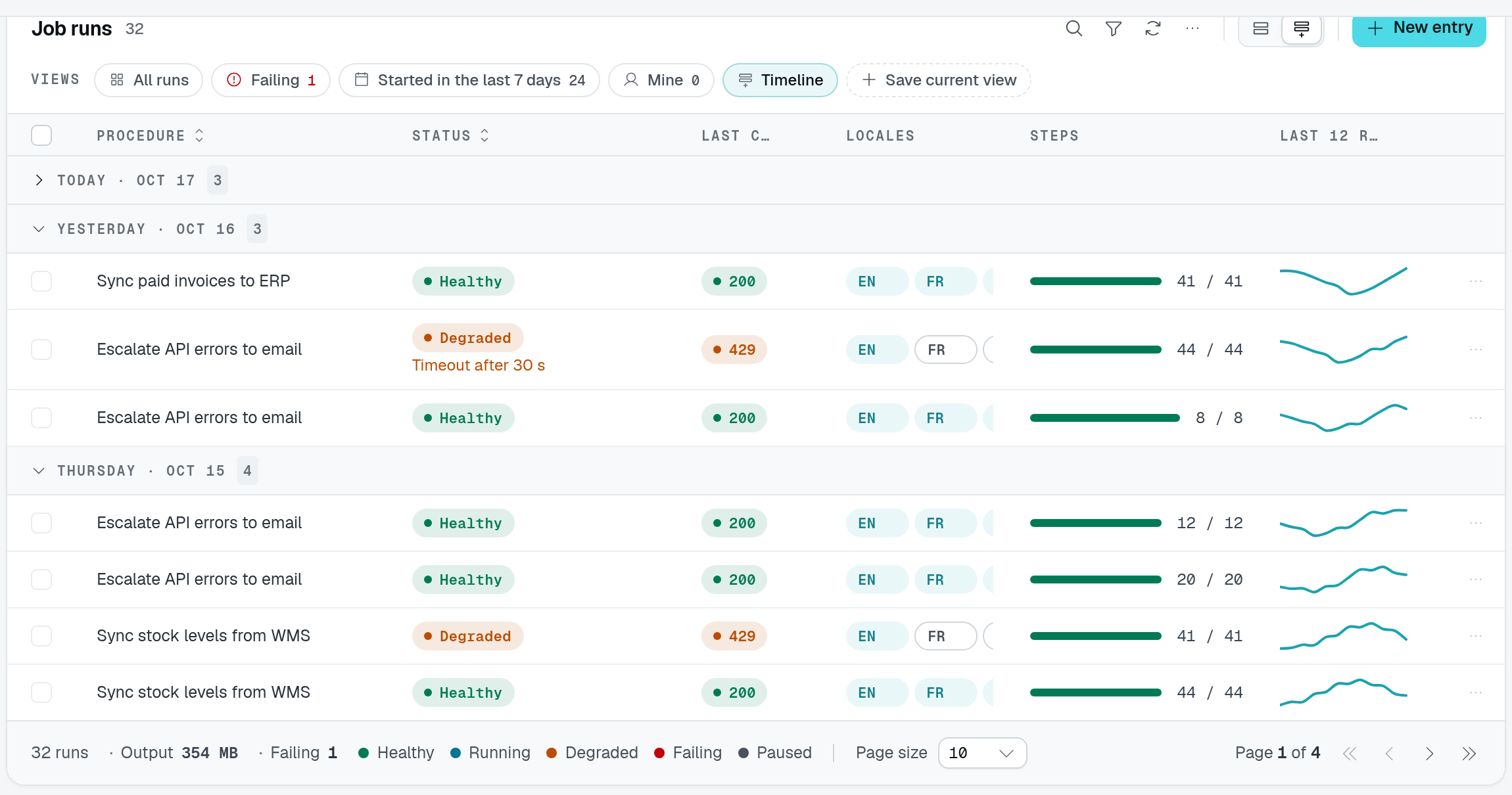
In the playground's Timeline view, collapsing Today hides its three rows while keeping the group count. The other days remain expanded; the footer still describes the filtered dataset, not just the expanded groups.
Usage
Setting grouped offers the display in the table's display switcher; defaultDisplay opens it first, and a view may open it with display: "grouped":
static runs = TableView(jobRunDataAPI, {
  caption: "Job runs",
  grouped: { groupByField: "startedAt", by: "day", collapsible: true, count: true },
  defaultDisplay: "grouped",
});

static byStatus = TableView(jobRunDataAPI, {
  caption: "Runs by status",
  grouped: { groupByField: "status", collapsible: true },
  rowActions: { add: false, duplicate: false, edit: false, delete: false },
});
Options
grouped takes a GroupedOptions:
| Option | Type | Default | Purpose |
|---|---|---|---|
groupByField | string | required | Column the rows are grouped on. It must be @Sortable(): the list sorts on it so a group's rows follow each other. |
by | "value" | "day" | "week" | "value" | One group per value, or per calendar day or week of a DateType column. |
collapsible | boolean | false | A click on a group header folds its rows. |
count | boolean | false | Group headers show how many rows the group holds. |
Registration throws for an unknown column, a column that is not @Sortable(), and a day or week grouping on a column that is not a DateType.
Behaviour
- Headers. A value group is titled with the value as its cell draws it (a select's label, a relation's name); rows without a value form a "No value" group. A day reads "Today", "Yesterday" or the date, a week "Week of …", in the reader's time zone and week start.
- Sort. The rows are listed sorted on the grouped column — newest first for
dayandweek, ascending forvalue; a sort the user picked on that column keeps its direction. The sort picker is off while the display is open. - Paging. The display is paged by rows like the grid, with any pagination mode. A page starting inside a group repeats its header on top.
- Counts.
countreads each listed group's row count from the controller'scountBatchroute (TableViewRoutes.CountBatch, part ofTableViewRoutes.All), over the whole filtered list, not only the page.TableView()warns at registration when the route is missing. A header still reads without its count if the request fails. - Folding applies to the groups of the current page.
There are no aggregates in group headers: put totals in the table's footer.
Views
Declare named states of a whole table view — filters, search, sort, columns, display, density — open them from the URL, and let users save their own.
Cell displays
Draw a column's cells another way with a typed display class — identity, two lines, pills, relative dates, status pills, progress bars, sparklines, durations, sizes, ids, toned text — with composed sub-lines, or register your own.