Overview
The DMS ships a catalog of blocks you declare on the backend; the shared Vue frontend renders them. For a standard screen you write no Vue: you compose blocks, and the dashboard draws the result. Start with the group that fits your screen below. Many block pages include a live preview you can tweak, alongside usage examples, options, recipes and pitfalls.
KpiCard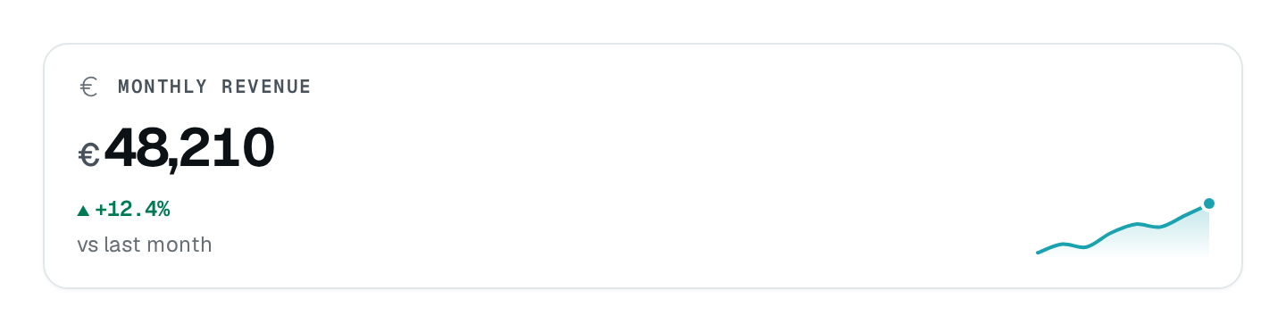
New to the DMS? Read Pages & components first to see how blocks attach to a page, then Block fundamentals for what every block shares.
The catalog
The data layer
| Reference | Use it for |
|---|---|
| Data types | The type of every form field and table column. |
| Data controller | Declare a table's shape, routes and field decorators once. |
| Derived controller | Give the same data a second editing screen with its own routes and permissions. |
| File storage | The storage behind the file and image types. |
When nothing fits
Custom component places a Vue component of your own on the page. Build only the block the catalog is missing, give it .meta({ name, description, icon }), and keep the rest of the page in DMS blocks so each part stays a permission of its own (Best practices).
How to read a block page
Use the examples first, then consult the options when you need a specific behavior. Pages with a playground follow this structure:
- What it is — what it draws and when to reach for it.
- Live preview — the real block, rendered by a DMS instance; change its options in the controls panel and copy the TypeScript.
- Usage — the import and a minimal, real example, with the route that feeds it.
- Options — the reference table generated from the block catalog.
- Recipes and pitfalls — the patterns that work and the mistakes to avoid.
- Next steps — where to go from there.
SaaS mode
Turn the dashboard into a sellable product with dms-saas — Stripe configuration, public owner registration, plans that gate permissions, and the billing operations on both sides.
Block fundamentals
What every DMS block shares — how blocks nest, read their data, write their texts in the reader's language, and carry their own permission.