Custom data types
The built-in catalog (Data types) covers most fields; a custom DataType covers the rest. A custom type is two halves joined by one id:
- The backend declares the type's identity: its validation, its compare modes, and the names of its input and filter widgets. None of this is Vue — components are referred to by string only.
- The frontend — a plugin in your frontend layer — supplies the read side: how a stored value renders in table cells and read views.
The two halves never share code. Use the same id on both sides and the wiring is automatic; the per-field options object travels from the backend to every frontend hook.
The backend half
Subclass DataType, decorate the class with @RegisterDataType("<id>"), and import the file once in your module — the decorator registers the type as an import-time side effect. The constructor passes three things up to super(...): the compare modes the type offers, its default mode, and the per-field options. The class then implements two members:
getValidation()— the Zod schema validating the value before it is persisted.defaultInputComponent()— the input widget, built with aFormComponents.*helper (InputText,InputNumber,InputCheckbox, …). Each helper returns acomponentNamestring plus its options — never a Vue component. The form input and the filter inputs both derive from this one implementation; override the publicinputComponent()/filterComponents()only when forms and filters need different widgets.
Three optional hooks refine the behavior: filter() customizes how a filter value becomes a database predicate, filterComponents() gives specific compare modes their own widget, and decorateField() attaches extra field decorators (the relation types use it).
The frontend half
From a plugin in your layer, register the same id with useDataTypes().registerDataType({...}). Registration is last-wins per id, and every field besides id is optional — they all concern reading values:
| Field | Purpose |
|---|---|
formatter | A map of (value, locale, options?, row?) => string | VNode functions, keyed by compare mode with a required default. Renders table cells; per-mode entries format filter chips. Two more keys: cell (a shorter grid rendering) and empty (drawn for a null value instead of the fallback). row is the listed row in a table, absent elsewhere. |
displayComponent | A read-only Vue component for the form's read view — it receives :model-value and takes precedence over formatter there. Any component works; wrap a heavy one in defineAsyncComponent to keep its code out of the startup bundle. |
beforeStateMapper | (value, options?) => value — reshapes the server value before the form state is seeded. Must be idempotent: the form reset re-applies it to values that may already be mapped. The built-in relation type uses it to turn populated objects back into bare ids. |
isSameValue | (left, right, options?) => boolean — whether two values of the type are the same. An edit form sends only the fields whose value differs from the loaded one, and compares them with it; without it, values compare deeply. The built-in relation type compares the ids referenced, so the populated row loaded and the id the picker holds match, and the picks of a multiple relation compare as a set. |
filterEditorValue | (text, mode) => value — the value a filter chip's editor holds for a filter value a view or tab declared as text, under a compare mode. The built-in number types read "0" as 0, the date type splits an is_between value into its two days. Without it the editor reads the text as is; the filter keeps its text, so the query is unchanged. |
selectSource | (options) => { searchUrl, keyMapping? } | undefined — for a type whose value holds ids of rows another table serves: the select route those rows are read from, given the options of the type's control. A filter chip and a read-only list name the ids through it, asking the route for those rows alone with ?ids=. The built-in relation and cascader_relation types read their picker's searchUrl and keyMapping. An id the route does not answer reads "Not found". A table cell, a card and a kanban card do not read through it: the route listing them joins the related rows (Foreign). |
inputComponent or filterComponents — input and filter widgets are decided on the backend and shipped as componentName strings. The frontend half only owns read rendering.formatter gets the field's backend options as its options argument both in table cells and in the form read view, so a formatter can rely on them (a status' labels and tones, a select's items).
A formatter runs wherever a value is drawn — a cell, a card field, a group header, a footer summary, a filter chip — often with no component setup active, so it must not call a composable: useI18n() throws there ("Must be called at the top of a setup function") and the page shows the error page. Write its texts through getAppTranslation(), the formatter's one way to the application's translations: processI18n("$my.key") for a $-prefixed label, processApiMessage(message) for a server message, and t("my.key", { count }, count) for a plain key (a plural count included). A ComposedText goes through getAppComposedText().processText(text). Each call reads the active locale, so the text follows a language switch.
Cell data types
A frontend data type can draw cells without being a column's type: a column names it with a display class registered under its id (@RegisterDisplay("<module>:<id>"), see Cell displays) and keeps its own type for forms and filters. The formatter receives the display's options, plus the column's own type options as typeOptions (a select's items, for instance) and the id of the column's own type as columnType (to write the value as the column would), and the row.
The DMS registers the frontend types behind its own DefaultDisplays classes under these ids: identity, two_line, pills, relative_date, indicator, status_pill, progress, sparkline, duration, bytes and mono. Their options are listed in Cell displays.
Worked example: a rating type
A 0–5 star rating. The backend declares the type and reuses the built-in numeric input; the frontend renders filled stars in cells and read views.
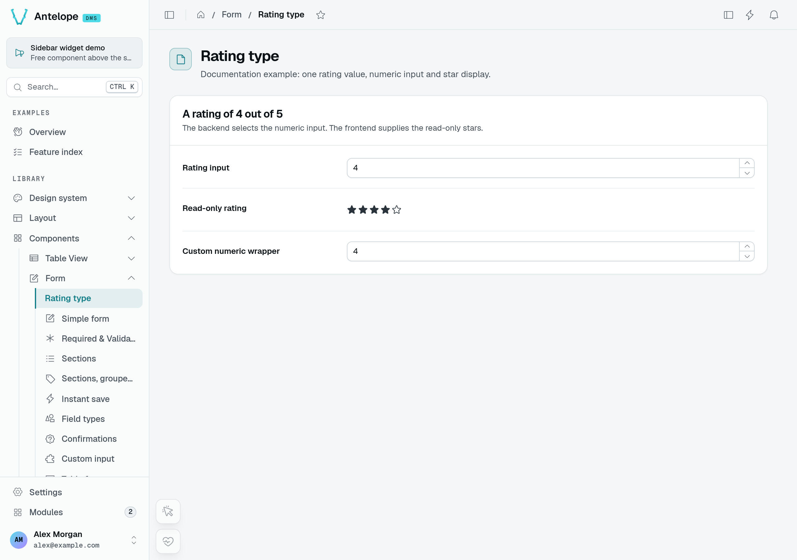
This capture runs the example in a temporary playground page. The numeric input and read-only display both start at 4; they are separate fields, not a live preview of each other. The additional Custom numeric wrapper row tests a thin InputRating wrapper around the same numeric control; the example below does not require that wrapper.
Backend — identity, validation, and the input widget:
import { z } from "zod";
import { FormComponents } from "@antelopejs/interface-dms/base/form";
import {
  DataType,
  DefaultDataCompareTypes,
  RegisterDataType,
} from "@antelopejs/interface-dms/base/data-types";

@RegisterDataType("rating")
export class RatingType extends DataType {
  constructor(public readonly options: { max?: number } = { max: 5 }) {
    super(
      [DefaultDataCompareTypes.Is, DefaultDataCompareTypes.IsNot], // compare modes
      DefaultDataCompareTypes.Is, // default mode
      options as Record<string, unknown>,
    );
  }

  protected defaultInputComponent() {
    // Reuse the built-in numeric input.
    const component = FormComponents.InputNumber({
      min: 0,
      max: this.options.max ?? 5,
      step: 1,
    });
    component.options = { ...component.options, ...this.options };
    return component;
  }

  getValidation() {
    return z
      .number()
      .min(0)
      .max(this.options.max ?? 5);
  }
}
Import the file once and use the type like any built-in: type: new RatingType({ max: 5 }) on a Form field (Forms) or a TableView column (Tables). If the type's options carry $-prefixed labels, add the matching i18n keys to every locale file (Localization).
Frontend — the matching id, a star formatter, and an async display component:
import { defineAsyncComponent, h } from "vue";
import UIcon from "@nuxt/ui/runtime/vue/components/Icon.vue";

export default defineDmsPlugin(() => {
  const { registerDataType } = useDataTypes();

  registerDataType({
    id: "rating", // must equal @RegisterDataType("rating")
    formatter: {
      default: (value, _locale, options) => {
        const max = (options as { max?: number })?.max ?? 5;
        const filled = Math.round(Number(value) || 0);
        return h(
          "span",
          { class: "inline-flex items-center gap-0.5" },
          Array.from({ length: max }, (_, i) =>
            h(UIcon, {
              name: i < filled ? "i-ph-star-fill" : "i-ph-star",
              class: "size-4",
            }),
          ),
        );
      },
    },
    displayComponent: defineAsyncComponent(() => import("../components/DisplayRating.vue")),
  });
});
Use the Vue runtime entry for UIcon in the standalone DMS frontend. The Nuxt component entry imports Nuxt runtime dependencies and does not build in this environment.
The display component receives modelValue and the field's options as individual props, including max. Supply the component imported by the plugin:
<script setup lang="ts">
import { computed } from "vue";
import UIcon from "@nuxt/ui/runtime/vue/components/Icon.vue";

interface Props {
  modelValue?: number | null;
  max?: number;
}

const props = withDefaults(defineProps<Props>(), { max: 5 });
const filled = computed(() => Math.round(Number(props.modelValue) || 0));
</script>

<template>
  <span v-if="modelValue == null" class="text-dimmed">—</span>
  <span
    v-else
    class="inline-flex min-h-9 items-center gap-0.5"
    role="img"
    :aria-label="`${filled} out of ${max} stars`"
  >
    <UIcon
      v-for="i in max"
      :key="i"
      :name="i <= filled ? 'i-ph-star-fill' : 'i-ph-star'"
      class="size-4"
      aria-hidden="true"
    />
  </span>
</template>
The read view uses this component instead of the formatter; table cells still use the formatter. Both apply the same rounding rule. A missing value displays a dash, while zero displays five empty stars.
Note what is absent: the frontend names no input or filter component — those came from the backend's defaultInputComponent() and resolve by name.
Theming & branding
Put your logo and palette on the dashboard — the branding app-config surface (sidebar, email and browser-tab logos), Nuxt UI color tokens, CSS variables, fonts, and interface scale.
TableView displays
Register an alternate TableView body renderer — grid, kanban, cards, calendar — that inherits the table's search, filters, sort, tabs, pagination, selection, and row actions.