Components
Radar chart
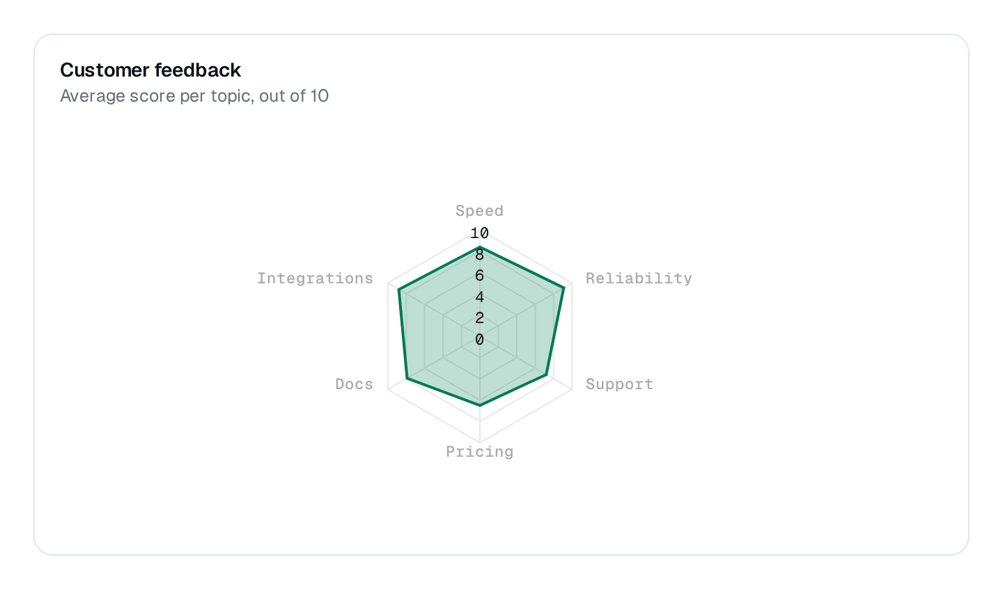
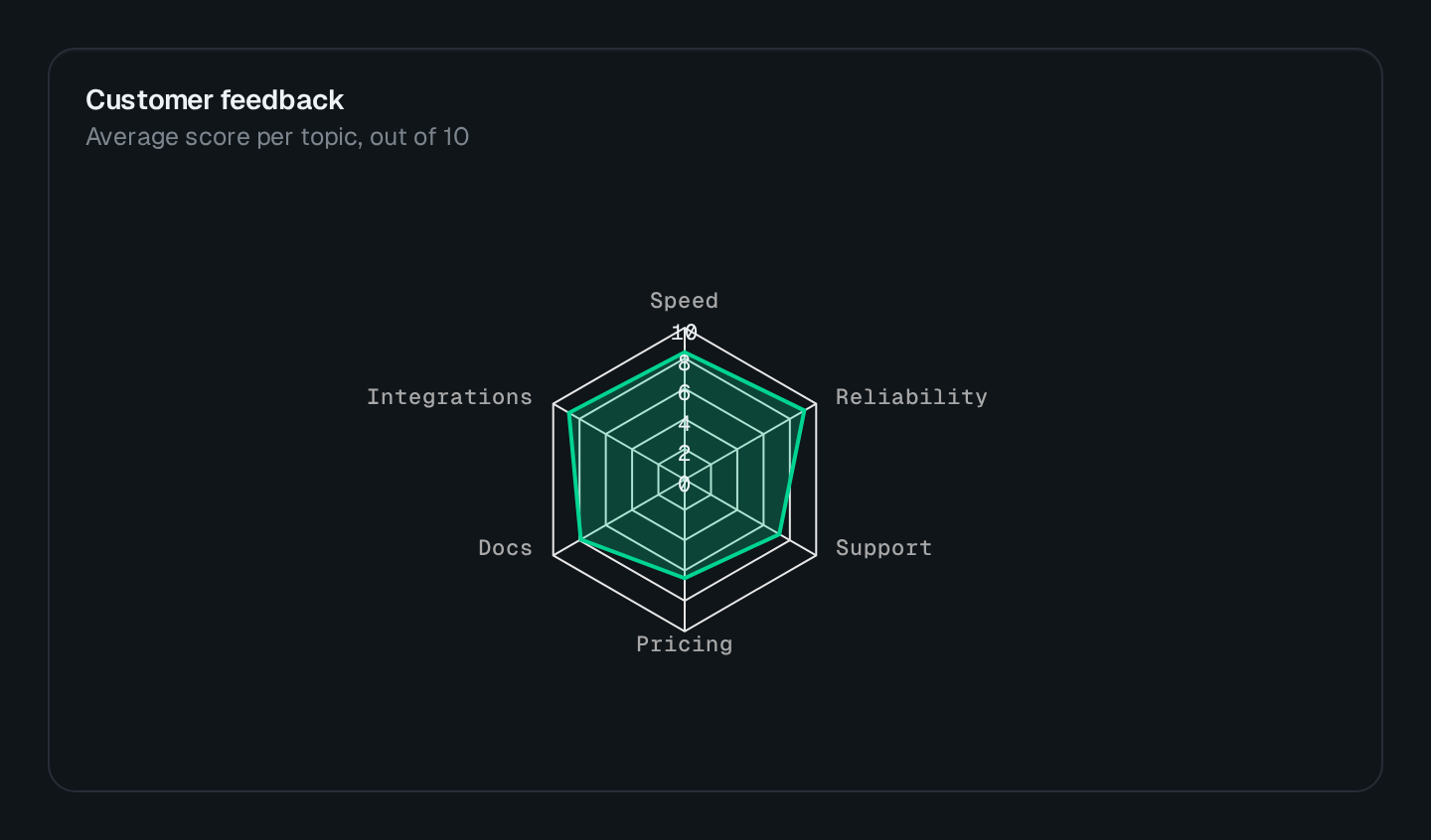
Several measures of a few items on spokes, one polygon per series.
ChartRadar draws one polygon per series over spokes, one spoke per measure. Use it to compare a few items on several measures — plans by feature, teams by skill. It draws its own polygon grid, not the horizontal grid lines of the axis charts.
ChartRadar Connecting to the DMS preview…
Usage
src/pages/dashboard.ts
import { ChartRadar } from "@antelopejs/interface-dms/base/chart";

static plans = ChartRadar({
  title: "$saas.plans.comparison",
  fetchUrl: "/api/saas/plans/radar",
  fillOpacity: 0.25,
});
The route answers { series } in the shape listed under Data shapes. Wrap the chart in a ChartCard to add a headline value and a comparison.
Options
| Option | Type | Default | Description |
|---|---|---|---|
titleContent | string | – | |
descriptionContent | string | – | |
colorAppearance | string | string[] | – | |
heightAppearance | string | – | |
widthAppearance | number | – | |
showTooltipAppearance | boolean | true | |
showLegendAppearance | boolean | true | |
legendPositionAppearance | "top" | "bottom" | – | |
showGridAppearance | boolean | true | |
yRange.min*Appearance | number | – | |
yRange.max*Appearance | number | – | |
comparisonStyleAppearance | "dashed" | "solid" | "dimmed" | – | |
smoothAppearance | boolean | true | |
curveAppearance | "smooth" | "straight" | "stepline" | – | |
xaxisTypeAppearance | "category" | "datetime" | "numeric" | – | |
fillOpacityAppearance | number | – |
Recipes
Keep it to a few series
Beyond three or four polygons the radar stops reading. Split the comparison, or use a column chart.