Components
Mixed chart
Lines, areas, columns and range bands sharing one axis, one type per series.
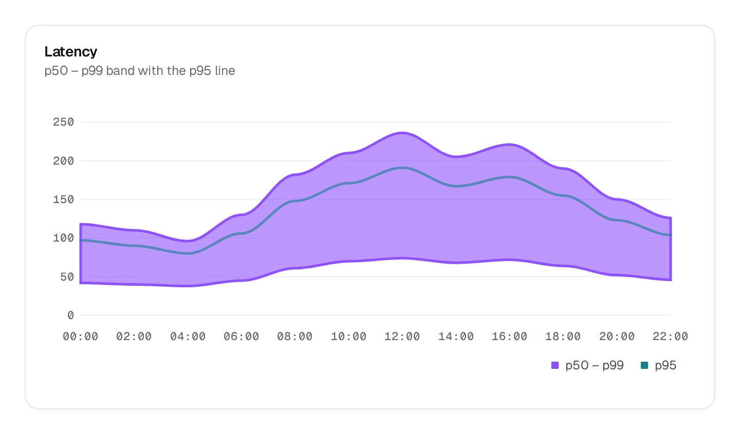
ChartMixed draws each series with its own type — columns for volume, a line for a rate, a band for a range — on one shared x axis. seriesDefs names each series' type and color.
ChartMixed Connecting to the DMS preview…
Usage
src/pages/dashboard.ts
import { ChartMixed } from "@antelopejs/interface-dms/base/chart";
import { ChartType } from "@antelopejs/interface-dms/base/chart-type";

static funnel = ChartMixed({
  title: "$shop.funnel.orders_and_visits",
  fetchUrl: "/api/shop/funnel",
  seriesDefs: [
    { name: "Orders", type: ChartType.COLUMN },
    { name: "Visits", type: ChartType.LINE, color: "info" },
  ],
});
The route answers { series } in the shape listed under Data shapes. Wrap the chart in a ChartCard to add a headline value and a comparison.
Options
| Option | Type | Default | Description |
|---|---|---|---|
titleContent | string | – | |
descriptionContent | string | – | |
colorAppearance | string | string[] | – | |
heightAppearance | string | – | |
widthAppearance | number | – | |
showTooltipAppearance | boolean | true | |
showLegendAppearance | boolean | true | |
legendPositionAppearance | "top" | "bottom" | – | |
showGridAppearance | boolean | true | |
yRange.min*Appearance | number | – | |
yRange.max*Appearance | number | – | |
comparisonStyleAppearance | "dashed" | "solid" | "dimmed" | – | |
smoothAppearance | boolean | true | |
curveAppearance | "smooth" | "straight" | "stepline" | – | |
xaxisTypeAppearance | "category" | "datetime" | "numeric" | – |
Recipes
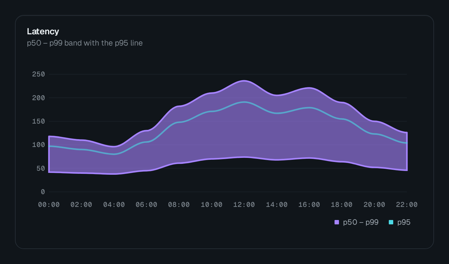
A band with a median
Declare one series as ChartType.RANGE_AREA and another as ChartType.LINE to draw a percentile band with its median on top.