Components
Heatmap
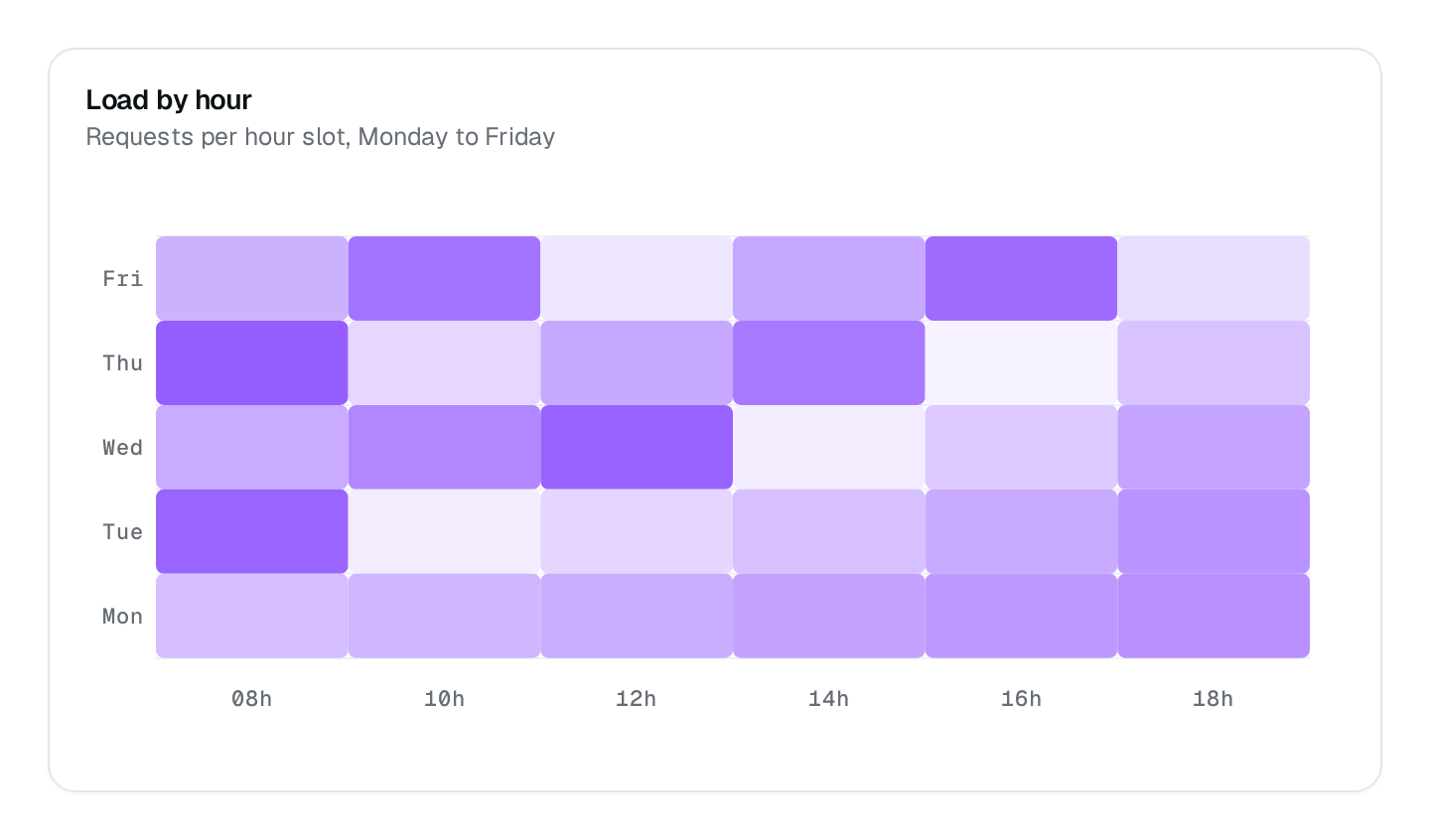
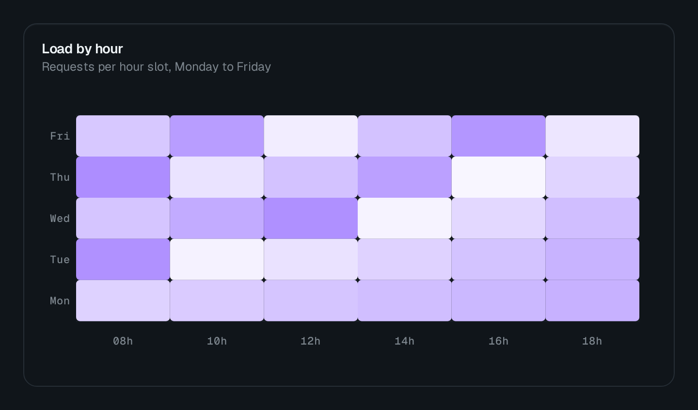
Intensity across two dimensions, such as hours by weekday.
ChartHeatmap colors a grid of cells by intensity: one series per row, each point { x, y } with y the value. Use it for activity across two dimensions — hours by weekday, routes by status class.
ChartHeatmap Connecting to the DMS preview…
Usage
src/pages/dashboard.ts
import { ChartHeatmap } from "@antelopejs/interface-dms/base/chart";

static logins = ChartHeatmap({
  title: "$security.logins.by_hour",
  fetchUrl: "/api/security/logins/heatmap",
  shadeIntensity: 0.6,
});
The route answers { series } in the shape listed under Data shapes. Wrap the chart in a ChartCard to add a headline value and a comparison.
Options
| Option | Type | Default | Description |
|---|---|---|---|
titleContent | string | – | |
descriptionContent | string | – | |
colorAppearance | string | string[] | – | |
heightAppearance | string | – | |
widthAppearance | number | – | |
showTooltipAppearance | boolean | true | |
showLegendAppearance | boolean | true | |
legendPositionAppearance | "top" | "bottom" | – | |
shadeIntensityAppearance | number | – | |
distributedAppearance | boolean | – |
Recipes
One color per row
distributed: true scales the shading of each row on its own, so a quiet row still shows its peaks.