Charts
Each chart block draws one chart type. Use it on its own, or — most often — inside a ChartCard, which adds the headline value and the comparison legend. Charts render on the frontend with ApexCharts; the options map onto ApexCharts concepts, but you never touch the library: the backend sends a serializable description.
ChartLine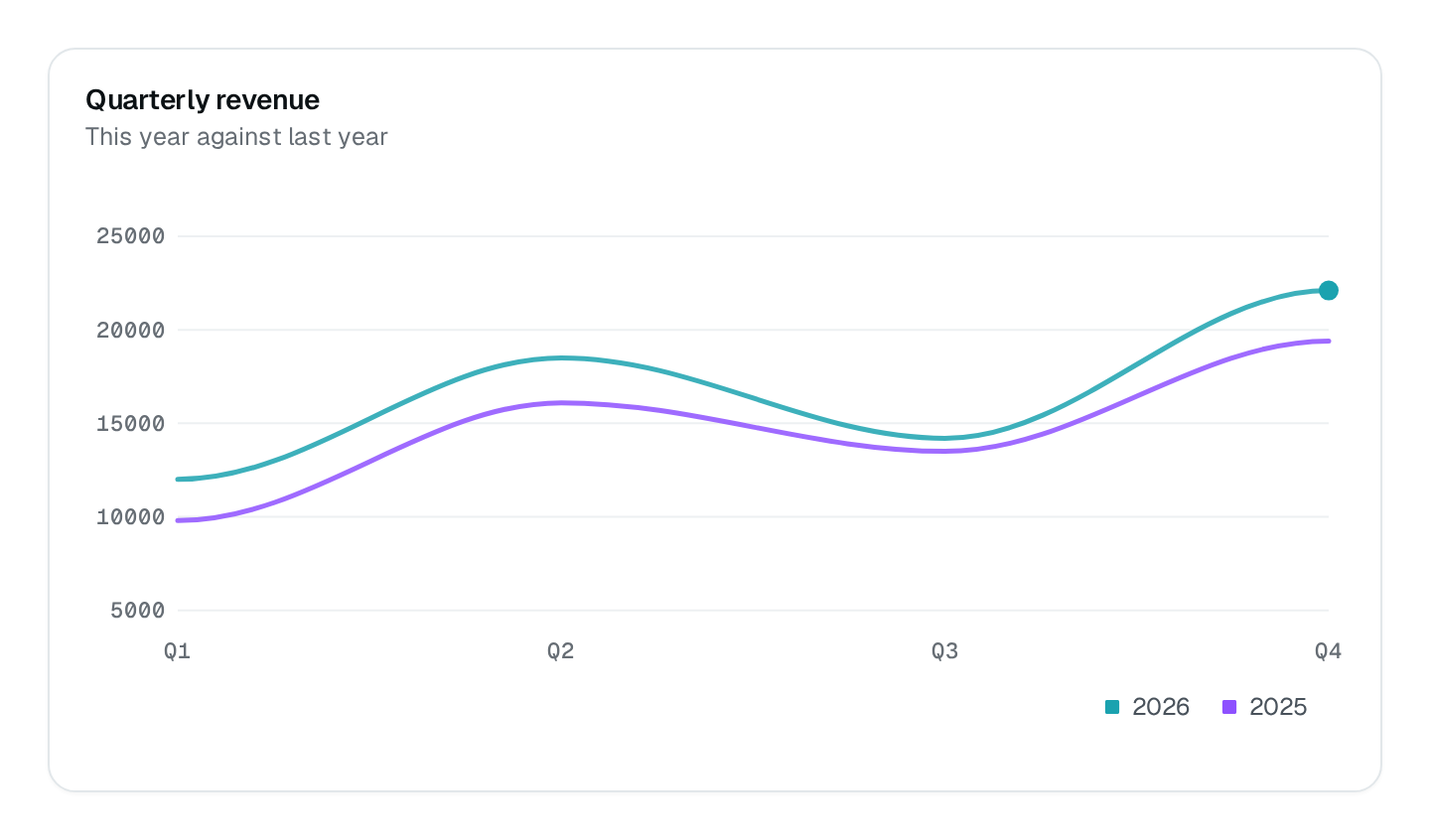
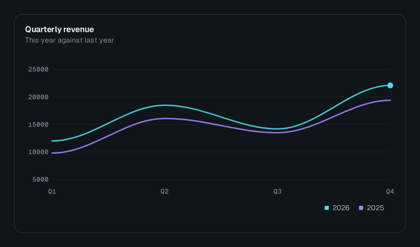
Pick a chart
| Block | Family | Use it for |
|---|---|---|
ChartLine | XY | A trend over time. |
ChartArea | XY | A trend whose volume matters, stacked or not. |
ChartRangeArea | XY | A band between a low and a high: percentiles, forecasts. |
ChartBar | XY | Comparing categories, horizontal bars. |
ChartColumn | XY | Comparing categories or periods, vertical columns. |
ChartScatter | XY | The relation between two measures. |
ChartMixed | XY | Lines, areas and columns on one axis. |
ChartRadar | XY | Several measures of a few items, on spokes. |
ChartCandlestick | XY | Open, high, low and close per period. |
ChartDonut | Circular | Parts of a whole, with a figure in the middle. |
ChartPie | Circular | Parts of a whole, labelled on the slices. |
ChartRadialBar | Circular | Progress of a few measures towards 100 %. |
ChartHeatmap | Grid | Intensity across two dimensions: hours × days. |
Every builder comes from @antelopejs/interface-dms/base/chart and is pinned to its ChartType: pass options without a type, the builder injects it.
import { ChartLine, ChartDonut } from "@antelopejs/interface-dms/base/chart";

static requests = ChartLine({ title: "Requests", fetchUrl: "/api/metrics/requests", xaxisType: "datetime" });
static plans = ChartDonut({ title: "Plans", fetchUrl: "/api/metrics/plans", centralLabel: "Accounts" });
Data shapes
| Family | staticDataset and route answer |
|---|---|
| XY | ChartSeries[]: { name, data, type?, color?, strokeWidth?, strokeDashArray? }. data holds { x, y, label? } points or bare numbers. |
| Range area | Points { x, y: [low, high] }. |
| Candlestick | Points { x, y: [open, high, low, close] }. |
| Circular | DonutRecord[]: { label, value }. |
| Heatmap | One series per row, each point { x, y } with y the intensity. |
A route answers { series, comparisonSeries? }. Series names follow the $-prefix convention.
Colors
color takes a semantic name (primary, success), a Nuxt UI shade token (primary-500, neutral-950), a CSS variable (--usage-accent or var(--usage-accent)), or a hex / rgb / hsl literal; an array colors each series. Shade steps are 50, 100 to 900 by 100, and 950; accent aliases primary. A semantic name follows the theme's selected shade, while a fixed shade stays fixed across light and dark modes.
Define a custom variable on :root or an ancestor of body, without a nested expression or an inline fallback. Missing, invalid or fully transparent tokens fall back to #7c3aed. A custom component reads the same palette with the auto-imported resolveChartColor / resolveChartColors, reading useThemeRevision().value inside its computed palette so it follows theme changes.
Reference lines and bands
annotations draws horizontal reference lines through an XY plot. A y2 turns a line into a shaded band.
| Field | Type | Purpose |
|---|---|---|
y | number | Where the line sits on the value axis. Required. |
y2 | number | Turns the line into a band between y and y2. |
label | string | Caption at the right end, in the annotation's color. |
color | ChartColorValue | Theme color or literal; the chart's primary by default. |
dashed | boolean | Dashed by default; false for a solid rule. |
Annotations do not move the Y range. In code, autoYRange: { padding: 0.08 } includes every y and y2 in the bounds and pads them outward by 8 %, then rounds them to a readable step; an explicit yRange wins over it.
ChartLine({
  title: "Replicas",
  fetchUrl: "/metrics/replicas",
  curve: "stepline",
  annotations: [{ y: 4, label: "max bound", color: "warning" }],
});
Synced crosshairs
Charts naming the same syncGroup share a crosshair: hovering one moves the tooltip of all of them to the same x position, which makes a grid of stacked metrics readable. Each chart keeps its own axes, colors and annotations, and still fetches and scales on its own.
Click events
Charts emit click events other blocks can watch (ChartEvents): SEGMENT_CLICK on circular charts, POINT_CLICK on XY charts (Actions & reactivity). The payload carries value for scalar points; on range areas and candlesticks value is null and the tuple arrives in values.
The escape hatch
rawOptions passes key / value pairs straight to ApexCharts when a knob is not a typed option. A plain key (markers) replaces that whole section; a dotted key (markers.size) sets one option inside it. The value is parsed as JSON when it can be. Reach for it last: raw options bypass the theme's color resolver.