Chart card
ChartCard wraps one chart in a card and surfaces the metric around it: a title with an optional icon and description, a large formatted headline value with its delta badge versus the comparison period, an optional primary / comparison legend, and the chart filling the body. The card owns the data; the nested chart only says how to draw it.
ChartCard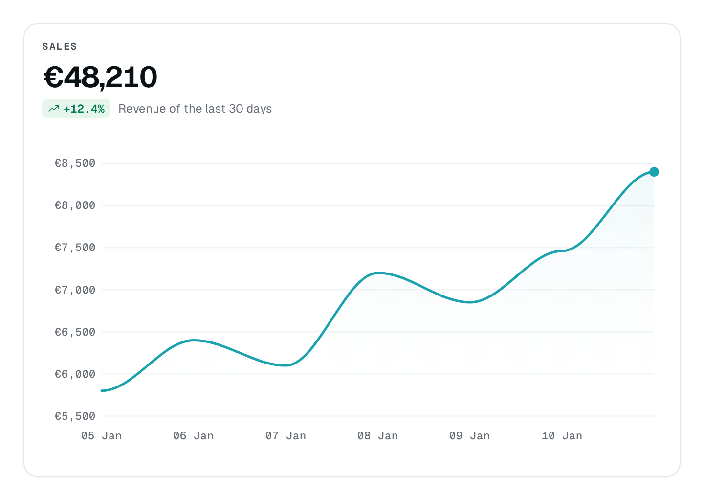
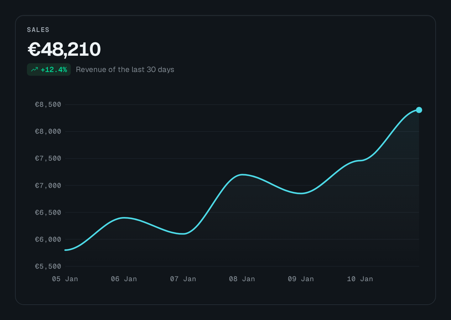
fetchUrl. This preview uses fixed sales data from the preview service, without a playground module or access to your application's data. If the live renderer is unavailable, the documentation shows a static screenshot instead.Usage
import { ChartCard } from "@antelopejs/interface-dms/base/chart-card";
import { ChartArea } from "@antelopejs/interface-dms/base/chart";

static trend = ChartCard({
  title: "$shop.sales.trend",
  fetchUrl: "/api/sales/series",
  periodScope: "sales",
  valueFormat: "currency",
  currencyCode: "EUR",
  chart: ChartArea({ smooth: true, comparisonStyle: "dashed", xaxisType: "datetime" }),
});
The route answers the headline and the series:
@Get("series")
series() {
  return {
    value: 48200,
    delta: 12.4,
    previousValue: 42900,
    series: [{ name: "$shop.sales.revenue", data: [{ x: "2026-10-01", y: 4200 }, { x: "2026-10-02", y: 4800 }] }],
    comparisonSeries: [{ name: "$shop.sales.previous", data: [{ x: "2026-10-01", y: 3900 }, { x: "2026-10-02", y: 4100 }] }],
  };
}
Each series name follows the $-prefix convention and reaches the legend, the tooltip and the POINT_CLICK payload translated.
Options
| Option | Type | Default | Description |
|---|---|---|---|
title*Content | string | – | Card heading. |
descriptionContent | string | – | |
primaryLabelContent | string | – | |
comparisonLabelContent | string | – | |
iconAppearance | string | – | |
valueFormatAppearance | "number" | "currency" | "percent" | "compact" | – | |
currencyCodeAppearance | string | – | |
showDeltaAppearance | boolean | true | |
showLegendAppearance | boolean | true | |
showSeriesLegendAppearance | boolean | – | Name each series of the chart. |
The card supplies its chart's title, description, showLegend, fetchUrl, fetchUrlMethod, periodScope and realtimeTopic; set presentation options on the chart instead (smooth, comparisonStyle, xaxisType, height, legendPosition). valuePrecision is available in code (Value precision).
Recipes
Name several series
A card plotting several series ("Average", "Max", "p95") names them with showSeriesLegend: true, placed by the chart's legendPosition:
ChartCard({
  title: "$api.routes.response_time",
  fetchUrl: "/api/routes/latency",
  showSeriesLegend: true,
  chart: ChartLine({ color: ["info", "neutral", "secondary"], legendPosition: "top" }),
});
Refresh on events
realtimeTopic makes the card read its route again on each event published there, keeping what it shows meanwhile. On a page declared with live, it reads at most once per maxRate.
Pitfalls
- Never pass a raw ApexCharts
legendthroughrawOptionsto name series: useshowSeriesLegend. - Without
realtimeTopic, a card bound to a rolling period only moves when the period does.