[data-reveal]{opacity:1!important;transform:none!important}
Components

Charts & widgets

Data-viz and dashboard components — charts, ChartCard, KpiCard, TopListCard, and the PeriodSelector that scopes them.

Dashboard pages are assembled from the components on this page: charts that plot series and distributions, cards that headline a single value or a ranking, and a period selector that drives one date range across every widget bound to it. Each is a builder like any other component — declare it as a static field on a page and feed it a backend route — then arrange the result in a grid (Layout & containers). For the authoring loop and route wiring, see Pages & components.

Charts render on the frontend with ApexCharts (via vue3-apexcharts); the builder options below map onto ApexCharts concepts (series, stacking, axis types, opacity, candlestick/heatmap, radial bar). You never touch ApexCharts directly — the backend emits a serializable description and the shared Nuxt frontend renders it.

Shared options

The charts and the three cards are data-driven and share these options; the per-component tables below list only what's distinctive. PeriodSelector is the control that drives them — it takes none of these options (see its own table).

OptionTypePurpose
titlestringHeading / component meta name. Required on the three cards, optional on charts.
descriptionstringSub-heading text.
fetchUrlstringRoute returning the component's payload.
fetchUrlMethodHttpMethodHTTP method for the fetch (defaults to GET).
periodScopestringid of a PeriodSelector to bind to; refetches when its range/comparison changes.

The three cards additionally share valueFormat (number / currency / percent / compact), currencyCode (ISO code when valueFormat is currency), and showDelta (the change-vs-comparison badge). Where a component supports fixtures instead of a route, pass its static* option.

Charts

Each low-level chart builder maps to one chart type. Each renders a single titled chart and is most often dropped inside a ChartCard, but works standalone too.

What it renders. A chart canvas sized by height / width, with an optional title/description above it, an optional legend and hover tooltips, and (for XY types) a grid and configurable axes. XY charts plot one or more named series; circular charts (donut/pie/radial) plot a list of label/value records; heatmap and candlestick take their own series shapes.

Import

src/pages/dashboard.ts
import {
  ChartLine,
  ChartArea,
  ChartRangeArea,
  ChartBar,
  ChartColumn,
  ChartScatter,
  ChartMixed,
  ChartRadar,
  ChartCandlestick,
  ChartDonut,
  ChartPie,
  ChartRadialBar,
  ChartHeatmap,
} from "@antelopejs-private/cms/interfaces/cms-base/chart";

Each builder is pinned to a ChartType. Pass options without a type field — the builder injects it.

BuilderChartTypeFamilyNotable extra options
ChartLineLINEXYstrokeWidth
ChartAreaAREAXYfillOpacity, stacked
ChartRangeAreaRANGE_AREAXYfillOpacity; points carry y: [low, high]
ChartBarBARXYstacked, barWidth, roundedCorners, orientation
ChartColumnCOLUMNXYstacked, columnWidth, roundedCorners
ChartScatterSCATTERXYpointSize, showLabels
ChartMixedMIXEDXYseriesDefs (per-series line/area/column + color)
ChartRadarRADARXYfillOpacity
ChartCandlestickCANDLESTICKXYOHLC data (y: [open, high, low, close])
ChartDonutDONUTCircularcentralLabel, centralSubLabel, arcWidth
ChartPiePIECircular
ChartRadialBarRADIAL_BARCircularhollowSize, showTotal
ChartHeatmapHEATMAPshadeIntensity, distributed

Options — common to all charts (BaseChartProps, plus the shared options)

OptionTypePurpose
colorChartColorOne color name/hex/rgb/hsl, or an array for multi-series.
heightstringCSS height, e.g. "320px".
widthnumberExplicit width.
showTooltipbooleanHover tooltips.
showLegendbooleanSeries legend.
realtimeTopicstring | string[]Realtime topic(s); the chart refetches when published over SSE.
rawOptionsKeyValuePair[]Escape hatch — raw key/value passthrough to the chart library.

Options — XY charts (XYChartProps, adds to the above)

OptionTypePurpose
showGridbooleanBackground grid lines.
staticDatasetChartSeries[]Inline series instead of fetchUrl.
yRange{ min: number; max: number }Clamp the Y axis so small variations read larger.
comparisonStyle"dashed" | "solid" | "dimmed"How a comparison series is drawn against the primary.
smoothbooleanSmooth (curved) lines/areas.
curve"smooth" | "straight" | "stepline"Line interpolation; wins over smooth when both are set.
annotationsChartAnnotation[]Y-axis reference lines or shaded bands.
syncGroupstringShare the crosshair and tooltip with the charts of that group.
xaxisType"category" | "datetime" | "numeric"X-axis interpretation; use "datetime" for time series.

Circular charts (CircularChartProps) instead take a staticDataset of DonutRecords — a label and a value — plus their per-type extras listed in the builder table.

Bands, reference lines and synced crosshairs

The three options a metrics screen leans on, and what they expect from the payload.

ChartRangeArea plots a filled band per series instead of a curve: each point is { x, y: [low, high] }. Percentile bands read as one distribution when you send adjacent ranges — p50 – p95 then p95 – p99 — rather than three separate lines. rangeArea is also a valid seriesDefs type on ChartMixed, so a band can carry a plain line on top.

annotations draws horizontal reference lines through the plot:

FieldTypePurpose
ynumberWhere the line sits on the value axis. Required.
y2numberTurns the line into a shaded band between y and y2.
labelstringCaption drawn at the right end, in the annotation's own color.
colorChartColorValueTheme color name or literal; defaults to the chart primary.
dashedbooleanDashed by default; pass false for a solid rule.
src/pages/metrics.ts
ChartLine({
  title: "Replicas",
  fetchUrl: "/metrics/replicas",
  curve: "stepline",
  annotations: [{ y: 4, label: "max bound", color: "warning" }],
});

syncGroup gives every chart naming the same group a shared crosshair: hovering one moves the tooltip of all of them to the same x position, which is what makes a grid of stacked metrics readable. Each chart keeps its own axes, colors and annotations — the group only ties the pointer.

Grouped charts still fetch, scale and animate independently. Charts outside the group are unaffected, so a page can hold several groups, or a group next to standalone charts.

Features

  • Multi-series and stacking for area/bar/column; color accepts an array to color each series.
  • staticDataset for fixtures vs. fetchUrl for live data; ChartSeries.data accepts { x, y, label } points, candlestick OHLC tuples, or bare numbers.
  • realtimeTopic wires the chart to SSE so it refetches when the backend publishes.
  • Charts emit click events other components can watch (the ChartEvents constants): SEGMENT_CLICK on circular charts, POINT_CLICK on XY charts — see Actions & reactivity. The payload carries value for scalar points; on the types whose points hold a tuple (rangeArea, candlestick) value is null and the tuple arrives in values.
  • rawOptions is the escape hatch when a needed ApexCharts knob isn't surfaced as a typed option.

ChartCard

A framed card that wraps one chart and surfaces a headline metric, delta, and comparison legend around it — the dashboard-ready version of a bare chart.

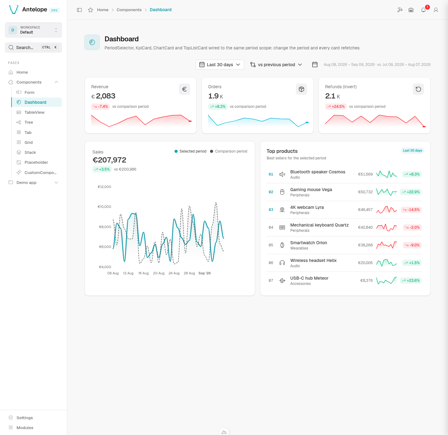
What it renders. A bordered card with a title (and optional icon/description), a large formatted headline value with an up/down delta badge versus the comparison period, an optional primary/comparison legend, and the nested chart filling the body.

Import

src/pages/dashboard.ts
import { ChartCard } from "@antelopejs-private/cms/interfaces/cms-base/chart-card";

Options (ChartCardBuilderOptions, plus the shared options)

OptionTypeDefaultPurpose
chartComponentThe nested chart builder (e.g. ChartArea({...})). Required.
iconstringi-ph-chart-lineIconify name shown on the card.
showLegendbooleanShow the primary/comparison legend.
primaryLabelstringLegend label for the primary series.
comparisonLabelstringLegend label for the comparison series.

Features

  • The card owns the fetchUrl / periodScope; the nested chart is configured for presentation (smooth, comparisonStyle, xaxisType, height).
  • Payload carries value, delta, previousValue, and series (plus optional comparisonSeries).

KpiCard

A single-metric stat card: a big formatted number with a delta and optional sparkline.

What it renders. A compact card with a title, an optional icon, a large formatted value, a colored up/down delta badge with a "compare" caption, and an optional inline sparkline. The "stat" variant is the tighter DMS look — mono uppercase label and a bare icon.

Import

src/pages/dashboard.ts
import { KpiCard } from "@antelopejs-private/cms/interfaces/cms-base/kpi-card";

Options (KpiCardProps, plus the shared options)

OptionTypeDefaultPurpose
variant"default" | "stat"defaultstat = compact DMS look (mono uppercase label, bare icon).
iconstringi-ph-trend-upIconify name.
showSparklinebooleanRender an inline sparkline.
sparklineAccentChartColorValue | "auto"Sparkline color; auto follows the delta direction.
invertbooleanTreat a negative delta as good (e.g. errors, churn).
compareLabelstringCaption next to the delta, e.g. "vs previous period".
staticValuenumberFixture value instead of fetchUrl.
staticDeltanumberFixture delta.
staticSparklinenumber[]Fixture sparkline points.

Features

  • fetchUrl payload returns value, delta, previousValue, sparkline; for static demos pass staticValue / staticDelta / staticSparkline.
  • invert flips the good/bad coloring so a decrease can read as positive.

TopListCard

A ranked leaderboard card — a vertical list of items each with a value, delta, and optional sparkline.

What it renders. A titled card listing rows in rank order, each with an optional rank badge, an icon or avatar, a title and description, a formatted value, an optional delta, and an optional row sparkline. The top N rows can be highlighted, rows can link elsewhere via to, and an empty list shows emptyLabel.

Import

src/pages/dashboard.ts
import { TopListCard } from "@antelopejs-private/cms/interfaces/cms-base/top-list-card";

Options (TopListCardProps, plus the shared options)

OptionTypePurpose
showRankbooleanShow numeric rank badges.
highlightTopNnumberEmphasize the first N rows.
rankColorChartColorValueColor of the rank badges.
showSparklinebooleanShow per-row sparklines.
sparklineAccentChartColorValue | "auto"Sparkline color; auto follows the delta.
invertbooleanTreat negative deltas as good.
badgeColorChartColorValueColor of value/delta badges.
maxHeightstringCap the list height (scrolls beyond).
staticItemsTopListItem[]Fixture items instead of fetchUrl.
emptyLabelstringText shown when there are no items.

fetchUrl returns { items: TopListItem[] }. Each TopListItem carries an id, a title, and a value, plus optional description, delta, sparkline, icon, avatar (src, optional alt), and to (link target).

Features

  • Rank chrome (showRank, highlightTopN, rankColor) and per-row deltas/sparklines are independently toggleable.
  • to turns a row into a link; avatar / icon give each row a leading visual.

PeriodSelector

The registry that links a PeriodSelector to widgets by a scope id (behind the periodScope option) is documented in Period filtering.

A date-range control that scopes every widget bound to its id. Place one on the page; charts, KPI cards, and lists referencing it via periodScope refetch when the range or comparison changes.

What it renders. A compact preset dropdown (Today, Last 7 days, This month, YTD, …) with an optional custom range, a comparison selector (none / previous period / previous year / custom), and — when showRangeLabel — the resolved date range as text. align positions it within its row.

Import

src/pages/dashboard.ts
import { PeriodSelector } from "@antelopejs-private/cms/interfaces/cms-base/period-selector";

Options (PeriodSelectorProps)

OptionTypePurpose
idstringScope id widgets reference via periodScope. Required.
defaultPresetPeriodPresetInitial range preset.
defaultComparisonPeriodComparisonInitial comparison mode.
presetsPeriodPreset[]Restrict the offered presets.
comparisonsPeriodComparison[]Restrict the offered comparison modes.
presetLabelsPartial<Record<PeriodPreset, string>>Override preset display labels.
comparisonLabelsPartial<Record<PeriodComparison, string>>Override comparison display labels.
align"left" | "center" | "right"Horizontal alignment within the row.
size"xs" | "sm" | "md" | "lg" | "xl"Control size, honoured by both variants.
showRangeLabelbooleanShow the resolved date range as text.
variant"default" | "segmented"Render the presets as a dropdown or as inline pills.

PeriodPreset is one of last-hour, last-24h, today, yesterday, last-7-days, last-30-days, last-90-days, this-month, last-month, this-quarter, last-quarter, ytd, last-year, custom. PeriodComparison is none, previous-period, previous-year, or custom.

Features

  • Linking by id. Any widget with periodScope: "<id>" is driven by the matching selector. On change it appends preset, from/to, and comparison to each scoped widget's request and triggers a refetch.
  • Multiple independent scopes on one page: give each selector a distinct id and point disjoint widget groups at each.
  • presets / comparisons narrow the menus; presetLabels / comparisonLabels relabel them (e.g. for i18n).
  • variant: "segmented" turns a short preset list into inline pills — one click per range instead of open-then-pick, which is the gesture a metrics page repeats all day. Keep the list to a handful; anything longer belongs in the dropdown. The custom range stays in its popover calendar either way, and the pills implement the radiogroup keyboard pattern (arrows, Home/End).
Compose a dashboard by putting one PeriodSelector at the top, then a Grid of GridRows holding KpiCards, a ChartCard, and a TopListCard — all sharing the same periodScope.