Field types
The common settings controls — plan cards, a row of segments, an "I accept" box, a list of headers, an API key, a webhook URL to copy, a JSON payload, a list of addresses — are data types or display options of the standard ones. Declare them on a field like any other type: they validate on the client and the server, read in tables and read-only forms, and need no Vue. Every class below lives in DefaultDataTypes (@antelopejs/interface-dms/base/data-types); the full catalog is in Data types.
Choices: SelectType({ display })
display decides how a select shows its items:
display | Renders | Picks |
|---|---|---|
dropdown (default) | A dropdown. | one, or several with multiple |
cards | A card per option, with its description. | one, or several with multiple |
segmented | The options side by side. | one |
radio | A list of radio buttons, each with its description. | one |
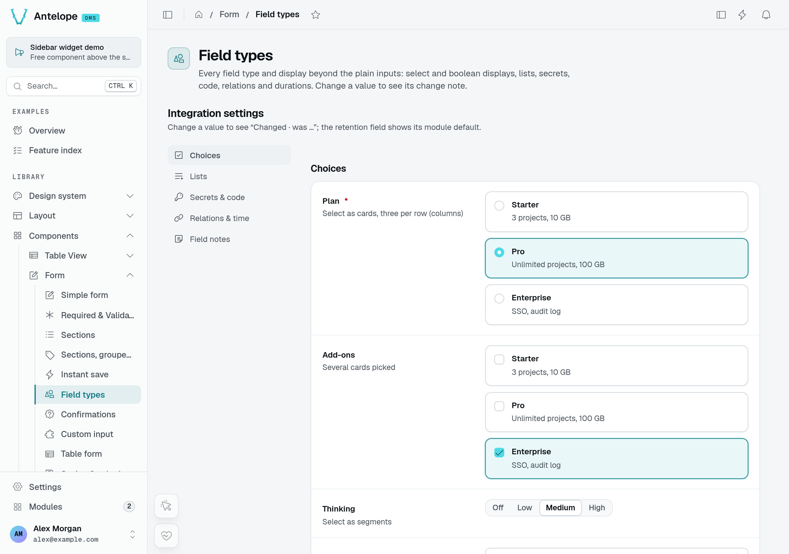
The Field types playground page uses cards for Plan and Add-ons, and segments for Thinking. This capture shows the actual available field width: the plan cards stack vertically here, despite the fixture's three-per-row description.
segmented and radio pick one value: a multiple select asking for either shows cards instead. Cards sit two per row once the field is 480px wide; SelectType({ display: "cards", columns: 3 }) keeps three options on one row instead of wrapping 2 + 1. FormComponents.InputChoiceCards takes the same columns, and so does DmsChoiceCards in a module's own input (:columns="3"). An option (SelectOption) takes label, value, and optionally description (the line cards and radios show), icon and disabled.
{
  id: "plan",
  label: "Plan",
  type: new DefaultDataTypes.SelectType({
    display: "cards",
    items: [
      { label: "Starter", value: "starter", description: "1 workspace, community support" },
      { label: "Team", value: "team", description: "10 workspaces, email support" },
    ],
  }),
  required: true,
},
Booleans: BooleanType({ display })
display | Renders |
|---|---|
switch (default) | A switch, with label and description beside it. |
checkbox | A box to tick, with label and description beside it. |
card | A bordered card: an icon, a title (label), a text (description) and a switch — for a choice that deserves more than a bare switch. |
A required boolean shown as a checkbox is an agreement ("I accept the terms"): only ticking it fills it, and the server validates it as true (z.literal(true)). A switch keeps false as a value, so a required switch accepts either. The same holds for a boolean whose inputComponent is FormComponents.InputCheckbox().
{ id: "terms", label: "Terms", required: true,
  type: new DefaultDataTypes.BooleanType({ display: "checkbox", label: "I accept the data processing terms" }) },
{ id: "owner", label: "Ownership",
  type: new DefaultDataTypes.BooleanType({ display: "card", icon: "i-ph-crown",
    label: "Make them a workspace owner", description: "Owners hold every permission and manage billing." }) },
Rows of fields: ArrayType
ArrayType edits a list of objects as a repeater: a row per item, a column per field — each drawn by its own type's input — a discreet ✕ per row and a "+ Add …" button.
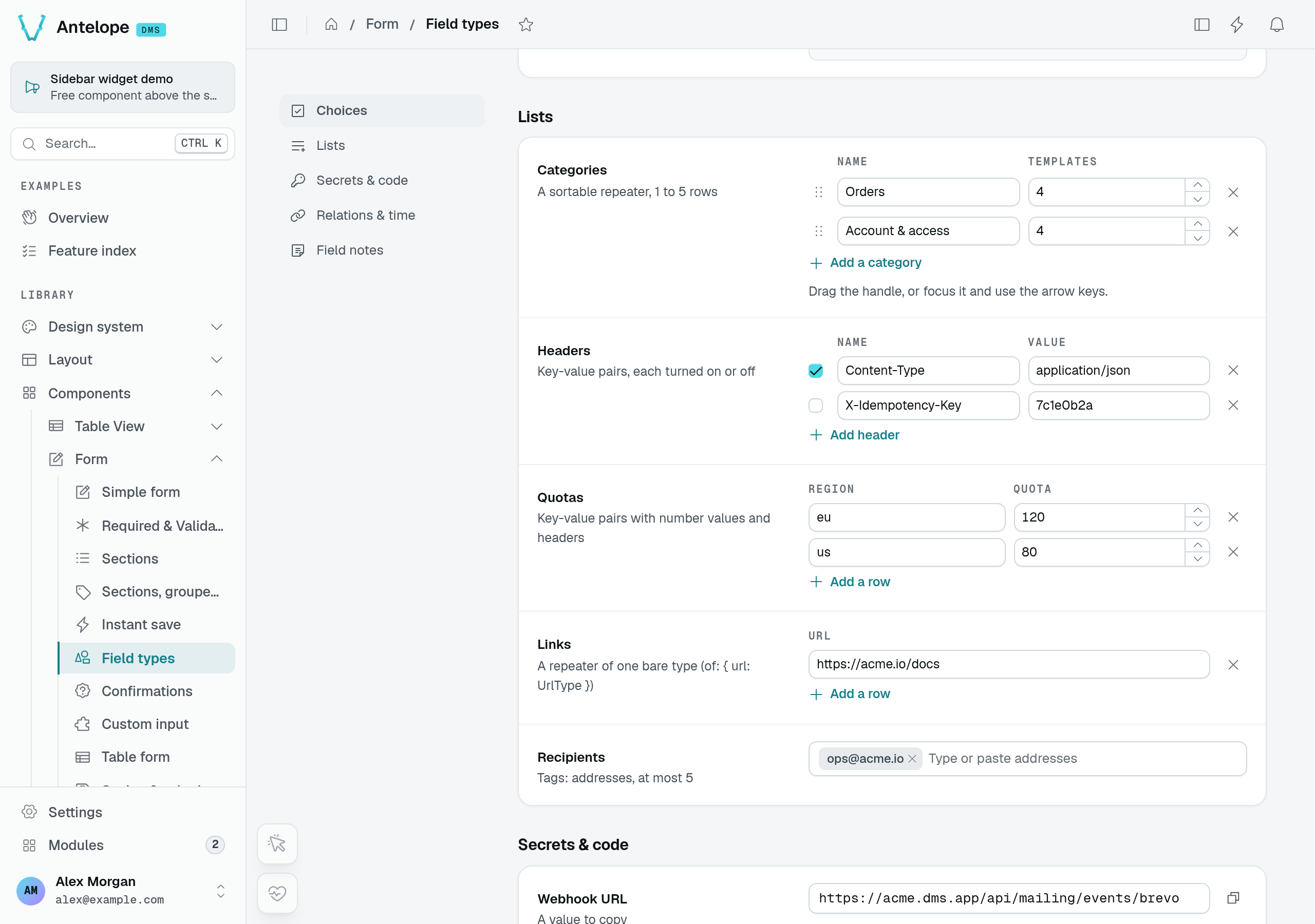
The playground's Categories repeater combines a name and a numeric template count per row. Headers and region quotas below use the same row-oriented editing pattern.
{
  id: "categories",
  label: "Categories",
  type: new DefaultDataTypes.ArrayType({
    of: {
      name: { type: new DefaultDataTypes.StringType(), label: "Name", required: true },
      templates: { type: new DefaultDataTypes.NumberType({ min: 0 }), label: "Templates" },
    },
    sortable: true,
    min: 1,
    max: 5,
    addLabel: "Add a category",
  }),
},
| Option | Type | Purpose |
|---|---|---|
of | Record<string, DataType | { type; label?; required? }> | The fields of a row, by key; label heads the column (the key otherwise). Required. |
sortable | boolean | A ⋮⋮ handle reorders the rows, by drag or with the arrow keys on it. |
min | number | Fewest rows: ✕ is disabled at min. |
max | number | Most rows: "+ Add …" is hidden at max. |
addLabel | string | Label of the add button (i18n key or literal). |
The value is the list of objects ([{ name, templates }, …]). Each cell is a form input: an error on categories.2.name turns that cell red, shows under the field and joins the validation summary.
Name and value pairs: KeyValueType
KeyValueType edits pairs of a name and a value — headers, labels, environment variables — on the same repeater, with two columns. The value is an object, a key per pair.
| Option | Type | Purpose |
|---|---|---|
valueType | DataType | Type of the values; a text by default. |
toggleable | boolean | A box per row turns the pair on or off: each value becomes { value, enabled }. |
addLabel | string | Label of the add button. |
keyLabel | string | Header of the name column ("Name" by default). |
valueLabel | string | Header of the value column ("Value" by default). |
A value without a name, or a name given twice, is refused under the field.
Secrets: SecretType
SecretType is a secret the module hands to the user: an API key, a webhook signing secret. The input shows it masked but its last four characters (••••f3a9); Show reveals it and the copy button copies it, in the browser.
| Option | Type | Default | Purpose |
|---|---|---|---|
revealable | boolean | true | Offer Show. |
copyable | boolean | true | Offer the copy button. |
rotateUrl | string | — | Offer Rotate…: after a confirmation, the form POSTs to this URL and the field takes the value of its { value } answer. Takes {{params.X}} / {{query.X}}, so an edit form names its record (/api/webhooks/{{params.id}}/rotate); Rotate is not offered while one has no value. |
placeholder | string | — | Placeholder of an empty secret. |
{ id: "webhookSecret", label: "Webhook secret",
  type: new DefaultDataTypes.SecretType({ rotateUrl: "/api/webhooks/rotate" }) },

// on the API controller
@Post("rotate")
rotate() {
  const value = `whsec_${randomBytes(24).toString("hex")}`;
  // …store it
  return { value };
}
A value to copy: StringType({ copyable: true })
A string with copyable: true is shown read-only with a copy button — a webhook URL, an endpoint, an id. Its filter in a table stays a text input.
Code: CodeType
CodeType stores text edited in a code editor: line numbers, highlighting in the theme's colours, the current line, a status line with the language and Ln/Col, and an autocomplete (Ctrl+Space) merging the language's keywords with the module's suggestions. The editor loads on demand, in its own chunk: until then, and in the server render, the code shows as is.
| Option | Type | Default | Purpose |
|---|---|---|---|
language | "json" | "sql" | "html" | "javascript" | "text" | — | Language highlighted. Required. |
lineNumbers | boolean | true | The gutter numbering the lines. |
minLines | number | — | Height of the editor, in lines, before it grows with its text. |
maxLines | number | — | Lines shown before the editor scrolls. |
completions | { label; detail?; icon? }[] | — | Suggestions of the module. |
completionsUrl | string | — | GET, fetched once, answering { items } (or a list) of { label, detail?, icon? }: suggestions listed first. Takes {{params.X}} / {{query.X}}; nothing is fetched while one has no value. |
placeholder | string | — | Placeholder of an empty editor. |
With language: "json", text that does not parse is refused under the field as you type, and by the server.
{ id: "query", label: "Query",
  type: new DefaultDataTypes.CodeType({
    language: "sql",
    minLines: 3,
    completions: [{ label: "invoices", detail: "table", icon: "i-ph-table" }],
    completionsUrl: "/api/database/completions",
  }) },
Tags: TagsType
TagsType is a list of short texts typed as tags: a pill per item. Commas, semicolons and spaces end an item, typed or pasted; duplicates are ignored (addresses compared in lower case).
| Option | Type | Default | Purpose |
|---|---|---|---|
itemType | "string" | "email" | "string" | With email, an item that is no address shows as a red pill with a message, and blocks the submit. |
max | number | — | Most items. |
suggestions | string[] | — | Offered as the user types. |
placeholder | string | — | Placeholder of the input. |
The value is a list of texts. A server error naming offending items ({ message, field, values }) turns those pills red. The invite form's addresses use TagsType({ itemType: "email", max: 50 }).
In tables and read-only forms
The same types read in a table cell, an expanded row or a read-only form: a repeater and a key-value field as a count ("3 rows", "2 entries"), a secret masked (••••f3a9), code as its first line, tags as pills. In a table filter, the new types offer is_empty and is_not_empty, a select keeps its dropdown whatever its display, and a boolean its checked/unchecked select.