Field notes
A field row says more than its label and its control. Under the control, the form draws short notes: a help line the module writes, the value a pending change replaces, the module's default, or why a value cannot be edited here. Declare them on the field; the form decides when each shows.
fields: [
  {
    id: "retention",
    label: "Keep history for",
    type: new DefaultDataTypes.NumberType({ min: 1, max: 365 }),
    defaultValue: 30,
    hint: "Older entries are deleted every night.",
  },
  {
    id: "email",
    label: "Email",
    type: new DefaultDataTypes.EmailType(),
    readonly: {
      badge: { label: "Verified", tone: "success" },
      link: { label: "Change in Security", to: "/settings/user/security" },
    },
  },
],
Help line: hint
hint (an i18n key or a literal) is a grey line under the control. It describes the control to assistive technology too (aria-describedby). While the field has an error, the error takes its place.
hint differs from description, which sits under the label: use description for what the field is, hint for what happens with the value.
Pending change: "Changed · was X"
While a field holds a value it did not load with (or last save), a "Changed · was 30" line shows under it, worded by the field's type ("was empty" for a field that had none). Values that do not fit a line — a password, code, rich text — say "Changed" alone. It needs nothing declared and shows only while a change waits for its save: not in an instant form, nor in an action form.
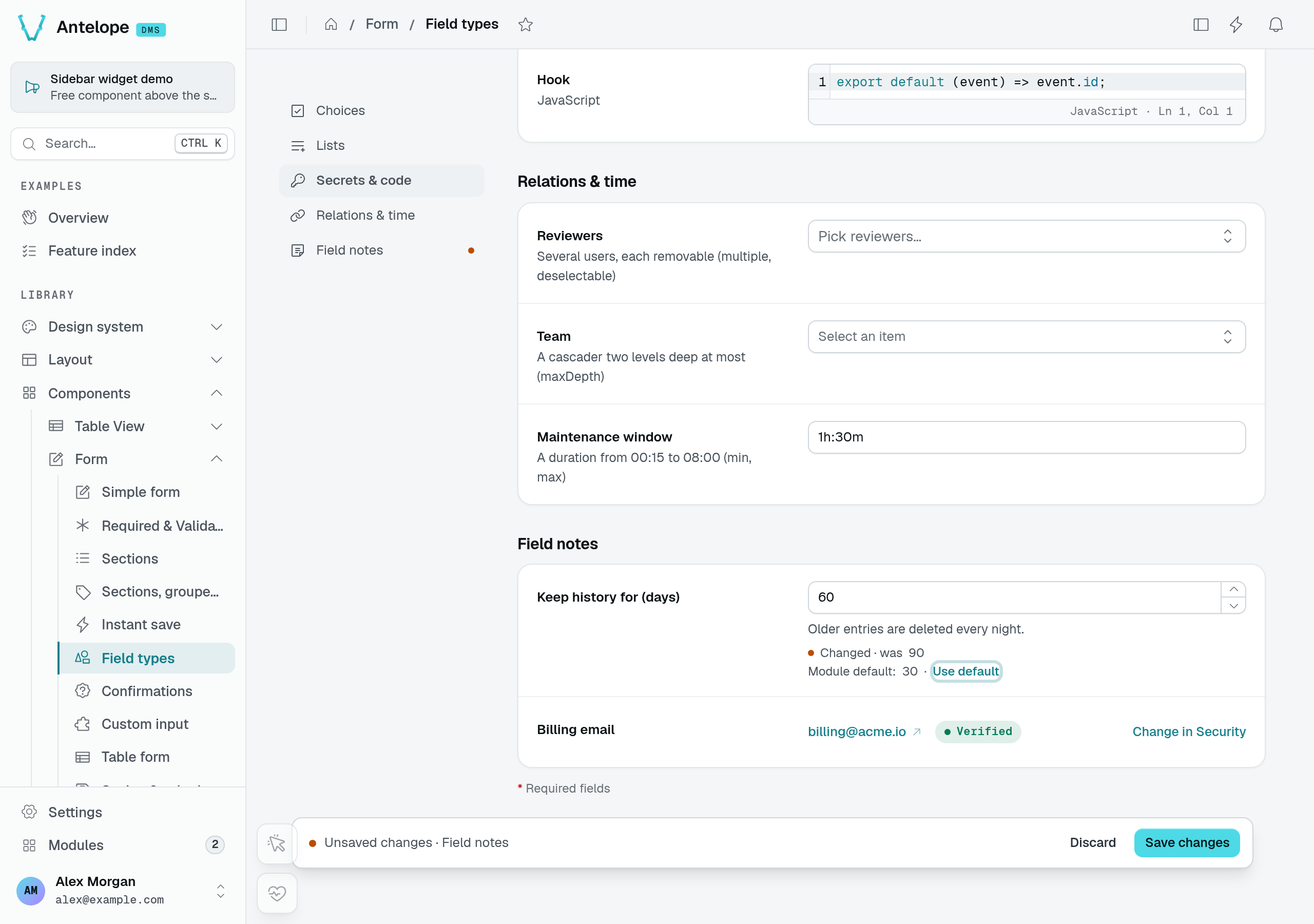
The Field types playground page shows three distinct facts together: 90 is the loaded value, 60 is the pending value, and 30 is the module default. The billing email below is read-only, with a Verified badge and a link to its editing page.
Module default: "Use default"
A field declaring a defaultValue that holds something else shows "Module default: 30 · Use default"; Use default puts the default back (as an unsaved change). On a new record, defaultValue is the value the field starts with. A disabled field offers no Use default.
Read-only values: readonly
readonly: true shows the value with its type's display, not an input: it is not edited, and not marked required. To say why, or where it is changed, give an object:
| Property | Type | Purpose |
|---|---|---|
badge | { label: string; tone: Tone } | A pill beside the value ("Verified", "Managed by SSO"). |
link | { label: string; to: string } | A link to where the value is changed. |
label is an i18n key or a literal; tone is one of the seven tones. Unlike disabled, which greys an input out, readonly presents a value the user is not meant to edit on this form.