Custom inputs
Replace a field's input with a component of your own, and keep its validation, its error and its save.
A Form field draws the input of its data type. To draw it another way, give the field an input component of your own. The field keeps its validation, its error message and its place in the save.
Overriding the input component
Each field renders the input its DataType chooses. Set inputComponent to override it with a factory from the FormComponents namespace (same import as Form), each taking its own options object:
- Text and numbers:
InputText,InputTextarea,InputEmail,InputPassword,InputPhone,InputNumber,InputPercentage,InputSlider,RichText. - Choices:
InputSelect,InputRadioGroup,InputSwitch,InputCheckbox,InputCascader,InputRelation. - Dates and times:
DatePicker,DatePickerRange,Calendar,InputTime. - Media and specialized:
File,Image,InputColor,InputAddress.
Prefer configuring the DataType; reach for inputComponent only when you need a different control than the type's default.
A module's own input
An inputComponent may also name a component of the module's frontend layer. It receives the field's id (give it to its control, so the error summary and the field's anchor find it), v-model, disabled and its own options as props. What it needs of the form it sits in, it asks useEnclosingForm(), auto-imported, rather than the DOM (closest("form"), requestSubmit()):
| Member | Type | Contract |
|---|---|---|
submit() | () → Promise<void> | Submits the form as its save button does: validation, the validators, then the request. A refused submit shows its errors. |
addValidator(validator) | (() => boolean) → () => void | Runs validator before each submit; false stops the submit before anything is sent. Removed with the component, or by calling the returned function. |
focusField(fieldId) | (string) → Promise<void> | Brings a field of the form into view and focuses its control (a group's first focusable part). |
useEnclosingForm() returns null outside a Form. A field that asks before a save, then saves once confirmed:
const form = useEnclosingForm();
const { confirm } = useConfirm();
let confirmedValue: number | null = null;

form?.addValidator(() => {
  if (!isLowered.value || confirmedValue === model.value) return true;
  void confirm({ title: "Delete older logs?", color: "error" }).then((accepted) => {
    if (!accepted) return;
    confirmedValue = model.value ?? null;
    void form.submit();
  });
  return false;
});
A number the field adjusted
DmsInputNumber, the number control a module's own input can draw, keeps a typed value within its min and max when the user leaves it or presses Enter: 250 typed in a field of max: 100 becomes 100. Its step only drives the steppers and the arrow keys: a value is never put on it, typed or loaded (9,692 stays 9,692 with steps of 100), unless the control is given stepSnapping: true, where 1020 typed in a field of steps of 50 becomes 1,000. It then shows the value it kept, never the one typed, and emits adjust with an InputNumberAdjustment (auto-imported type):
| Member | Type | Contract |
|---|---|---|
typed | number | The number as typed, read in the field's locale ("1,020"). |
value | number | The number the field keeps, already in v-model. |
reason | "min" · "max" · "step" | Above max, below min, or off step (stepSnapping only). |
Nothing is emitted when the field keeps what was typed, or when nothing was typed since it last settled. With clamp: false the field keeps a value outside min / max and reports it as its error, so only "step" can be emitted. A custom field says why its value changed with a note under the control, cleared once the value changes again:
<script setup lang="ts">
const model = defineModel<number | null>();
const adjustment = ref<InputNumberAdjustment | null>(null);
const { formatNumber } = useRegionalFormat();

watch(model, (value) => {
  if (value !== adjustment.value?.value) adjustment.value = null;
});
</script>

<template>
  <DmsInputNumber v-model="model" :min="0" :max="5000" :step="50" @adjust="adjustment = $event" />
  <p v-if="adjustment" class="text-muted text-xs" role="status">
    {{ formatNumber(adjustment.typed) }} → {{ formatNumber(adjustment.value) }}
  </p>
</template>
Custom input in a real form
The example below uses RetentionInput.vue, a component of the DMS playground's frontend layer. It binds a numeric model to DmsInputNumber, reports control errors with useControlError, and asks the enclosing form to confirm a reduction before submitting.
Form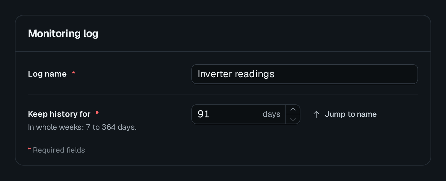
It keeps the number in whole weeks from 7 to 364 days:
- Type 400 and leave the input: it sets 364, and its
adjusthandler explains the correction. The enclosing form still owns the pending value and its save state. - Type 10: the control reports an error, because 10 days is not a whole number of weeks.
- Lower the loaded 91 days to 14 and save: a confirmation opens before the form submits.
See Custom component for rendering a module component, Frontend layer for installing its Vue code, and Component events for the surrounding event system.