Dashboard chrome
The dashboard shell is the UI around your page: navigation, header, search, footer, and optional panels. A frontend layer adds an item by calling its register function from a plugin. The shell renders that item without changes to the DMS itself.
One piece of chrome is registered from the backend instead: layout banners, whose visibility has to be decided on the server for each request.
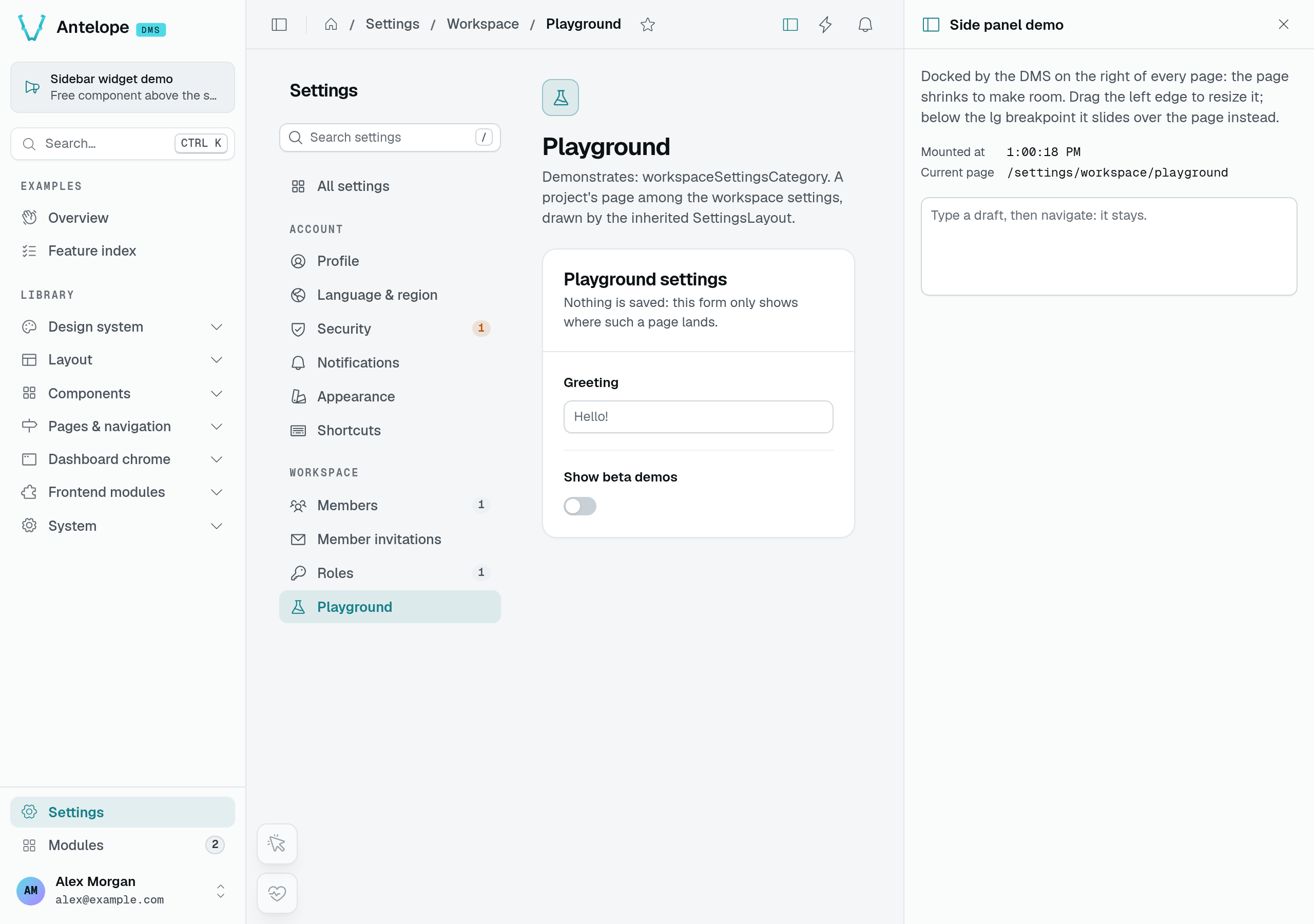
The screenshot shows the existing playground demo, not a panel installed by default. For this pattern, pair a header action with a side panel. Use an app widget for a floating framed tool, or an overlay when your component owns its positioning.
Header actions
registerHeaderAction adds an icon-only button to the right of the dashboard header navbar — the strip that already holds quick actions and notifications.
Signature
registerHeaderAction(action: HeaderAction): void
useHeaderActions(): { actions: ComputedRef<HeaderAction[]> }
Config shape
| Field | Type | Required | Notes |
|---|---|---|---|
id | string | yes | Stable key; re-registering the same id replaces the entry. |
icon | string | yes | Icon name (e.g. i-ph-cloud-arrow-up-light). The button is icon-only. |
label | string | yes | Tooltip and aria-label. A $-prefixed value resolves as an i18n key. |
onSelect | () => void | one of | Run on click. |
sidePanelId | string | one of | The side panel the button opens and closes. Takes precedence over onSelect. |
order | number | no | Sort key, ascending. Defaults to 100. |
isVisible | () => boolean | no | Re-evaluated reactively; omit to always show. |
isActive | () => boolean | no | Makes the button a toggle and reports whether it is on. Derived from the side panel with sidePanelId. |
Active state — a toggle (an action with isActive or sidePanelId) renders engaged while it is on: color="primary" instead of the muted toolbar style, with aria-pressed set. Every action gets the same treatment, the builder's included. With sidePanelId, the DMS reads the state and runs the click through useSidePanel, so the module wires nothing.
When/where to call — An action linked to a side panel by sidePanelId, without callables, is plain data: register it from an ordinary plugin, and the server renders the button and its state. An action carrying callables (onSelect, isVisible, isActive) must be registered from a .client plugin, since the SSR payload would drop them. The server does not render a button carrying a callable: it joins the header once the page has hydrated. The consumer filters out any entry left with neither a callable onSelect nor a sidePanelId, so a stray server-side registration degrades to "button not shown" rather than a crash.
Where it renders — DashboardHeader.vue, in the navbar #right slot, as a UButton with variant="ghost". Visible entries are sorted by order.
Example
export default defineDmsPlugin(() => {
  registerHeaderAction({
    id: "my-module:sync",
    icon: "i-ph-arrows-clockwise-light",
    label: "$my_module.sync",
    order: 50,
    onSelect: () => {
      // trigger your action
    },
  });
});
For a button that toggles a side panel, see the side panel example.
Layout banners
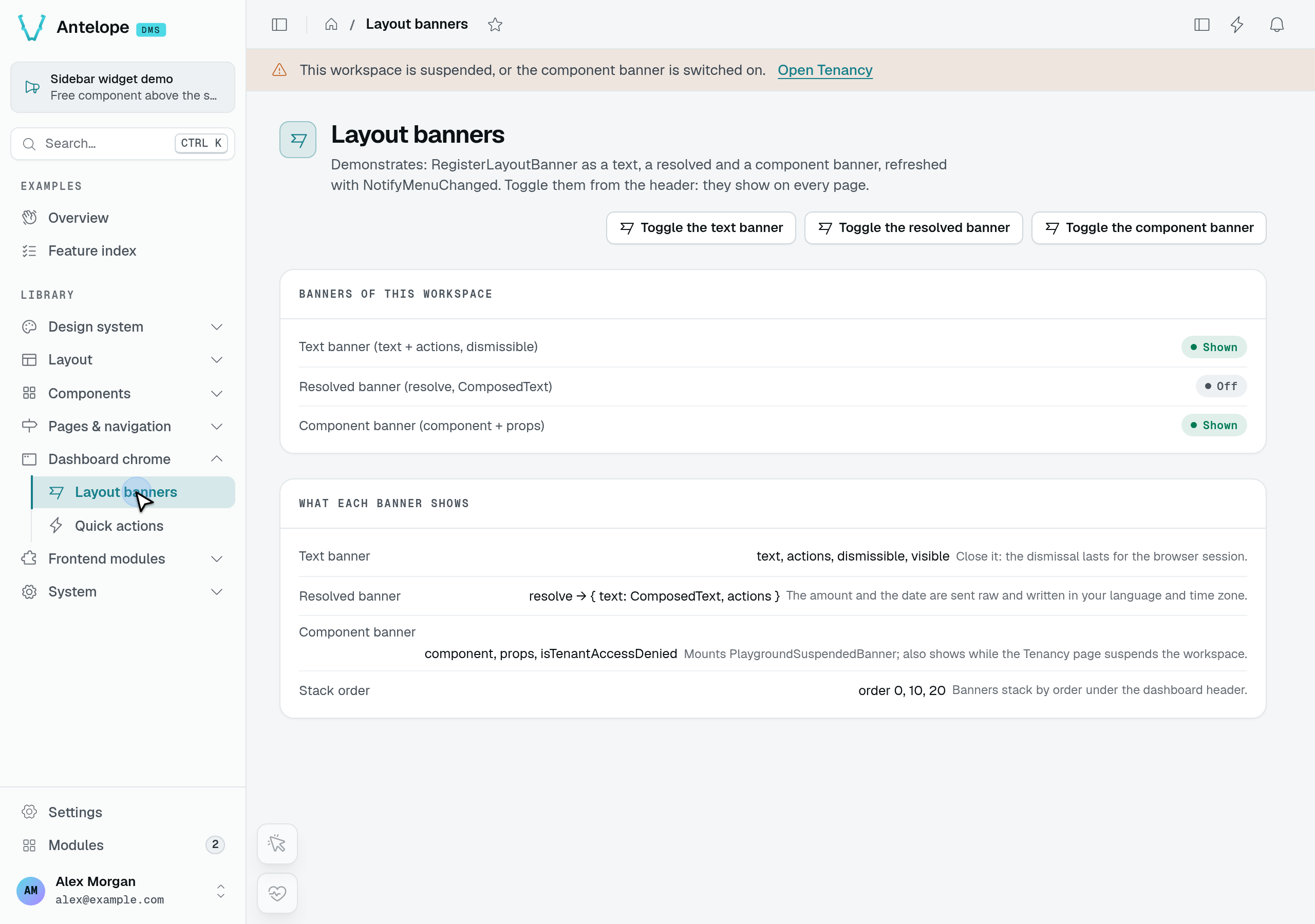
A layout banner is a global message stacked under the header navbar. By default it shows on the application's pages and stays out of the module area under /modules (the modules page, the module store and the module back-office pages); a banner reporting a workspace-wide state — billing past due, a suspended workspace — sets scope: LayoutBannerScope.EVERYWHERE to follow the user there too. Unlike the rest of this chapter, a banner is registered by a backend module with RegisterLayoutBanner from @antelopejs/interface-dms/layout-banners: its visible resolver runs on the server for each site layout request, so the banner is in the server-rendered page and never flashes in after hydration.
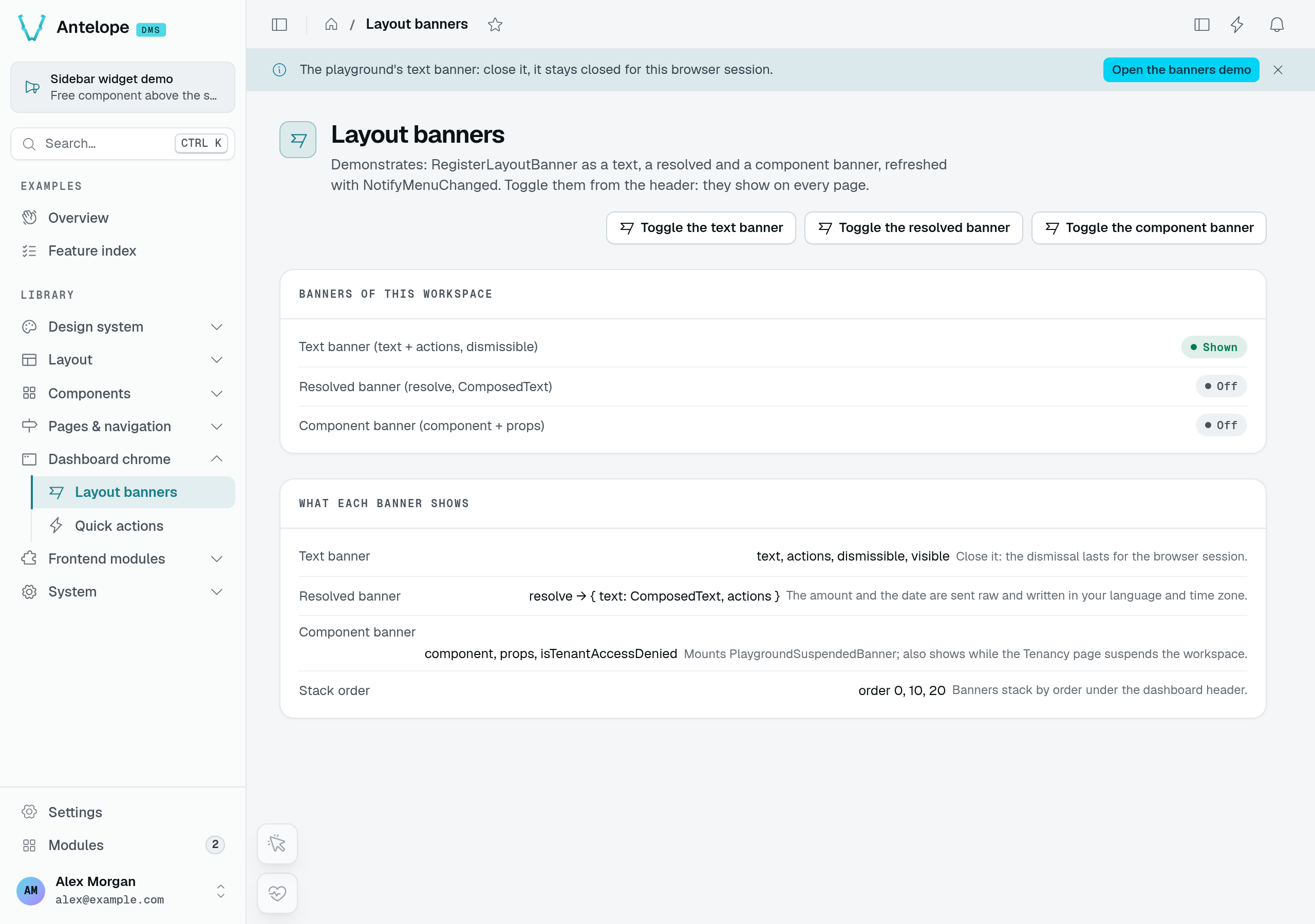
The playground's Layout banners page toggles a real backend registration. The text banner has a link and a close button; the component variant below mounts PlaygroundSuspendedBanner. The suspension message is demo content, not evidence that tenant access has been denied.
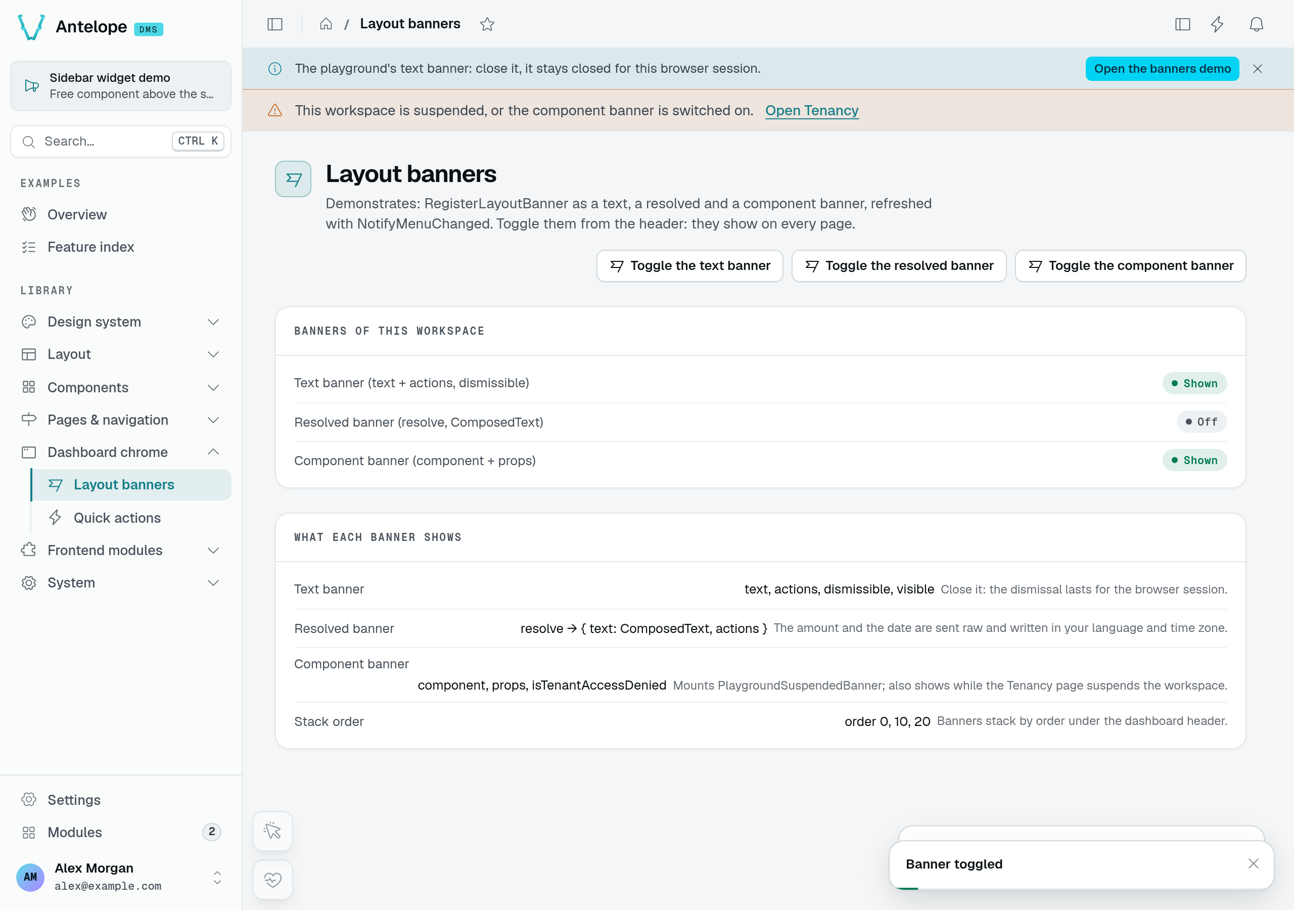
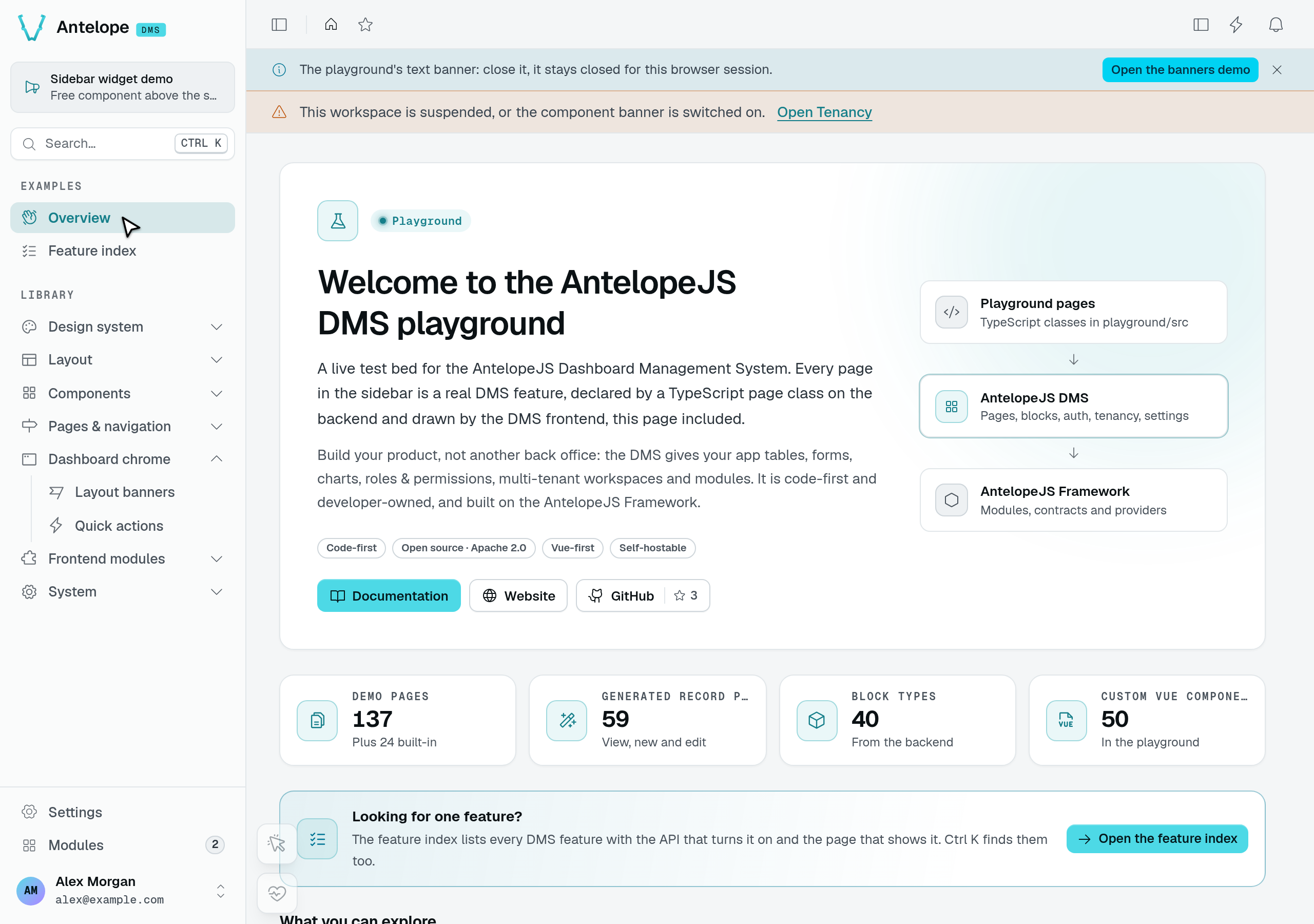
The banners remain under the header after navigation to Overview. Close the text banner and return to Layout banners: it stays dismissed for this browser session, while the component banner remains. The status list still says Shown because the backend registration is enabled; dismissal belongs to this browser, not to that registration.
import {
  LayoutBannerScope,
  LayoutBannerVariant,
  RegisterLayoutBanner,
} from "@antelopejs/interface-dms/layout-banners";

RegisterLayoutBanner({
  key: "my-module:past-due",
  variant: LayoutBannerVariant.ERROR,
  // A workspace-wide state: also shown inside /modules.
  scope: LayoutBannerScope.EVERYWHERE,
  component: "MyModulePastDueBanner", // or `text: "$my_module.banner"`
  order: 10,
  visible: async ({ tenantId, isOwner }) =>
    isOwner && (await isPastDue(tenantId)),
});
When the message names the state that makes the banner show — "Invoice INV-42 of €29.00 failed, retry Oct 10" — register resolve instead of visible: it answers per request a composed text and link buttons, or undefined to hide the banner, and the browser writes the amount and the date in the reader's language. No frontend component is needed for that case.
RegisterLayoutBanner({
  key: "my-module:past-due",
  variant: LayoutBannerVariant.ERROR,
  scope: LayoutBannerScope.EVERYWHERE,
  resolve: async ({ tenantId }) => {
    const invoice = await openInvoice(tenantId);
    if (!invoice) return undefined;
    return {
      text: {
        key: "my_module.banner.past_due",
        params: {
          invoice: invoice.number,
          amount: { type: "money", value: invoice.amountDue, currency: invoice.currency },
          date: { type: "date", value: invoice.nextAttemptAt, format: "day" },
        },
      },
      actions: [{ label: "$my_module.banner.pay", to: "/billing?pay=1" }],
    };
  },
});
Where it renders — DashboardBanners.vue, in the dashboard panel's header slot right under DashboardHeader.vue, full width. The DMS draws the chrome: the variant's color and icon, a close button when dismissible is set, and the live-region role — alert for error, status for info and warning. A component banner mounts your global component as the content, with the banner's props bound to it.
Scope — the site layout carries every banner with its scope, and useLayoutBanners() keeps the ones whose scope covers the current route, on the server-rendered page and again on each client-side navigation. Opening a module page removes the app banners without a refetch, and coming back brings them back. A banner registered without scope is an app banner: before the option existed, every banner also showed inside /modules.
Dismissal — a dismissible banner stays closed for the browser session. The dismissed keys live in the dms-dismissed-banners cookie, which the server-side render reads as well, so a closed banner does not come back on the next page.
Height — banners stack in the panel's header, above the part of the panel that scrolls, so the height they take comes out of the page, not out of the window. A page that fills the panel (fillHeight) gets shorter by that much instead of scrolling, and grows back as soon as the banner is dismissed. A page that sizes itself from the viewport, with calc(100vh - …), knows nothing of the banner and scrolls under it.
The full contract — every field, the resolver context, the timeout and how to refresh connected clients with NotifyMenuChanged — is in the Layout Banners reference.
Command palette sources
registerCommandPaletteSource contributes groups of commands to the Ctrl/Cmd+K palette (UDashboardSearch). Each source is a reactive builder of Nuxt UI CommandPaletteGroup arrays; the palette aggregates every registered source, in source order.
Signature
registerCommandPaletteSource(source: CommandPaletteSource): void
unregisterCommandPaletteSource(id: string): void
useCommandPaletteGroups(): { groups: ComputedRef<CommandPaletteGroup[]> }
Config shape
| Field | Type | Required | Notes |
|---|---|---|---|
id | string | yes | Stable key; re-registering the same id replaces the entry, and unregister targets it. |
order | number | no | Position of this source's groups relative to other sources, ascending. Defaults to 100. |
groups | () => CommandPaletteGroup[] | yes | Builds the groups. Evaluated inside a computed, so any reactive state read here updates the palette automatically. Return [] when there is nothing to show. |
Prefix your group ids with your source id: group ids are global to the palette, and a collision silently merges the colliding groups' items under the first group's header. order applies to the initial (empty-search) view — while the user types, the palette reorders groups by match relevance.
An item may also carry a non-rendered searchText field (the COMMAND_PALETTE_SEARCH_TEXT_KEY constant): it joins the fuzzy-match corpus, weighted below label and suffix, and is stripped before the item renders — matching on it never replaces the breadcrumb shown. This is how the built-in navigation source matches on page descriptions; use it for keywords an item should answer to without displaying them.
When/where to call — From a .client plugin: the source carries callables (groups, item onSelect), which the SSR payload would drop. The consumer filters out any entry whose groups is not a function, so a stray server-side registration degrades to "commands not shown" rather than a crash. A source whose groups getter throws is skipped and logged, so it cannot take the other sources down with it.
Where it renders — DashboardSearch.vue feeds the aggregated groups to UDashboardSearch, opened from the sidebar search or Ctrl/Cmd+K.
Built-in sources — the DMS registers four; pick an order around them to position your groups:
| Source | Order | Groups it contributes |
|---|---|---|
Quick actions (dms-quick-actions) | 10 | Backend-registered quick actions, one group per category; the server sends only what the caller can run |
Personal pages (dms-personal-pages) | 20 | The user's favorite pages, and recently visited modules resuming at their last path |
Navigation (dms-navigation) | 40 | The whole nav tree flattened into breadcrumbed links (access-filtered; broader than the sidebar) |
Session (dms-session) | 50 | Profile / settings / switch-account, a language submenu, copy-current-URL, and logout |
Example
export default defineDmsPlugin(() => {
  const { tasks } = useMyTasks(); // any reactive state

  const groups = computed(() => [
    {
      id: "my-module-tasks",
      label: "Tasks",
      items: tasks.value.map((task) => ({
        label: task.title,
        icon: "i-ph-check-square-light",
        to: `/modules/tasks/${task.id}`,
      })),
    },
  ]);

  registerCommandPaletteSource({
    id: "my-module:tasks",
    order: 30, // between personal pages (20) and navigation (40)
    groups: () => groups.value,
  });
});
Memoize your groups in your own computed (as above) and return it from groups — each source then only re-runs its builder when its own dependencies change. Labels coming from backend metadata may be $-prefixed i18n keys; resolve them with getAppTranslation().processI18n since useI18n is unavailable in plugin context.
Command palette assistant
registerCommandPaletteAssistant gives the Ctrl/Cmd+K palette an assistant mode, provided by your module. While an assistant is registered:
- Tab in the palette's input switches the same dialog between search and assistant mode. Assistant mode takes the violet
secondaryaccent: the input's lead icon becomes youricon, the placeholder becomes yourplaceholder, the dialog's halo turns violet, and the footer's "Ask AI" button reads "Back to search". A screen reader announces each switch. Shift+Tab is left alone, so focus still moves through the dialog. - Every non-empty search ends with an "Ask the assistant “query”" item, after the search results. When nothing matches, it is the only item and is highlighted, so Enter asks the assistant.
- In assistant mode, an empty prompt lists your suggestions ("Try asking"). Once the user types, the prompt heads the list as its first item, so Enter sends it; the suggestions stay below it, reachable with the arrow keys.
- A submitted prompt mounts your
answerComponentinside the palette, in a violet frame headed by yourlabel. Editing the prompt removes the answer.
Without an assistant, the palette has no assistant mode at all: Tab moves focus as before and no item is added.
Signature
registerCommandPaletteAssistant(assistant: CommandPaletteAssistant): void
unregisterCommandPaletteAssistant(id: string): void
useCommandPaletteAssistant(): { assistant: ComputedRef<CommandPaletteAssistant | undefined> }
Config shape (CommandPaletteAssistant)
| Field | Type | Required | Notes |
|---|---|---|---|
id | string | yes | Stable key; re-registering the same id replaces the entry, and unregister targets it. |
label | string | yes | Name shown in the answer frame and as the "Ask" items' group header. A $-prefixed value resolves as an i18n key. |
icon | string | yes | Icon of the assistant mode: the input's lead icon and the items' well (e.g. i-ph-sparkle). |
placeholder | string | no | Input placeholder in assistant mode; $-prefixed for an i18n key. Defaults to "Ask anything about your workspace…". |
suggestions | () => CommandPaletteAssistantSuggestion[] | yes | Builds the suggestions shown while the prompt is empty. Evaluated inside a computed, so reactive state read here updates them. |
answerComponent | string | yes | Full registered name of the global component that answers a submitted prompt. |
A suggestion is { label, prompt?, icon? }: label is shown ($-prefixed for an i18n key), prompt is what gets submitted (defaults to the resolved label), and icon defaults to the assistant's.
The answer component receives CommandPaletteAssistantAnswerProps and is mounted afresh for every submission:
| Prop | Type | Notes |
|---|---|---|
prompt | string | The submitted prompt, trimmed. |
close | () => void | Closes the palette. Call it before an action that takes the user elsewhere. |
The palette only frames the answer; what the component does with the prompt is yours to decide — answer it inline and read-only, or hand it off to your own interface ("Continue in the assistant"). Keep actions explicit buttons rather than running them on submit. Loading is expressed through Vue's async setup: a component whose setup awaits (a top-level await in <script setup>) shows the palette's violet loading skeleton until it resolves, and a component that renders right away draws its own progress — the right choice when the answer streams in. A component whose async setup rejects, or a name that matches no registered component, shows "The assistant could not answer" in the frame instead.
When/where to call — From a .client plugin: suggestions is a function, which the SSR payload would drop; the palette ignores an entry that lost it. When several modules register an assistant, the palette uses the one registered last; unregister hands the mode back to the previous one, or removes it.
Where it renders — DashboardSearch.vue, in the same UDashboardSearch dialog as the sources: the suggestions and the prompt as palette groups, the answer in the palette's empty slot, the toggle in its footer.
Example
export default defineDmsPlugin(() => {
  registerCommandPaletteAssistant({
    id: "my-module:assistant",
    label: "$my_module.assistant.label",
    icon: "i-ph-sparkle",
    suggestions: () => [
      { label: "$my_module.assistant.suggestions.churn" },
      { label: "Late orders", prompt: "Which orders are late this week?" },
    ],
    answerComponent: "MyModulePaletteAnswer", // a global component from your layer
  });
});
<script setup lang="ts">
const props = defineProps<CommandPaletteAssistantAnswerProps>();
const router = useDmsRouter();

// Awaited in setup: the palette shows its skeleton until the answer is here.
const answer = await askMyModule(props.prompt);

function openConversation(): void {
  props.close();
  void router.push(`/modules/my-module/chat?q=${encodeURIComponent(props.prompt)}`);
}
</script>

<template>
  <p>{{ answer.text }}</p>
  <UButton class="mt-3" size="sm" color="secondary" @click="openConversation">
    Continue in the assistant
  </UButton>
</template>
The playground registers a demo assistant whose answer echoes the prompt after a short delay (playground/frontend-vue/app/plugins/command-palette-assistant-demo.client.ts).
App widgets (framed dock)
useAppWidgets().register(widget) adds a framed widget to the dock the dashboard anchors in the bottom-left corner of the page. The DMS owns the presentation: each widget renders as a low-opacity icon chip, stacked with the other widgets, and its body component unfolds into an animated card on hover or keyboard focus. Your module only declares metadata.
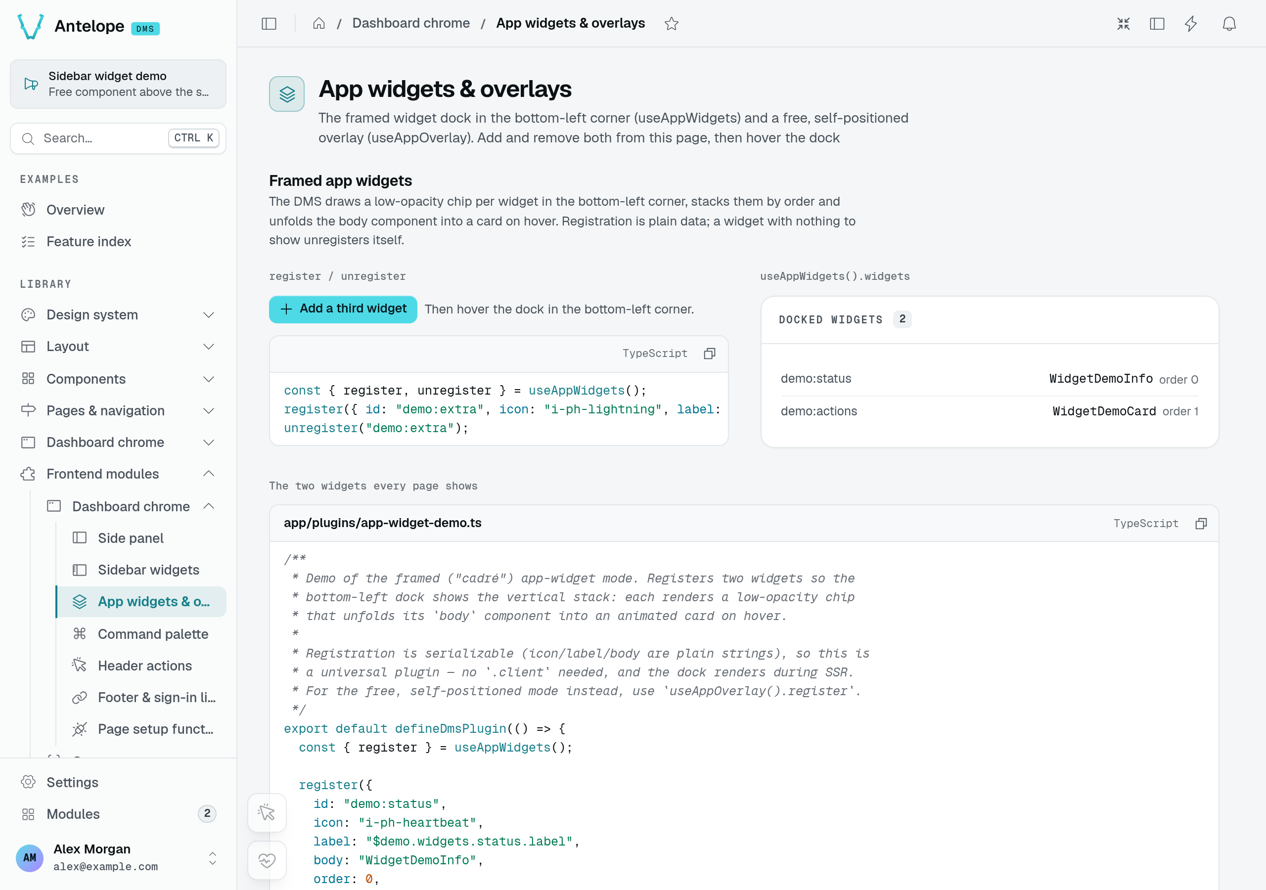
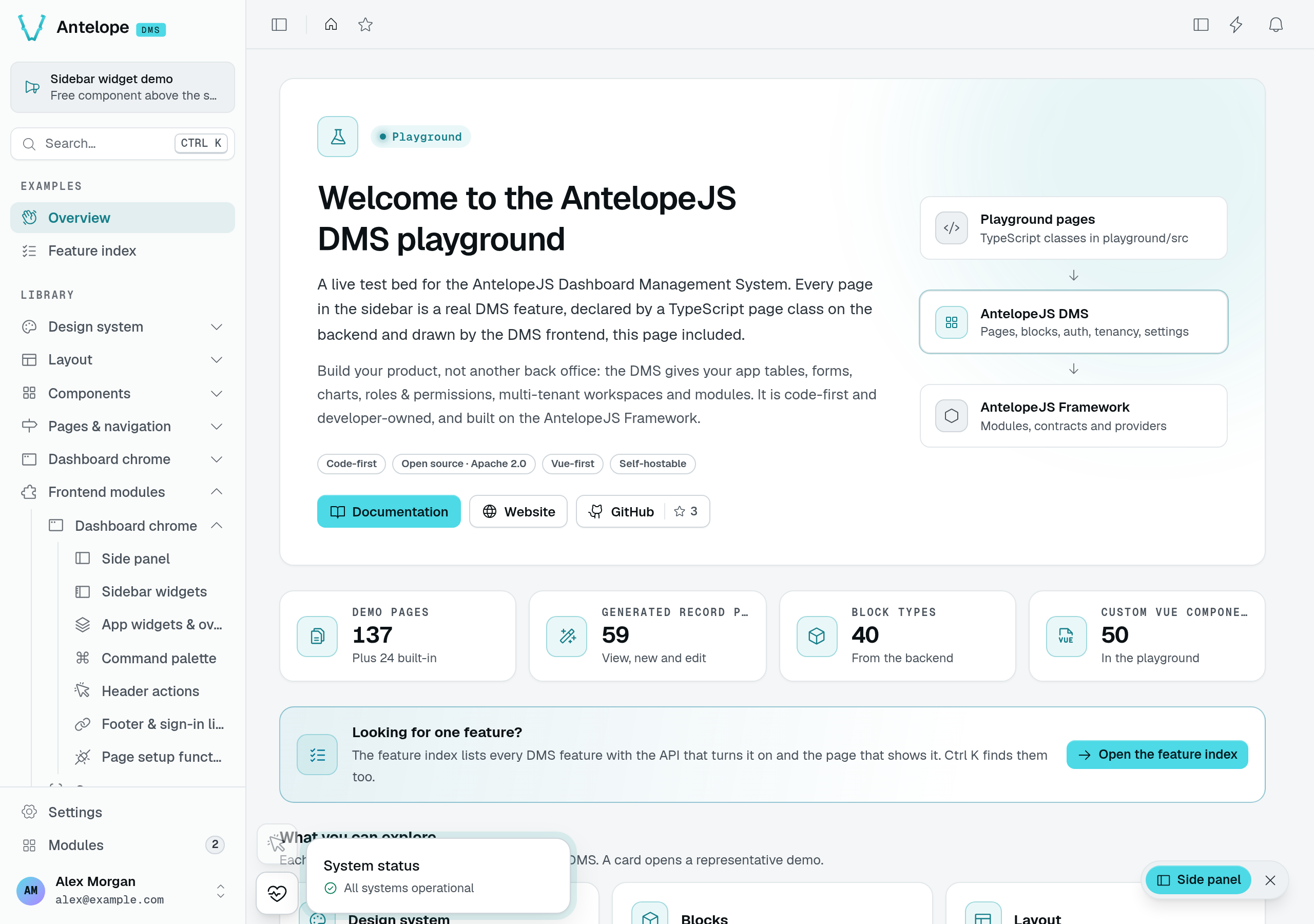
The playground registers System status and Demo actions. Hover System status to unfold its card; moving away collapses it again. The expanded capture below shows the same registered dock after navigating to Overview, with the independent free overlay also enabled.
Signature
useAppWidgets(): {
  widgets: Readonly<Ref<AppWidget[]>>;
  register: (widget: AppWidget) => void;
  unregister: (id: string) => void;
}
Config shape (AppWidget)
| Field | Type | Required | Notes |
|---|---|---|---|
id | string | yes | Stable key; re-registering the same id replaces the entry, and unregister(id) removes it. |
icon | string | yes | Icon name (e.g. i-ph-git-branch-light) shown in the dock chip. |
label | string | yes | Chip tooltip and accessible name. A $-prefixed value resolves as an i18n key (useTranslation().processI18n). |
body | string | yes | The global component name rendered inside the unfolded card. |
order | number | no | Stack order, ascending from the bottom. Defaults to 0; registration order breaks ties. |
When/where to call — From an ordinary plugin (no .client needed): every field is a serializable string. Conditional visibility is the widget's own responsibility — register when it has something to show, unregister(id) otherwise.
Where it renders — AppWidgetsDock.vue, an absolute stack in the bottom-left of the dashboard content panel. The chip lights up on hover/focus and the body card slides out to the right; the other chips stay put.
Example
export default defineDmsPlugin(() => {
  useAppWidgets().register({
    id: "my-module:status",
    icon: "i-ph-pulse-light",
    label: "$my_module.widget.label",
    body: "MyModuleStatusCard", // a global component from your layer
    order: 10,
  });
});
Sidebar widgets (free)
useSidebarWidgets().register(widget) mounts a free component in the sidebar. Unlike the framed dock, the DMS adds no chrome here: the component renders as-is, stacked with the other sidebar widgets, and scrolls with the sidebar content. Where it lands is the widget's own choice (position); when it renders is a separate axis (module).
Signature
useSidebarWidgets(): {
  widgets: Readonly<Ref<SidebarWidget[]>>;
  register: (widget: SidebarWidget) => void;
  unregister: (id: string) => void;
}
Config shape (SidebarWidget)
| Field | Type | Required | Notes |
|---|---|---|---|
id | string | yes | Stable key; re-registering the same id replaces the entry, and unregister(id) removes it. |
component | string | yes | The global component name to mount. It receives a collapsed: boolean prop reflecting the sidebar's state. |
position | SidebarWidgetPosition | no | Where the widget lands: SidebarWidgetPosition.ABOVE_SEARCH_BAR or SidebarWidgetPosition.BELOW_SEARCH_BAR. Defaults to the historical placement — below for a module-scoped widget, above otherwise. |
order | number | no | Stack order, ascending from the top, among the widgets sharing the same position — widgets at different positions render at different spots, so order cannot interleave them. Defaults to 0. Ties are broken by the widget's current index in the registry, which is not the same as when it was registered: re-registering an id keeps its index (even if the new order puts it in a different tie group), and unregister then register sends it to the end. Give tied widgets distinct values when the stack has to be deterministic. |
module | string | no | When set, the widget only renders while browsing inside that module (/modules/<id>/**). Omit to render in the global sidebar only — the widget is then hidden while browsing inside a module. Scoping only picks the default position; a widget that declares one keeps it either way. |
Import SidebarWidgetPosition, useSidebarWidgets, and their related types and helpers explicitly from #dms-layout/app/composables/useSidebarWidgets. resolveSidebarWidgetPosition(widget) returns the position a widget effectively renders at, defaults applied, and isSidebarWidgetVisible(widget, currentModuleId) answers whether it renders while browsing that module.
When/where to call — From an ordinary plugin (no .client needed): every field is serializable, so the widget renders during SSR. Module scoping is declarative via the module field; any other conditional visibility is the widget's own responsibility — render nothing when there is nothing to show, or unregister(id).
Where it renders — DashboardSidebar.vue, at the position the widget declares, in the sidebar's content area:
ABOVE_SEARCH_BAR— at the very top, directly below the logo and above the search button.BELOW_SEARCH_BAR— under the search button, and under the module title card as well while browsing inside a module, so a module widget reads as part of the module rather than of the chrome.
When it renders — independently of position, module gates visibility: a global widget (no module) only renders outside modules, and entering a module hides it; a module-scoped one only renders inside its own module. A widget stays registered when out of scope — it just never mounts — so registering once at boot is enough. Widgets coming from different layers keep a predictable stack by agreeing on order values: ordering spans the whole position, not each layer's own widgets.
Widgets keep rendering when the sidebar collapses to the icon rail: each one receives collapsed: boolean and adapts on its own (an icon-only variant, for example). Ignoring the prop is harmless, but the widget should at least not overflow the rail.
Example
export default defineDmsPlugin(() => {
  useSidebarWidgets().register({
    id: "my-module:announcement",
    component: "MyModuleAnnouncement", // a global component from your layer
    position: SidebarWidgetPosition.ABOVE_SEARCH_BAR, // or BELOW_SEARCH_BAR
    module: "my-module", // omit to render in the global sidebar only
    order: 10,
  });
});
<script setup lang="ts">
defineProps<{ collapsed?: boolean }>();
</script>

<template>
  <div
    class="rounded-md border border-default px-3 py-2"
    :class="{ 'px-0 text-center': collapsed }"
  >
    <UIcon name="i-ph-megaphone" />
    <span v-if="!collapsed">New release available!</span>
  </div>
</template>
Side panels (docked)
registerSidePanel docks a component of yours on the right of the dashboard, next to the page — an assistant, an inspector, a chat. Unlike an overlay, the panel does not cover the page: from the lg breakpoint the page shrinks to make room, and a resize handle on the panel's inner edge sets its width. Below lg, where the page cannot usefully shrink, the same panel slides over the page as a sheet above a backdrop.
The DMS owns the panel's state. The registration is plain data, and the panel opens and closes through useSidePanel(id), from anywhere: a header action, a command, the panel's own close button.
To open a table's row in a side panel, there is nothing to register: a row action with a sidePanel target uses the same panel, with a header the DMS draws (title, position among the rows, previous / next, close). See Row drawers.
Signature
registerSidePanel(panel: SidePanel): void
unregisterSidePanel(id: string): void
useSidePanel(id: string): {
  isOpen: Readonly<Ref<boolean>>;
  open: () => void;
  close: () => void;
  toggle: () => void;
}
useAppSidePanels(): { panels: Readonly<Ref<SidePanel[]>> }
Config shape (SidePanel)
| Field | Type | Required | Notes |
|---|---|---|---|
id | string | yes | Stable key; re-registering the same id replaces the entry, and unregisterSidePanel(id) removes it. useSidePanel(id) targets it. |
component | string | yes | The global component name rendered inside the panel. It fills the panel's height and scrolls its own content. |
ariaLabel | string | no | Accessible name of the panel landmark (<aside>). A $-prefixed value resolves as an i18n key. |
defaultWidth | number | no | Width in px before the user resizes the panel. Defaults to 440. |
minWidth | number | no | Narrowest width in px the handle allows. Defaults to 320. |
maxWidth | number | no | Widest width in px the handle allows. Defaults to 720. The docked panel never takes more than 60% of the viewport either. |
When/where to call — From an ordinary plugin (no .client needed): every field is serializable, so the panel is registered on the server as well, and a panel left open renders open in the server HTML.
Where it renders — once for the whole app, as an app overlay the DMS registers itself (SidePanelHost.vue), outside the routed layouts. The panel is position: fixed on the right; each dashboard frame keeps the panel's width free on its right from lg (the --dms-side-panel-width CSS variable), so the page shrinks next to it. The panel shows for a signed-in user on pages with the dashboard shell; a page without it (onboarding, an error page) hides the panel and keeps it mounted.
- One panel at a time — opening a panel closes the one that was open.
close()only acts on its own panel: closing a panel that is not the open one does nothing. - State — which panel is open, and the width each was given, live in the
dms-side-panelcookie. The server reads it, so a reload renders the open panel docked at its width, with no layout shift. - Width — dragging the handle, the arrow keys on the focused handle (
←widens,→narrows,Home/Endjump to the bounds), and a double click to reset todefaultWidth. The page follows the handle while it moves; the width is stored when the drag ends. - Navigation — the panel is rendered outside the layouts, so its component stays mounted across every navigation, including between the default and settings layouts.
- Focus — opened as a sheet, the panel takes focus unless its component already did; when it closes, focus goes back to where it was. A backdrop click or Escape closes the sheet. Docked, Escape is left to your component.
Example
export default defineDmsPlugin(() => {
  registerSidePanel({
    id: "my-module:assistant",
    component: "MyModuleAssistantPanel", // a global component from your layer
    ariaLabel: "$my_module.assistant.label",
    defaultWidth: 440,
  });

  registerHeaderAction({
    id: "my-module:assistant",
    icon: "i-ph-sparkle-light",
    label: "$my_module.assistant.toggle",
    sidePanelId: "my-module:assistant", // the DMS toggles it and shows it active
  });
});
<script setup lang="ts">
const { close } = useSidePanel("my-module:assistant");
</script>

<template>
  <div class="flex h-full flex-col">
    <header class="flex items-center justify-between p-4">
      <h2>Assistant</h2>
      <UButton icon="i-ph-x-light" variant="ghost" @click="close" />
    </header>
    <!-- … -->
  </div>
</template>
App overlays (free)
useAppOverlay().register(name) registers a global component by name that renders persistently on every page, with no chrome at all — the component is mounted naked and positions itself (typically position: fixed). Use it for floating action buttons, status bubbles, or anything the framed dock doesn't fit. Because it lives outside the routed page, it survives navigation.
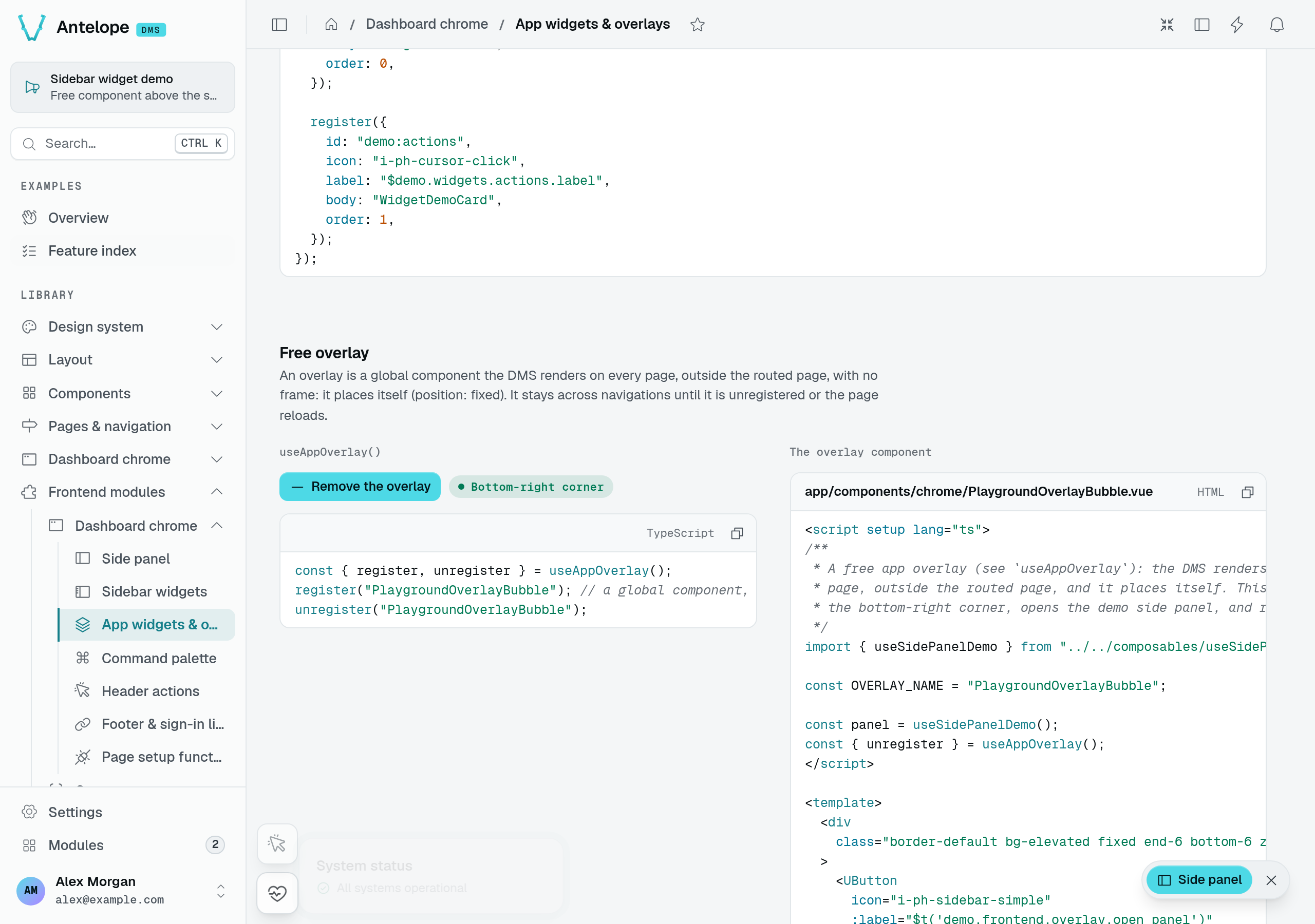
Choose Show the overlay on the playground's App widgets & overlays page. Its PlaygroundOverlayBubble owns the bottom-right positioning and its close control; the DMS does not wrap it in the dock's card.
Signature
useAppOverlay(): {
  overlays: Readonly<Ref<string[]>>;
  register: (name: string) => void;
  unregister: (name: string) => void;
}
Config shape
| Argument | Type | Notes |
|---|---|---|
name | string | The global component name to mount. The component must be globally available (the layer's auto-imported components, or one you register globally). Registering the same name twice is a no-op. |
When/where to call — From an ordinary plugin: the payload is a string, so it is SSR-safe.
Where it renders — app.vue, inside UApp but outside the current page. Each registered name is mounted via <component :is="overlay">, so the overlay is app-wide and persistent — and entirely responsible for its own placement.
Example — a floating support bubble that shows on every page, not just on your own module pages:
export default defineDmsPlugin(() => {
  useAppOverlay().register("MyModuleSupportBubble");
});
collapsed contract, a side panel when the component needs a full-height column next to the page that should not cover it, and an overlay when the component must control its own placement and look.Footer links
registerFooterLink adds a link to the footer's link row (next to the copyright and the locale switcher).
The row starts with two Antelope links, dms:documentation and dms:website (orders 10 and 20). Register an entry under one of these ids to replace it, or remove it with unregisterFooterLink(id). URL targets (https://…) open in a new tab.
The rest of the footer comes from appConfig.branding.footer: the name after the © and the language picker (Theming & branding).
Signature
registerFooterLink(link: FooterLink): void
unregisterFooterLink(id: string): void
useFooterLinks(): { links: ComputedRef<FooterLink[]> }
Config shape
| Field | Type | Required | Notes |
|---|---|---|---|
id | string | yes | Stable key; re-registering the same id replaces the entry. |
label | string | yes | An i18n key; the footer renders it through t(). |
to | string | yes | Route or URL for the link target. |
order | number | yes | Sort key, ascending. Required — there is no default. |
When/where to call — From an ordinary plugin: the entry is plain data and SSR-safe. The registry is a module-level ref, so it does not even require the frontend context, but registering from a plugin keeps the layer's wiring in one place.
Where it renders — Footer.vue, as a Link per entry, sorted by order, with the label resolved via t(link.label).
Example
export default defineDmsPlugin(() => {
  registerFooterLink({
    id: "my-module:docs",
    label: "footer.docs",
    to: "/docs",
    order: 200,
  });
  // The Antelope website link goes; the documentation one stays.
  unregisterFooterLink("dms:website");
});
Auth links
registerAuthLink adds a link below an auth page's form (for example, an extra link under the login form). Unlike the other registries, auth links are page-scoped: an entry declares which page it belongs to, and each page reads only its own links.
Signature
registerAuthLink(link: AuthLink): void
useAuthLinks(page: string): { links: ComputedRef<AuthLink[]> }
Config shape
| Field | Type | Required | Notes |
|---|---|---|---|
id | string | yes | Stable key; re-registering the same id replaces the entry. |
page | string | yes | Which auth page the link belongs to. Must match the key the page passes to useAuthLinks(...) — e.g. the login page calls useAuthLinks("login"). |
label | string | yes | An i18n key, resolved through $t(). |
to | string | yes | Route or URL for the link target. |
order | number | yes | Sort key, ascending. Required — there is no default. |
When/where to call — From an ordinary plugin: the entry is plain data and SSR-safe. The registry is a module-level ref.
Where it renders — Below the target auth page's form. The login page renders its useAuthLinks("login") results, when non-empty, as a centered column of Links under the submit button, each label resolved through $t() and sorted by order.
Example
export default defineDmsPlugin(() => {
  registerAuthLink({
    id: "my-module:sso",
    page: "login",
    label: "auth.sso_hint",
    to: "/auth/sso",
    order: 100,
  });
});
Overview
How a custom frontend module plugs into the DMS dashboard — the registration model and the catalog of extension points.
Theming & branding
Put your logo and palette on the dashboard — the branding app-config surface (sidebar, email and browser-tab logos), Nuxt UI color tokens, CSS variables, fonts, and interface scale.