Activity feed
ActivityFeed draws a card with an eyebrow title and optional link buttons ("View all"), then one row per event: a tinted icon well, the title, dimmed details joined by "·", the time on the right and an accent dot for an unread event. Events are filed under day separators — "Today · Sep 29", "Yesterday · Sep 28", the weekday, then the date. With groupByDay: false the rows say how long ago instead.
ActivityFeed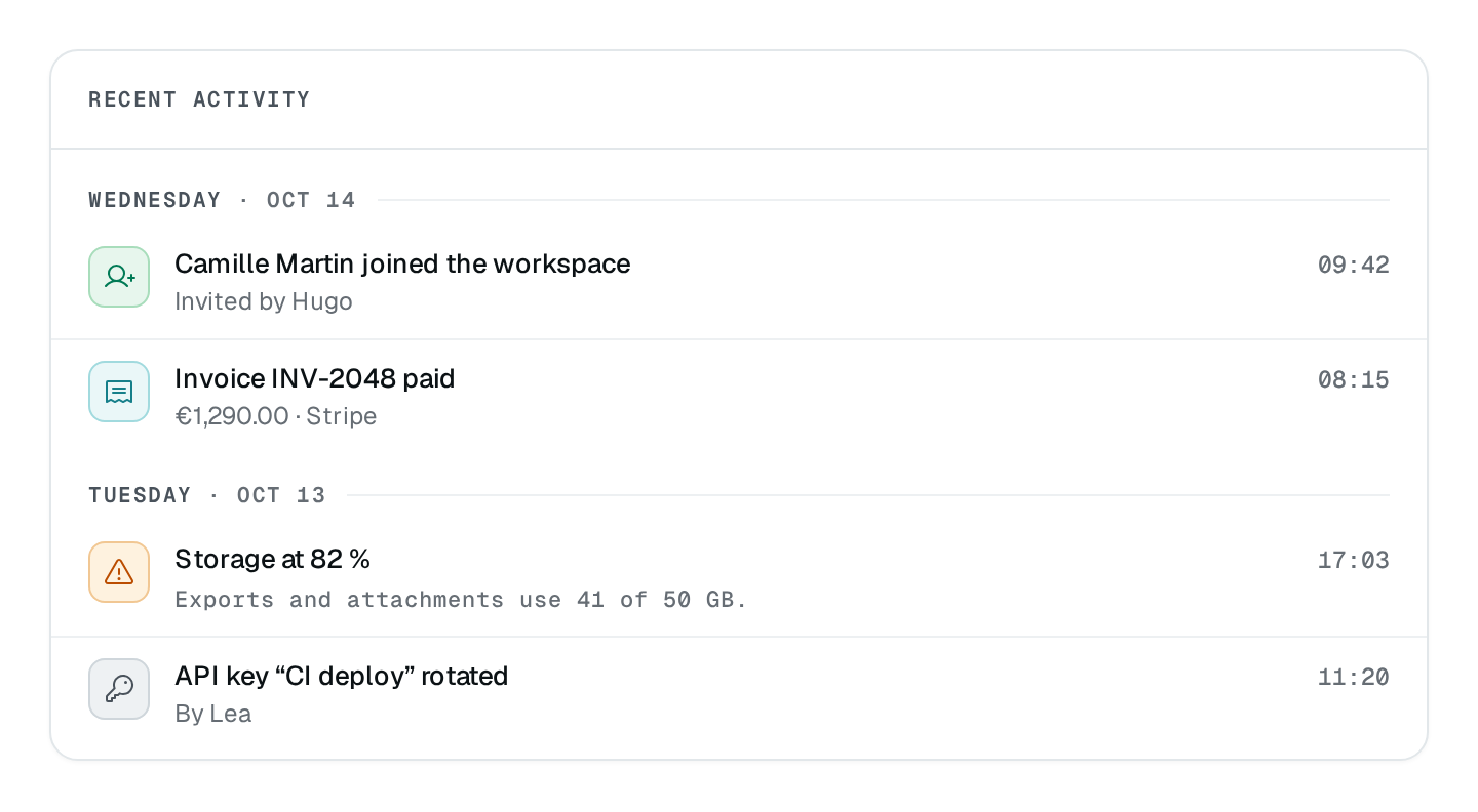
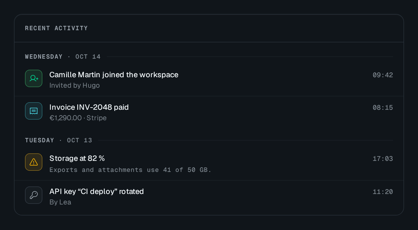
Usage
import { ActivityFeed } from "@antelopejs/interface-dms/base/activity-feed";

static activity = ActivityFeed({
  title: "$app.overview.activity",
  fetchUrl: "/api/activity",
  maxItems: 8,
  actions: [{ label: "$app.overview.view_all", to: "/audit" }],
});
The route answers the entries newest first, as { items, count? }:
@Get("activity")
list() {
  return {
    items: [
      {
        id: "evt_10481",
        icon: "i-ph-check-circle",
        tone: "success",
        title: "$shop.activity.order_paid",
        params: { order: "#10481" },
        meta: ["Globex Logistics", "Stripe"],
        date: "2026-09-29T09:18:00Z",
        to: "/orders/10481",
      },
    ],
  };
}
Options
| Option | Type | Default | Description |
|---|---|---|---|
titleContent | string | – | Small heading at the top of the card. |
countContent | number | – | A number shown beside the title; a data source can replace it. |
badgeContent | string | object | – | A short tag at the top of the card, such as the period it covers. |
empty.title*Content | string | – | |
empty.descriptionContent | string | – | |
groupByDayAppearance | boolean | – | Day separators with times, rather than relative times. |
maxItemsAppearance | number | – | |
visibleItemsAppearance | number | – | Entries shown before a "Show N more" button unfolds the rest. |
wrapAppearance | boolean | – | Entries wrap their texts rather than cutting them to one line. |
fillHeightAppearance | boolean | – | Takes the full height of its place, the entries scrolling inside, rather than growing with them. |
monoAppearance | boolean | – | |
cardAppearance | boolean | true | Draws the block on a card; turn it off when it already sits in one. |
An entry has a title and optionally an icon, a tone, meta (details), detail (a third dimmed mono line: the evidence behind the entry), date (ISO), time (text in place of the time), params, unread and to. The title, each detail, detail and time take a plain string, a $ key or a composed text.
Recipes
A to-do list with a count
A feed that is a to-do list ("Needs attention") says how many entries there are beside its title, and which window they cover in a soft badge. The route answers { items, count: 12 } — count may exceed the entries it returns.
static attention = ActivityFeed({
  title: "$api.overview.attention.title",
  badge: "$api.overview.last_24h",
  fetchUrl: "/api/monitoring/overview/attention",
  groupByDay: false,
  mono: true,
});
Keep every word
Entries are cut to one line with an ellipsis by default. A feed whose entries carry meaning to their last word sets wrap: true; leave fillHeight off so the card grows with them, and use visibleItems for a "Show N more" fold.
Fill a grid cell
Beside another card in a grid row, fillHeight: true stretches the feed to the row's height and scrolls its entries under the fixed head.
Plurals and values
params holds the values a $ title or detail names, as composed-text parameters: { type: "count", value } picks the plural form, { type: "relative", value } reads "3 minutes ago".
{
  icon: "i-ph-tray",
  title: "$mailing.inbox.to_review", // "{count} message to review | {count} messages to review"
  params: { count: { type: "count", value: 3 } },
}
Pitfalls
- The head count and badge are drawn in the card head, so not with
card: false. skeletonCountdefaults tomaxItems, or 3.