Stacks
HStack lays its children out left to right, VStack top to bottom. alignment sets the cross axis, distribution shares the free space along the main axis, and spacing is the gap between children. A Spacer between children absorbs the leftover space: logo · Spacer · actions pins the logo left and the actions right.
HStack
HStack

import { HStack, Spacer } from "@antelopejs/interface-dms/base/stack";
import { LiveToggle } from "@antelopejs/interface-dms/base/live-toggle";
import { PeriodSelector } from "@antelopejs/interface-dms/base/period-selector";

static toolbar = HStack({ alignment: "center" })
  .child("live", LiveToggle())
  .child("spacer", Spacer())
  .child("period", PeriodSelector({ id: "sales" }));
| Option | Type | Default | Description |
|---|---|---|---|
alignmentLayout | "start" | "center" | "end" | "stretch" | "center" | Alignment of children across the stack. |
distributionLayout | "start" | "center" | "end" | "space-between" | "space-around" | "space-evenly" | "start" | Distribution of children along the stack. |
spacingLayout | string | "8px" | Space between children, as a CSS length. |
wrapLayout | boolean | false | Wrap children onto a new line when the row runs out of space. |
growLayout | number | – | Share of the parent stack's free space the stack takes. |
VStack
VStack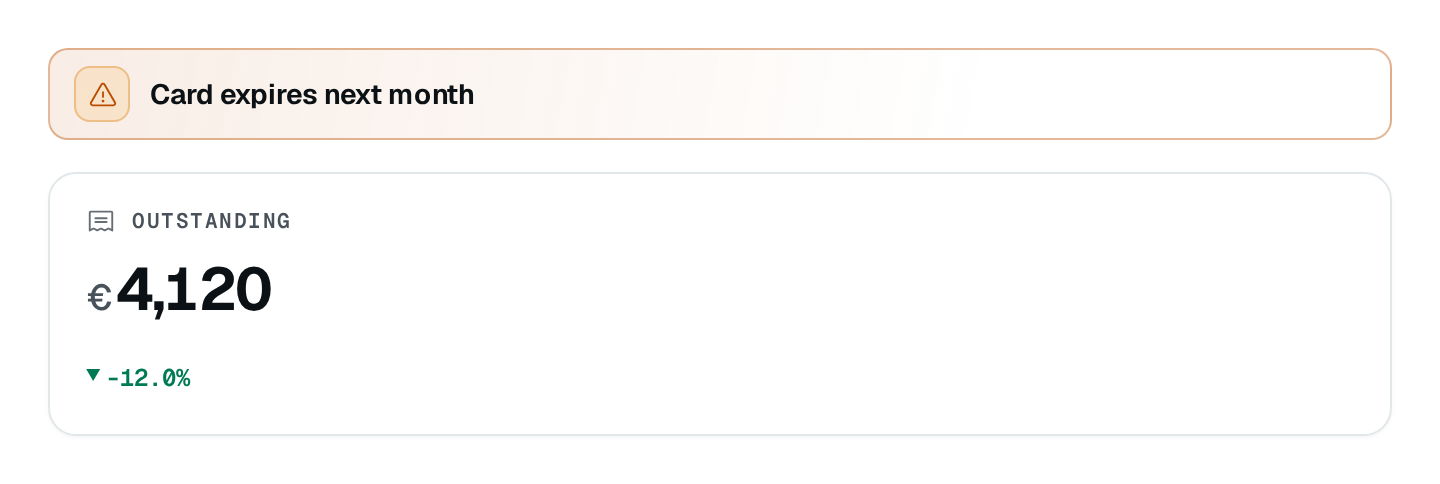
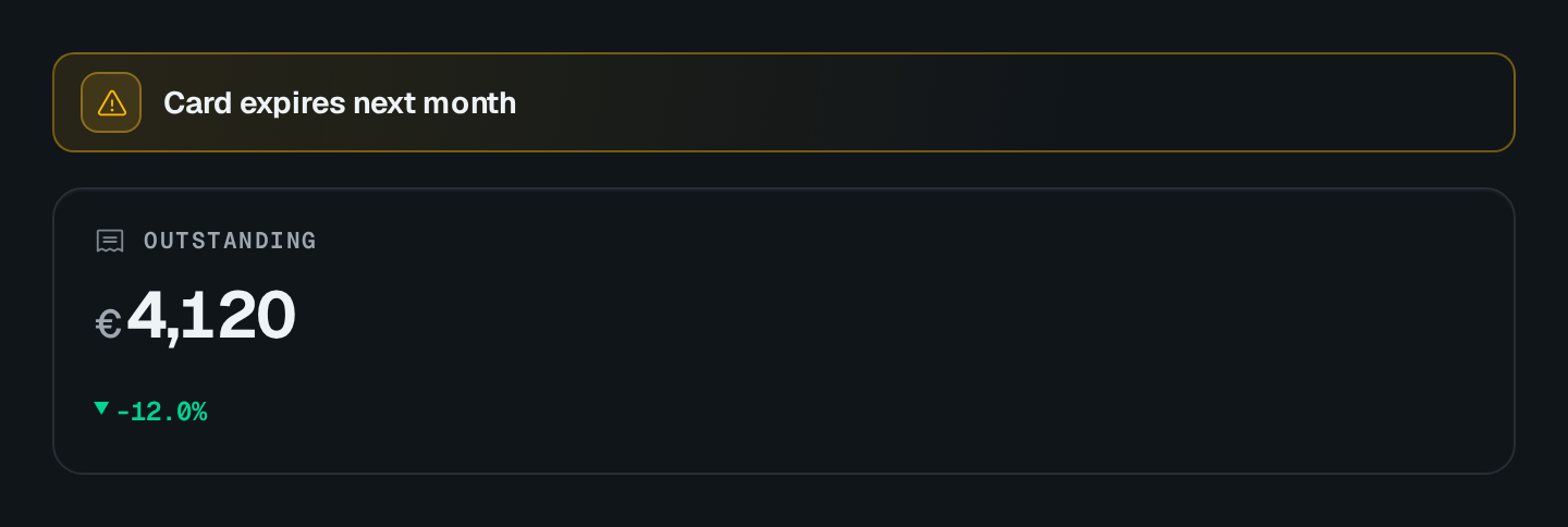
import { VStack } from "@antelopejs/interface-dms/base/stack";

static column = VStack({ alignment: "stretch", spacing: "12px" })
  .child("notice", Banner({ tone: "info", size: "sm", title: "Numbers refresh every 15 minutes." }))
  .child("body", Placeholder({ label: "Content" }));
| Option | Type | Default | Description |
|---|---|---|---|
alignmentLayout | "start" | "center" | "end" | "stretch" | "center" | Alignment of children across the stack. |
distributionLayout | "start" | "center" | "end" | "space-between" | "space-around" | "space-evenly" | "start" | Distribution of children along the stack. |
spacingLayout | string | "8px" | Space between children, as a CSS length. |
growLayout | number | – | Share of the parent stack's free space the stack takes. |
Spacer
A Spacer is a flexible gap that works in either stack direction, and holds an empty cell in a GridRow.
HStack| Option | Type | Default | Description |
|---|---|---|---|
minSizeLayout | string | – | Smallest size the spacer shrinks to. |
maxSizeLayout | string | – | Largest size the spacer grows to. |
growLayout | number | 1 | Share of the leftover space the spacer takes. |
Recipes
Share a row between panels
A stack fills the width of what holds it, except inside an HStack: there sibling stacks share the row equally, or by their grow. A sidebar at grow: 1 beside a content column at grow: 3 takes a quarter of the row. In a row holding a Spacer, sibling stacks keep their content width so the spacer can push them aside.
Equal-height cards
alignment: "stretch" makes children fill the cross axis, which gives a row of cards one height.
Pitfalls
wrapexists onHStackonly.- A
Spacerrespects itsminSize/maxSizebounds: amaxSizethat is too small leaves the remaining space unused.